Anthony Araujo-Amaral
Anthony is an efficient, highly skilled and versatile designer with a strong foundation in both print and digital media. He brings a collaborative spirit and a problem-solving mindset to every project, consistently delivering quality designs.He thrives in independent and collaborative settings. He has worked closely with senior executives and creatives to develop and refine visual identities—including product launches, rebranding efforts and high-profile projects for municipal governments, civic organizations, colleges, and medical publications.With a background in instruction and mentorship, he also demonstrates strong communication and leadership skills. He is interested in building strong systems and bettering work processes. Although he has broad areas of expertise, he also has great interest in history and typography. His work reflects a thoughtful balance of creativity, precision, and adaptability.
Logos & Branding
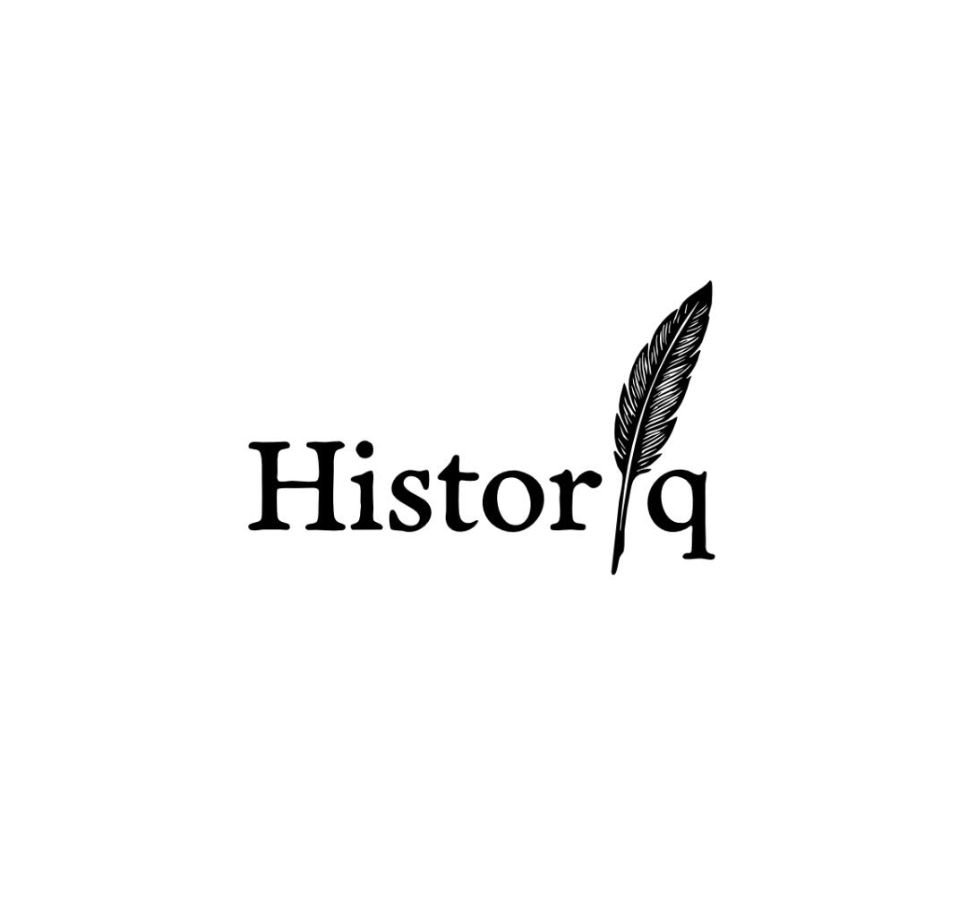
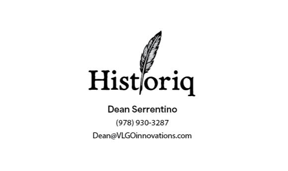
Historiq
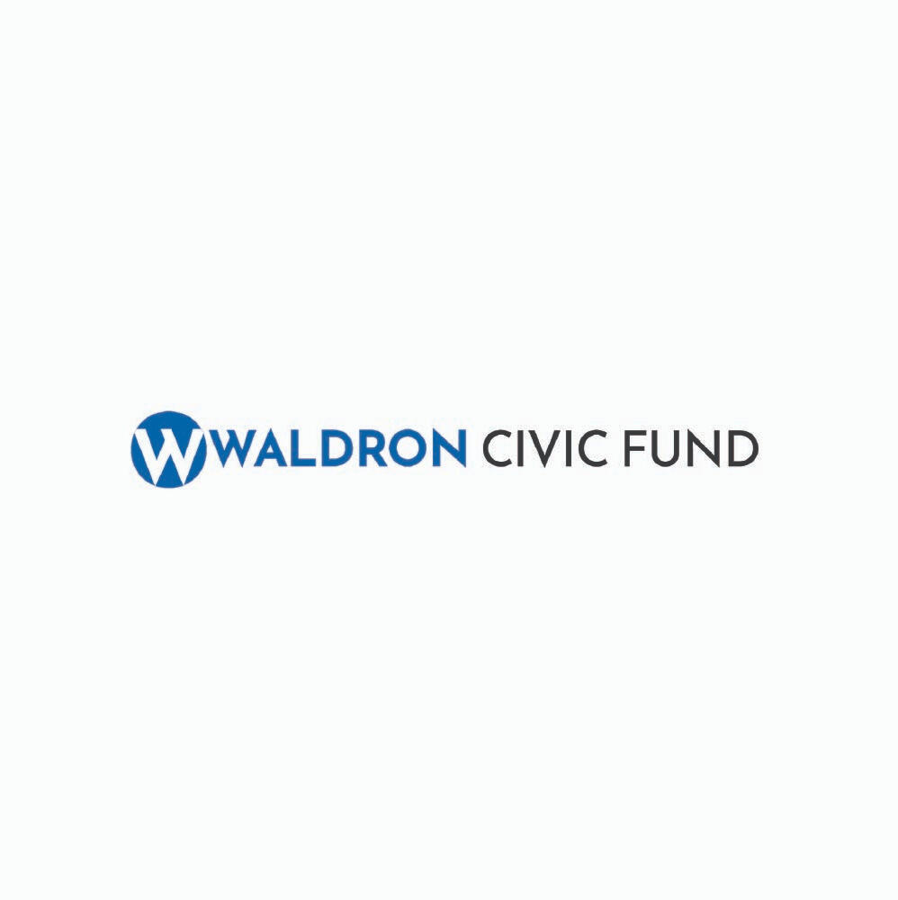
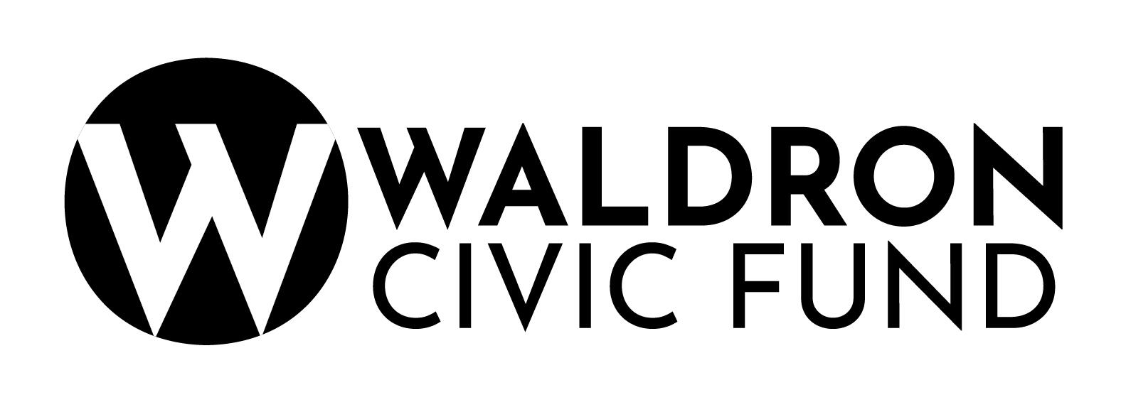
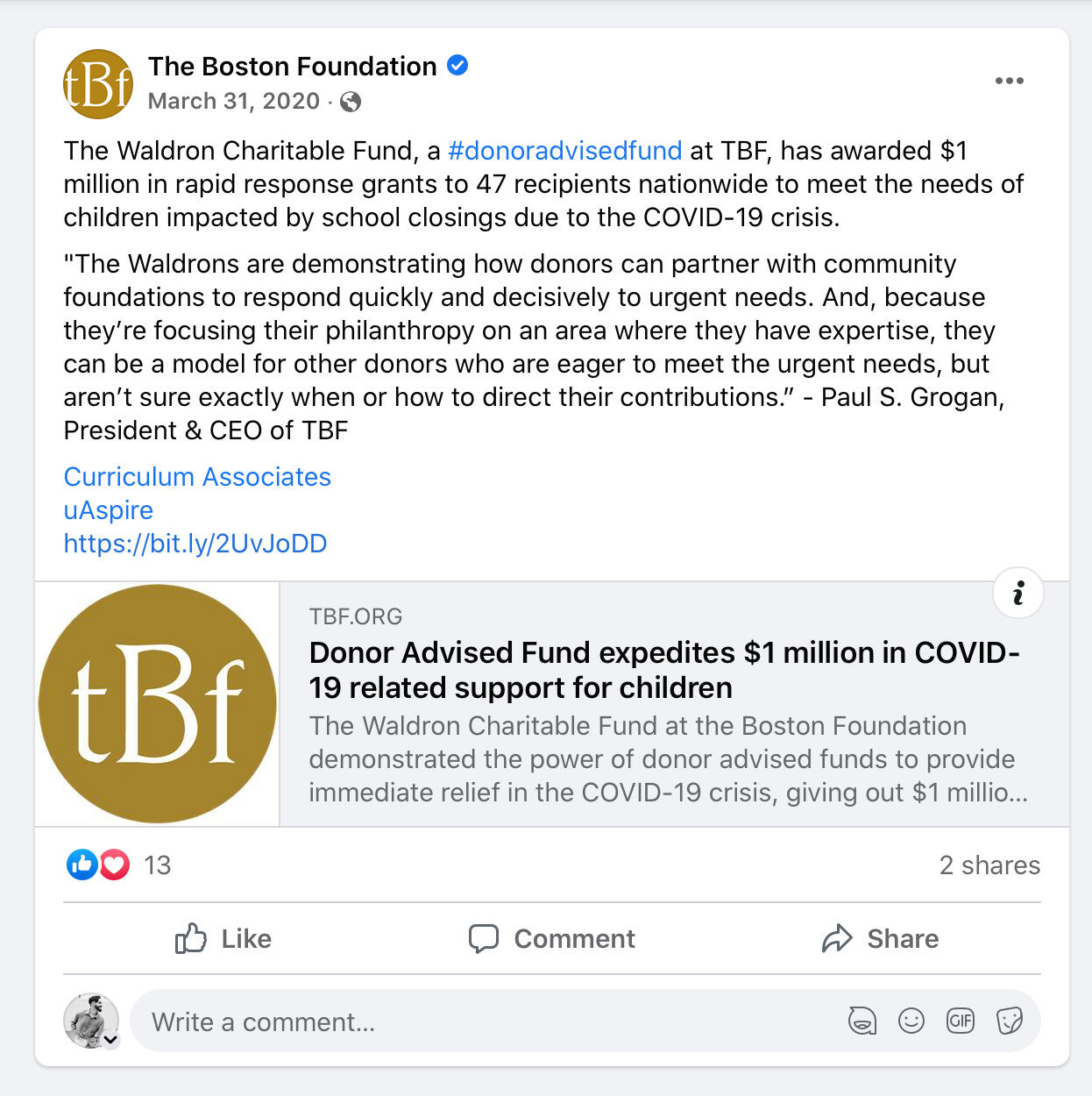
Waldron Civic Fund
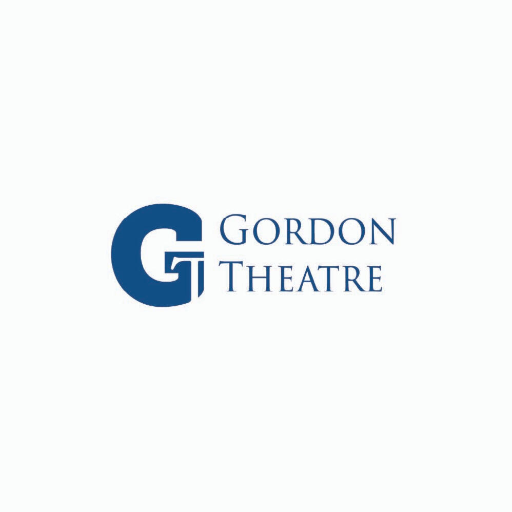
Gordon College Theatre
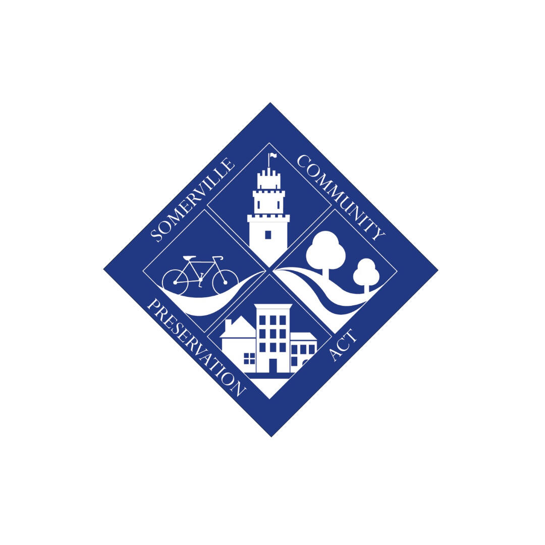
City of Somerville Community Preservation Act
Curated Rags
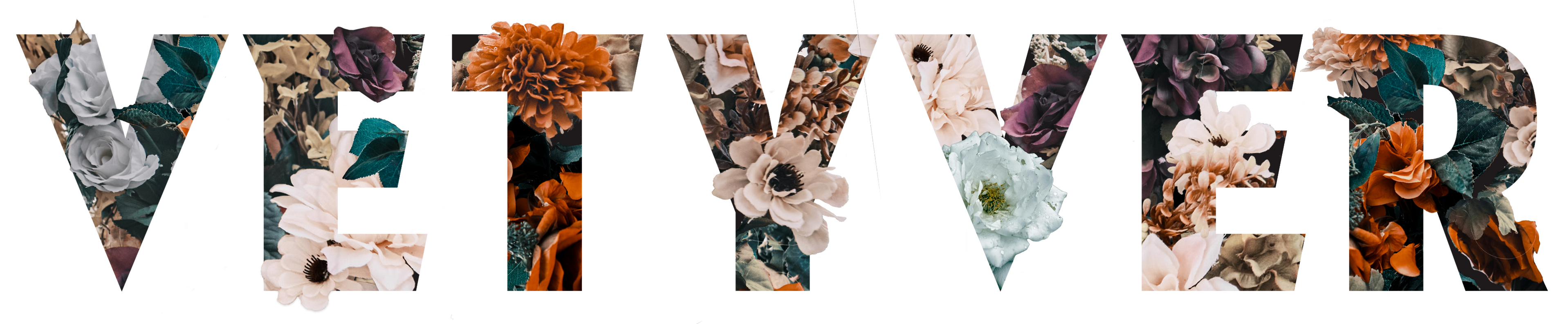
VETYVER
Corporate Work
Ads
Environmental Graphics
Flyers
Brochures
Smaller Collateral
Personal Work
Murals and Paintings
Airborne: Approved for Release 09/79 — An Artist Book
System of a Down Box Set

Type & Image Plates — A Visual Exercise
Type Design — Fonts
Contact
I do commissions! For business inquiries, contact me at [email protected].Available for logo design, branding, print collateral, and mural commissions. Based in the Greater Boston area, open to remote projects.
Web Services by RICA Web Solutions | ricaweb.carrd.co
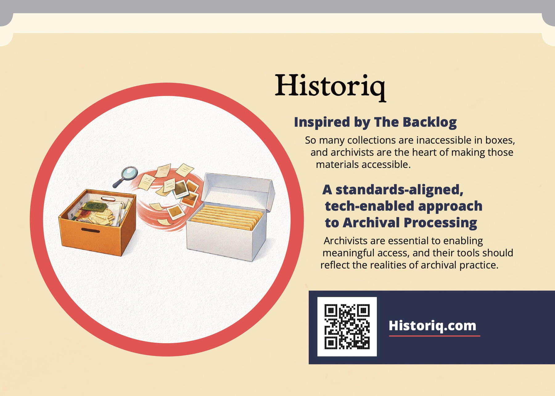
Historiq — Logo Design
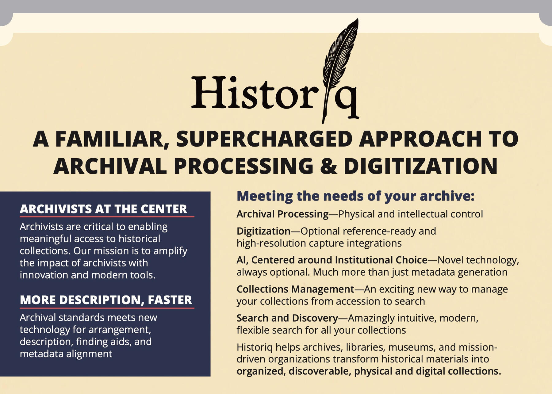
Designed logo, collaborated with co-founders Dean Serrentino and Robert Waldron on ideation and execution of wordmark, branding secondary colors and elements, and print collateral, incorporated generative AI in early concept development to align with company’s AI-forward mission.Historiq offers innovative modern archival processing & digitization.
It partners with archives, libraries, museums, and mission-driven organizations to transform historical materials into organized, discoverable digital assets. Their archivist-led approach combines professional standards with smart, technology-enabled workflows that accelerate processing while preserving integrity.2025–2026


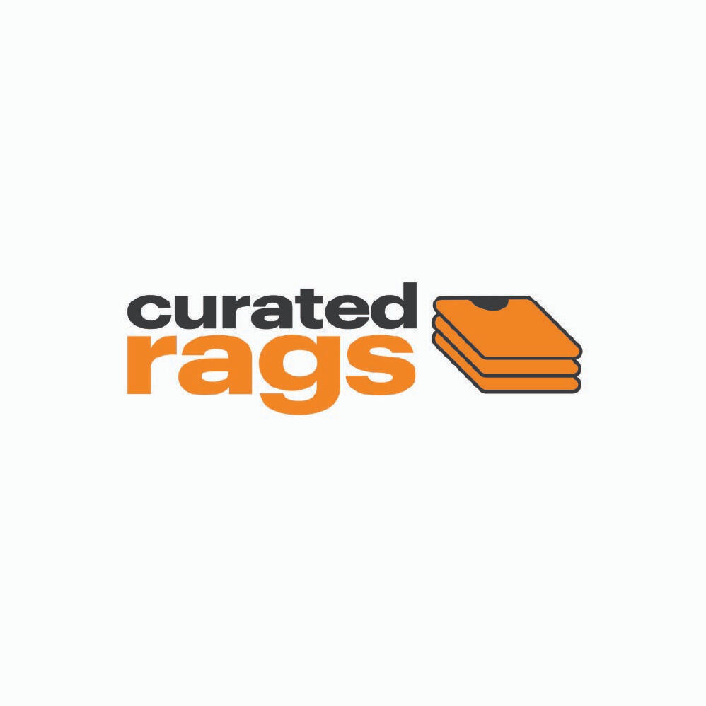
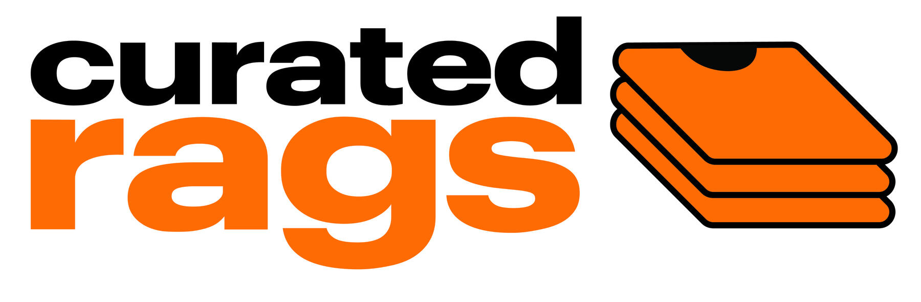
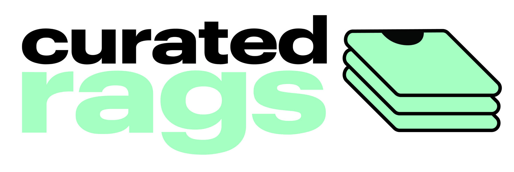
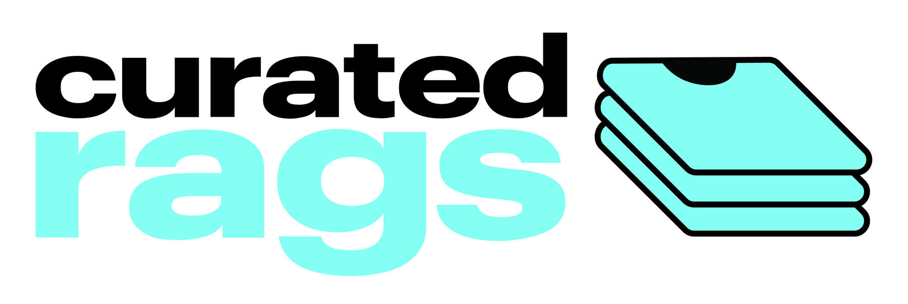
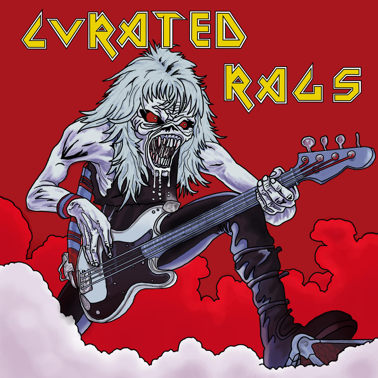
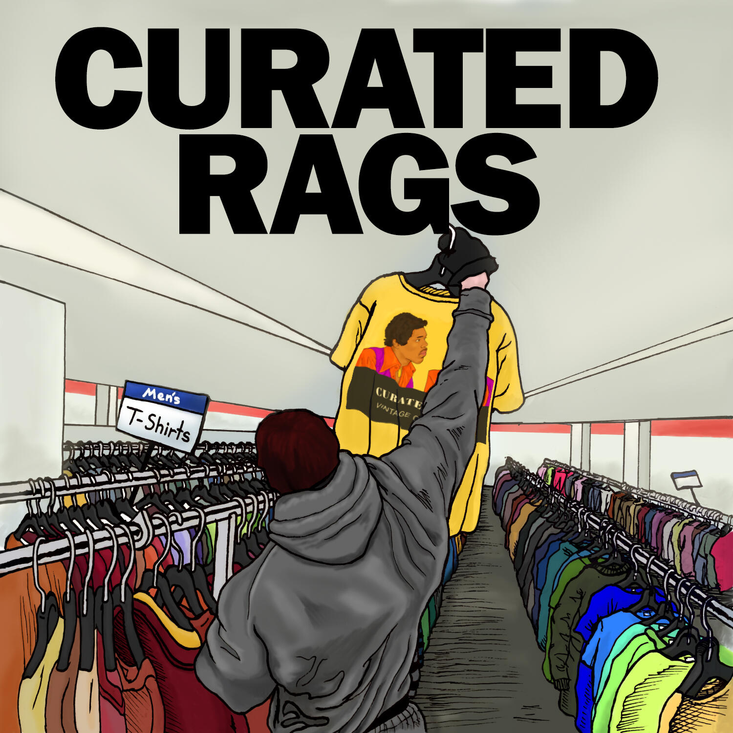
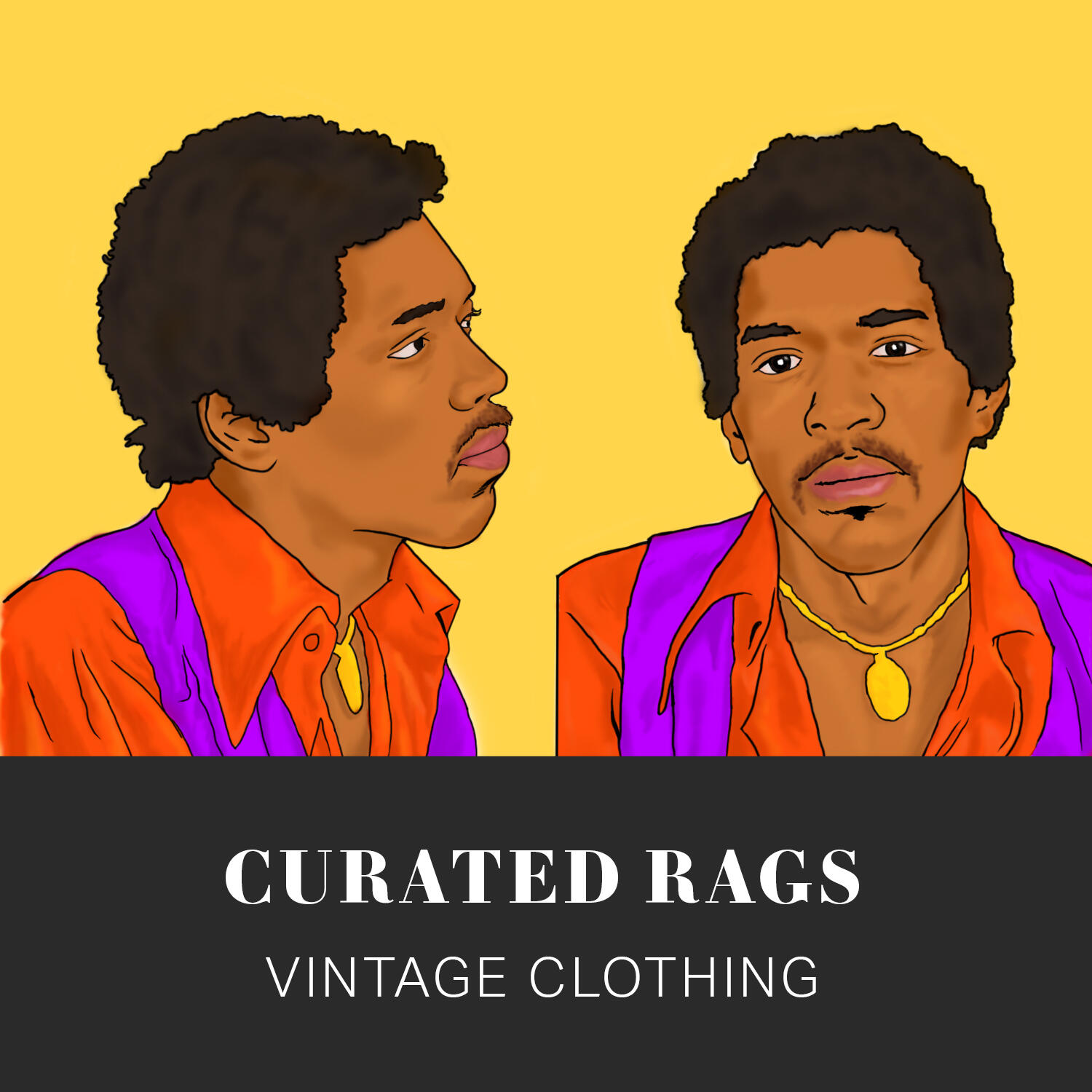
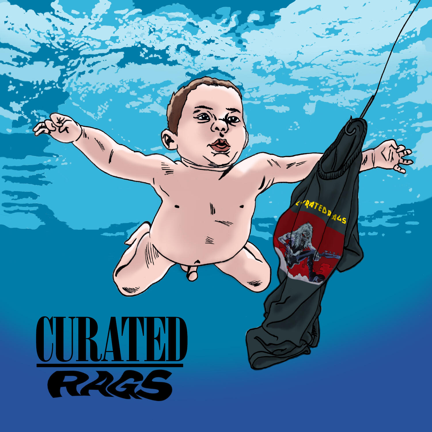
Curated Rags — Logo and Sticker Design
Curatedrags.com, a premiere online vintage and custom clothing shop operating in Greater Boston, run by Benjamin Novick who wanted a very stripped back design with vibrant colors for the brand.The stickers are parodies of famous pop culture pieces meant to be included in shipping orders.2021

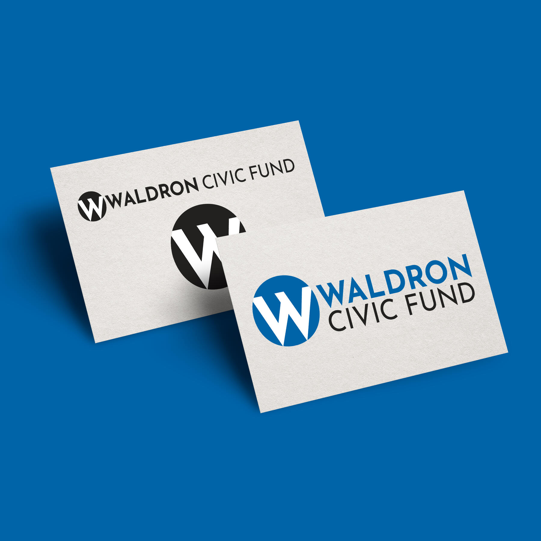
Robert and Jennifer Waldron Civic Fund — Logo and Branding Design
In 2022, I designed the logomark and branding for the Waldron Civic Fund, a charitable fund that awarded $1 million in rapid response grants to meet the needs of children impacted by school closings due to the COVID-19 crisis in 2020.Co-managed by Robert and Jennifer Waldron, the fund expedited support in the wake of a flood of requests from nonprofits nationwide serving the health, nutrition, and special education needs of underserved children impacted by school closures.Robert Waldron is CEO of Curriculum Associates, an education technology company that provides more than 13 million K-12 students nationwide with personalized learning materials to prepare them for success. Jennifer Waldron works with uAspire, a nonprofit organization removing financial barriers to higher education that was launched with the support of the Boston Foundation.I updated the brand in 2025 to reflect a name change.2022, updated 2025
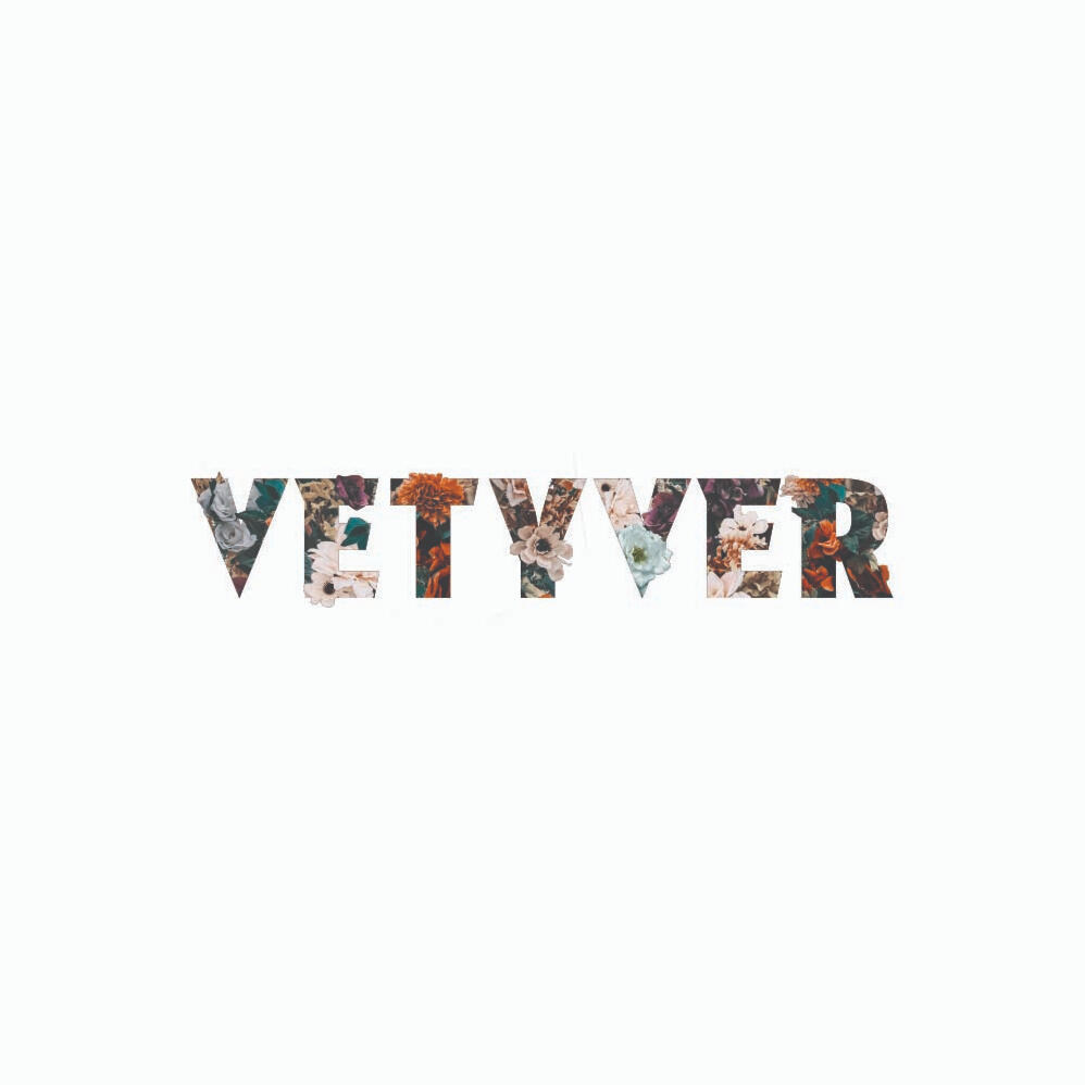
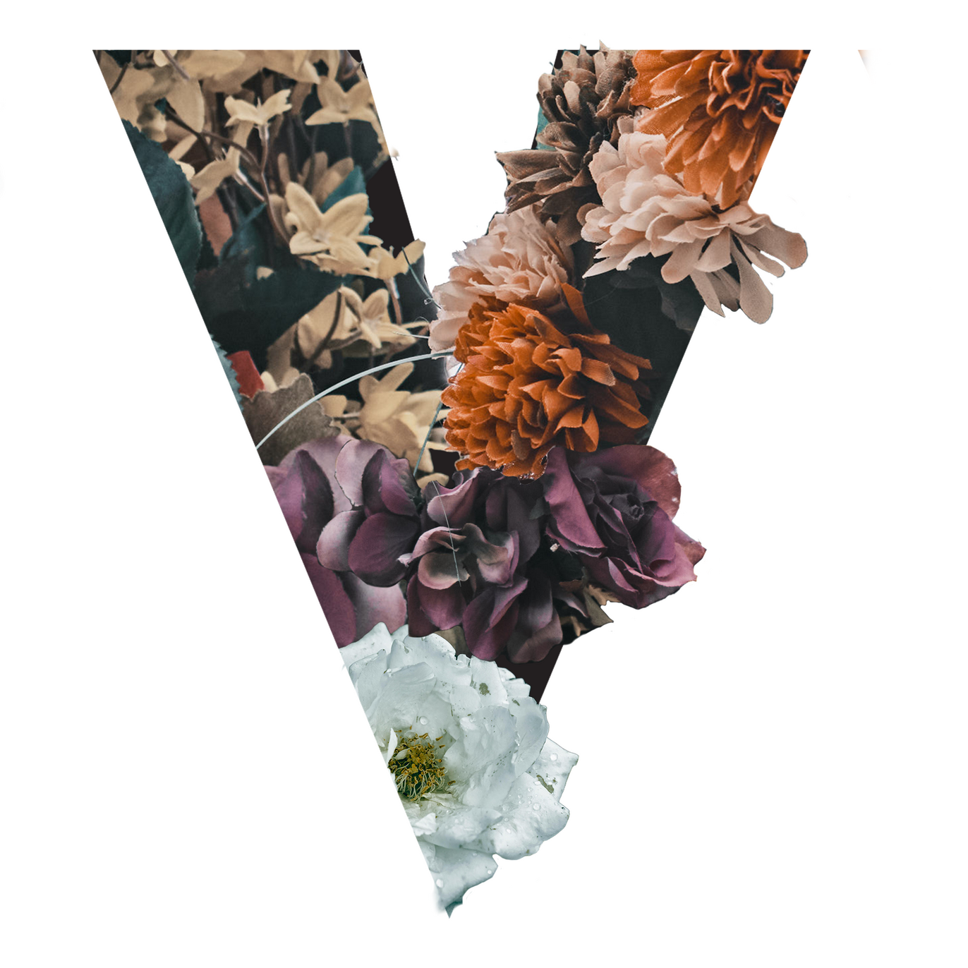
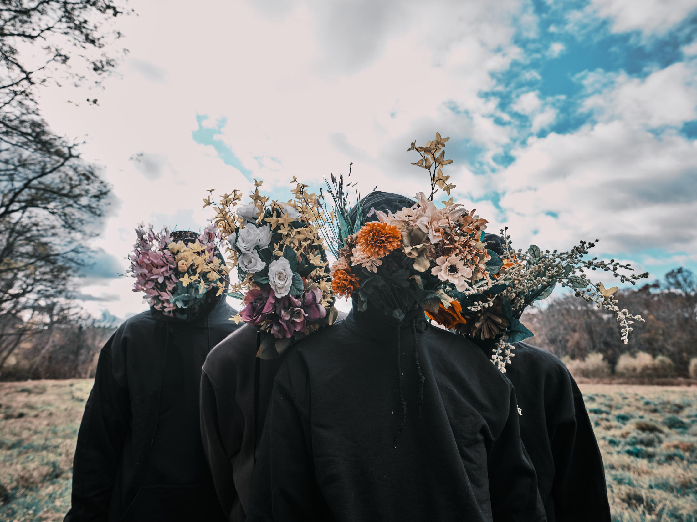
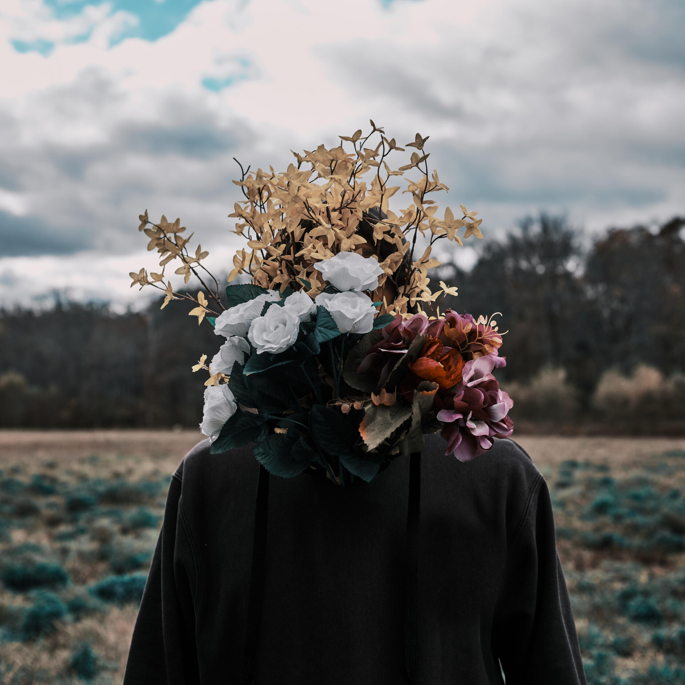
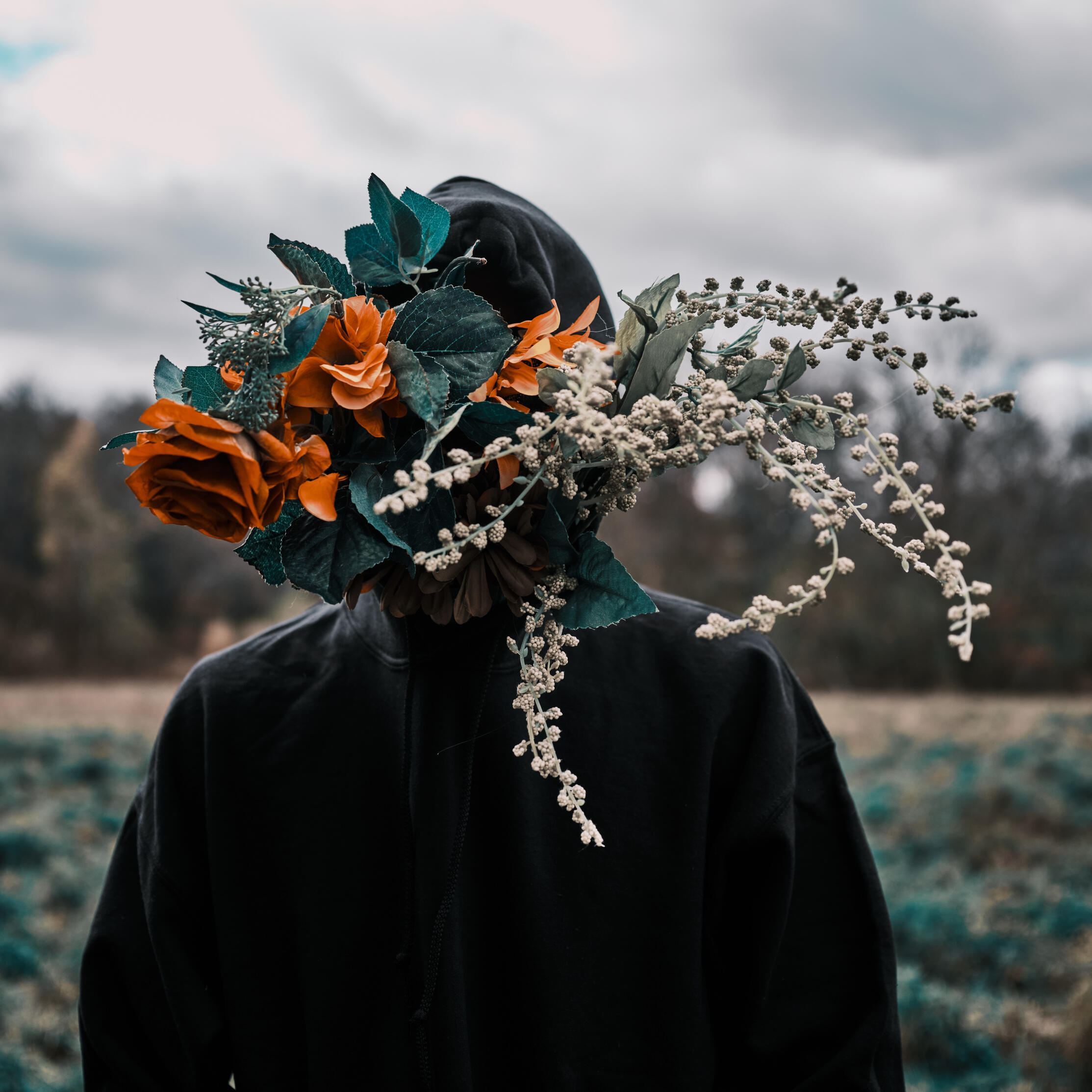
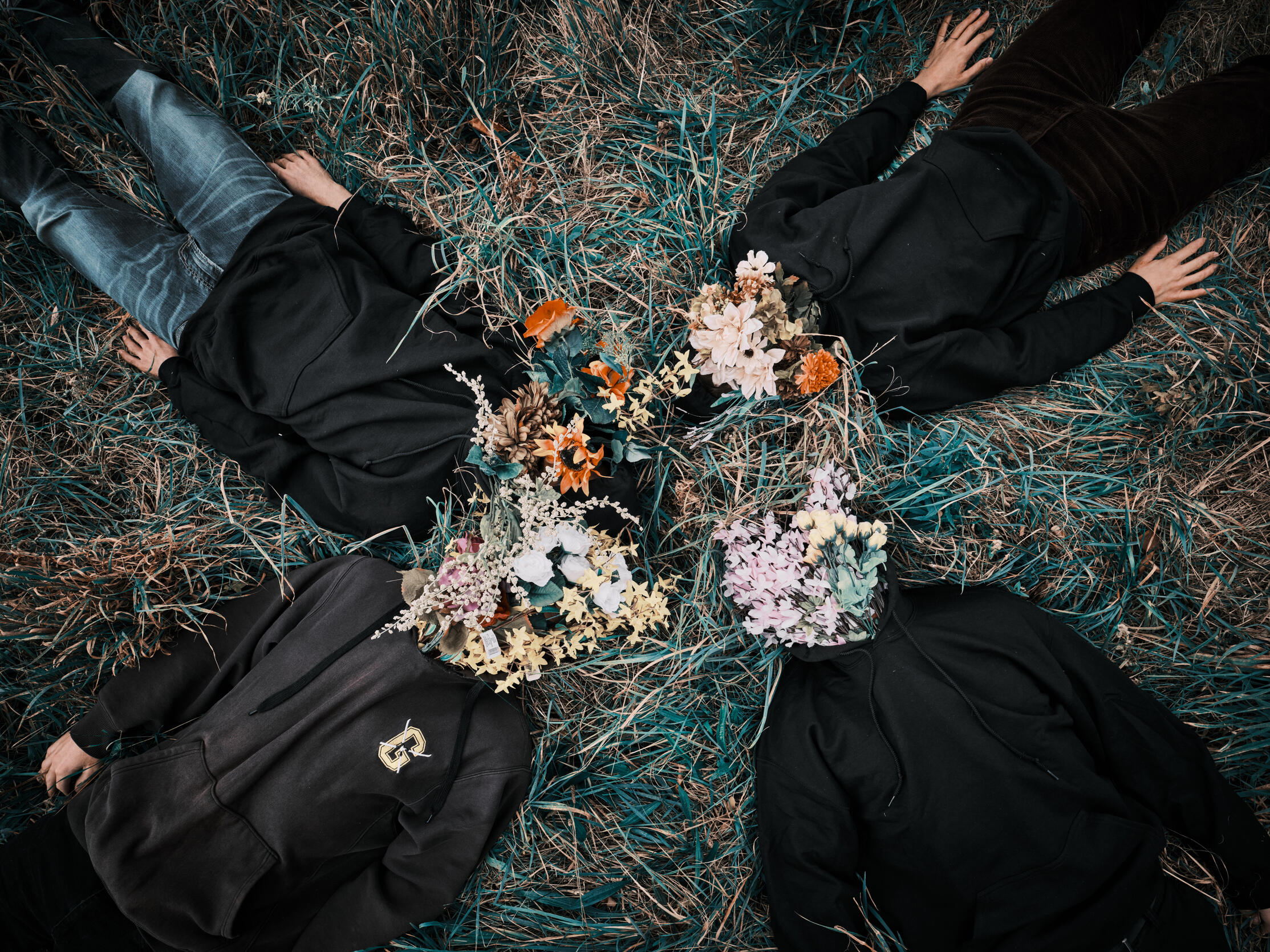
Vetyver — Logo Design
Wordmark logo redesign for the Boston-based independent rock band, Vetyver, using the beautiful photos taken by Tim Ma, pictured below. I individually edited and composed each letter's floral arrangement.
2025

City of Somerville Community Preservation Act — Logo Design
Under the guidance of Charles Gerlach and Nelia Braga, Directors of the Somerville High School Graphic Design Vocational Program, I designed the logo for the CPA along with Michael Rosenberger (who designed the top quadrant).Adopted in 2012, the Community Preservation Act or “CPA” is a City of Somerville (MA) fund that pays for improvements to parks, historic buildings and artifacts, and affordable housing. They ask for public input about what will help the community. Community organizations and City departments can apply for grants for historic and parks projects.2017
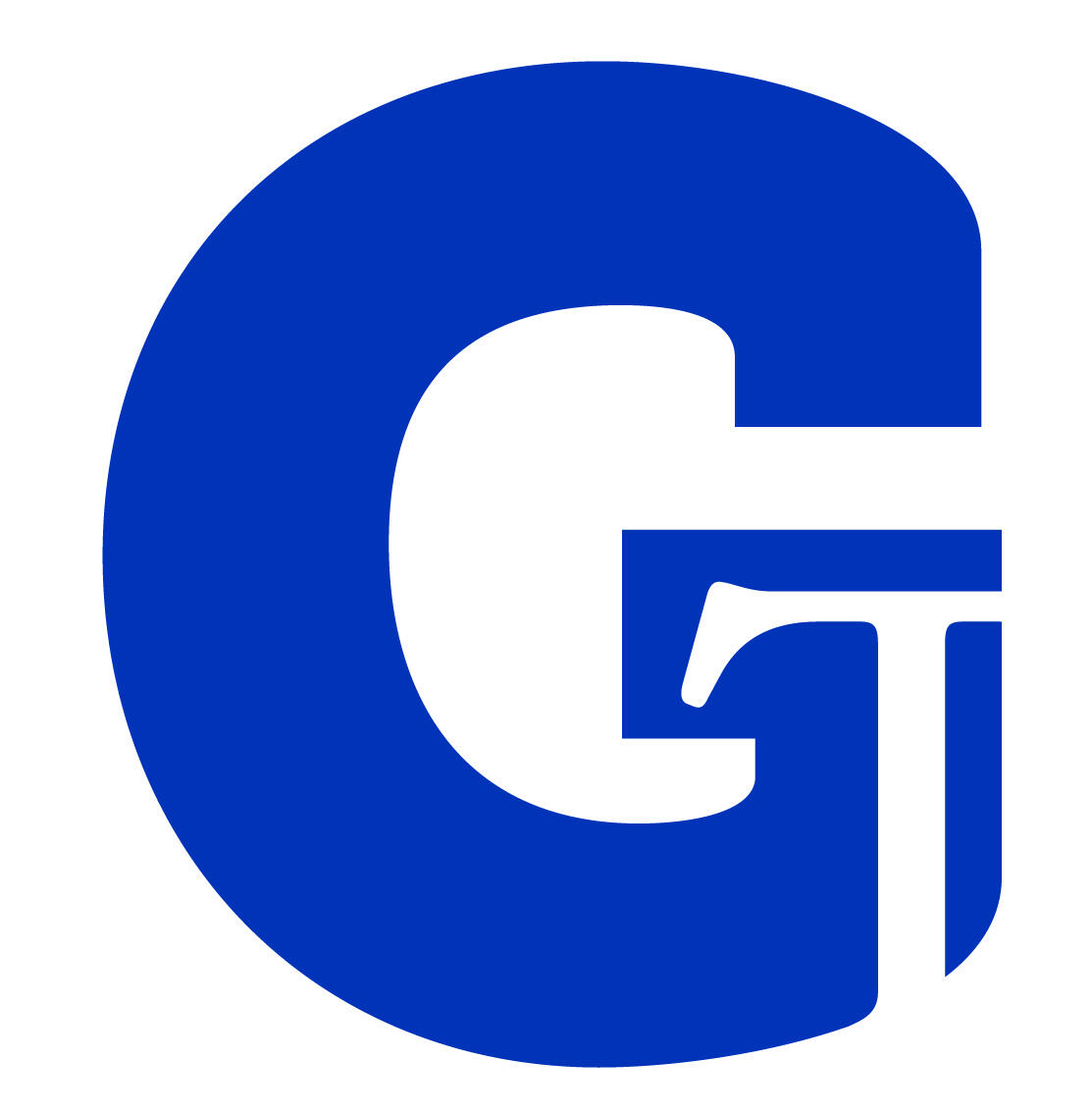
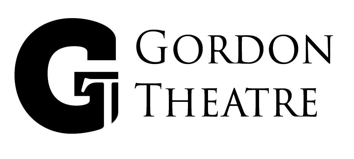
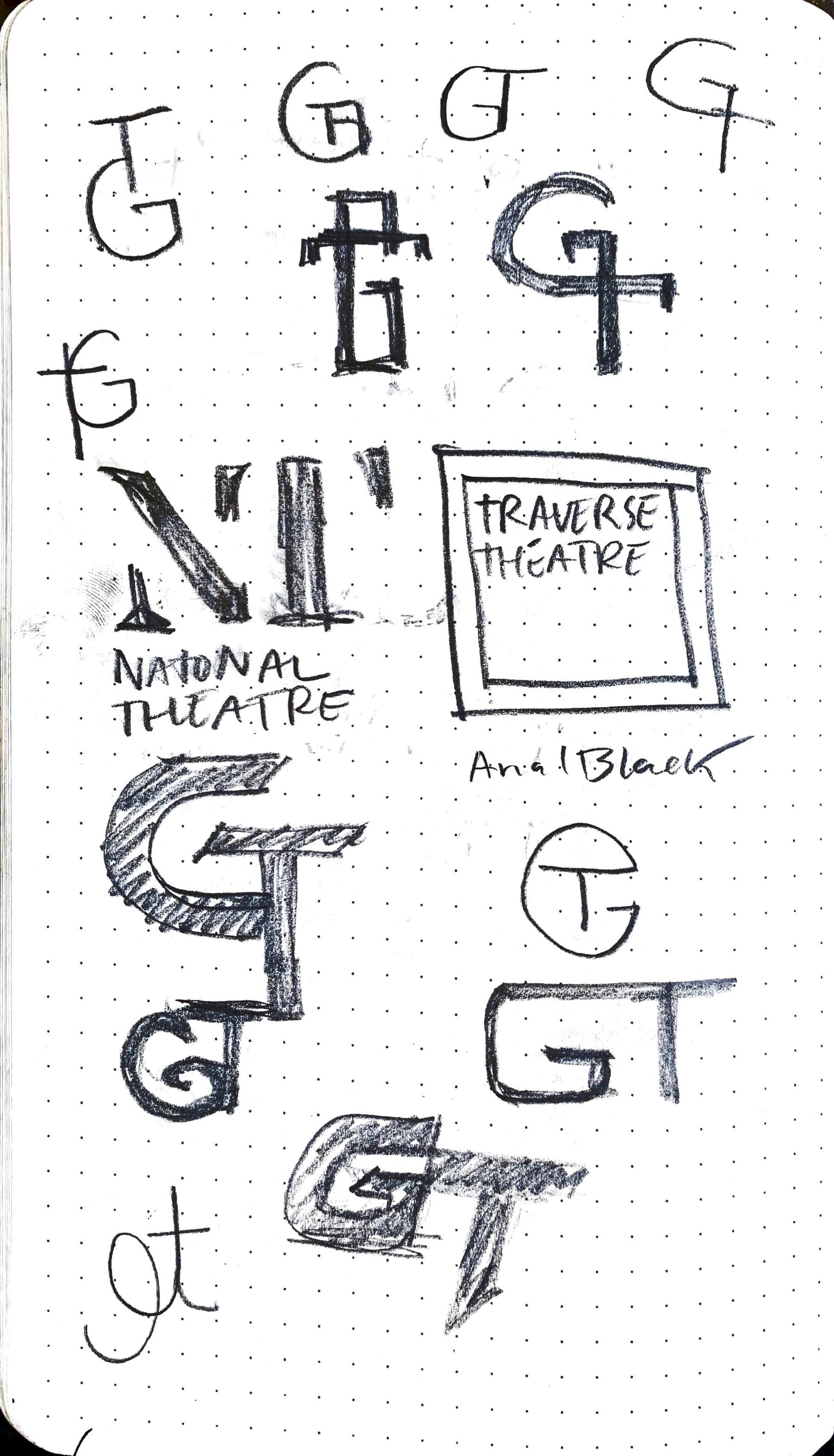
Gordon College Theatre — Logo Design
Gordon College Theatre has been named among the “Top 20 Best College Theatres” in America by The Princeton Review. Norman Jones commissioned me to redo the branding for the Theatre to reflect its vibrant program.The premise was to use the two distinct letterforms G + T and their negative space to capture the Gordon Theatre’s core values of being Creative, Collaborative and Curious.2021
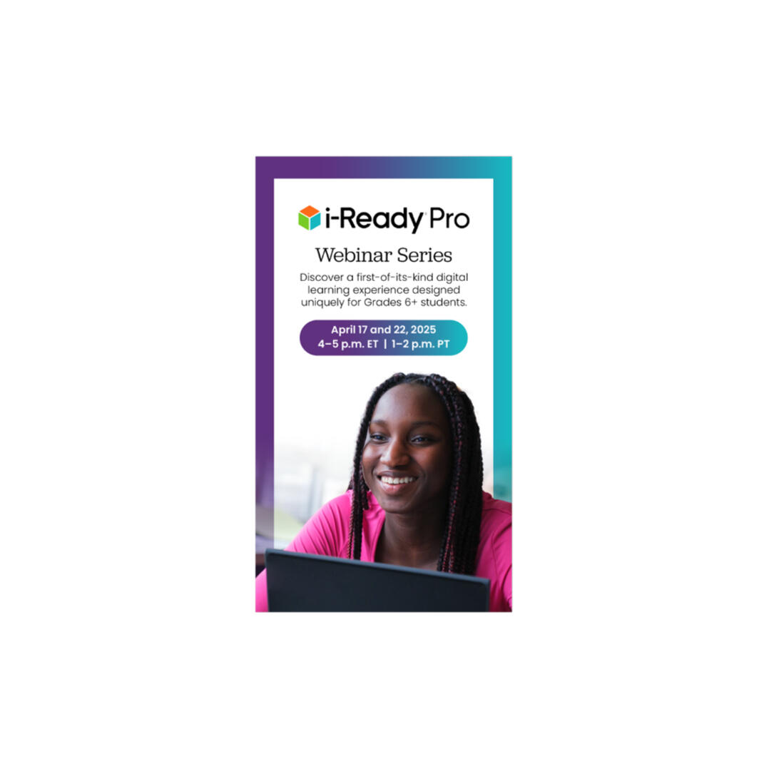
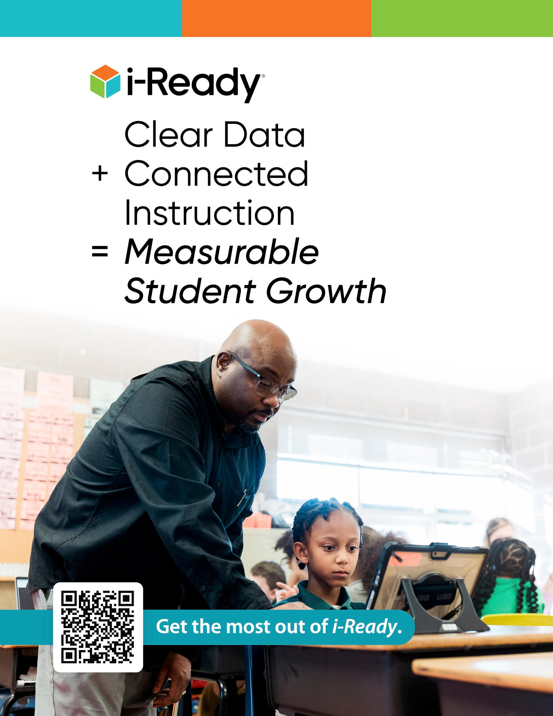
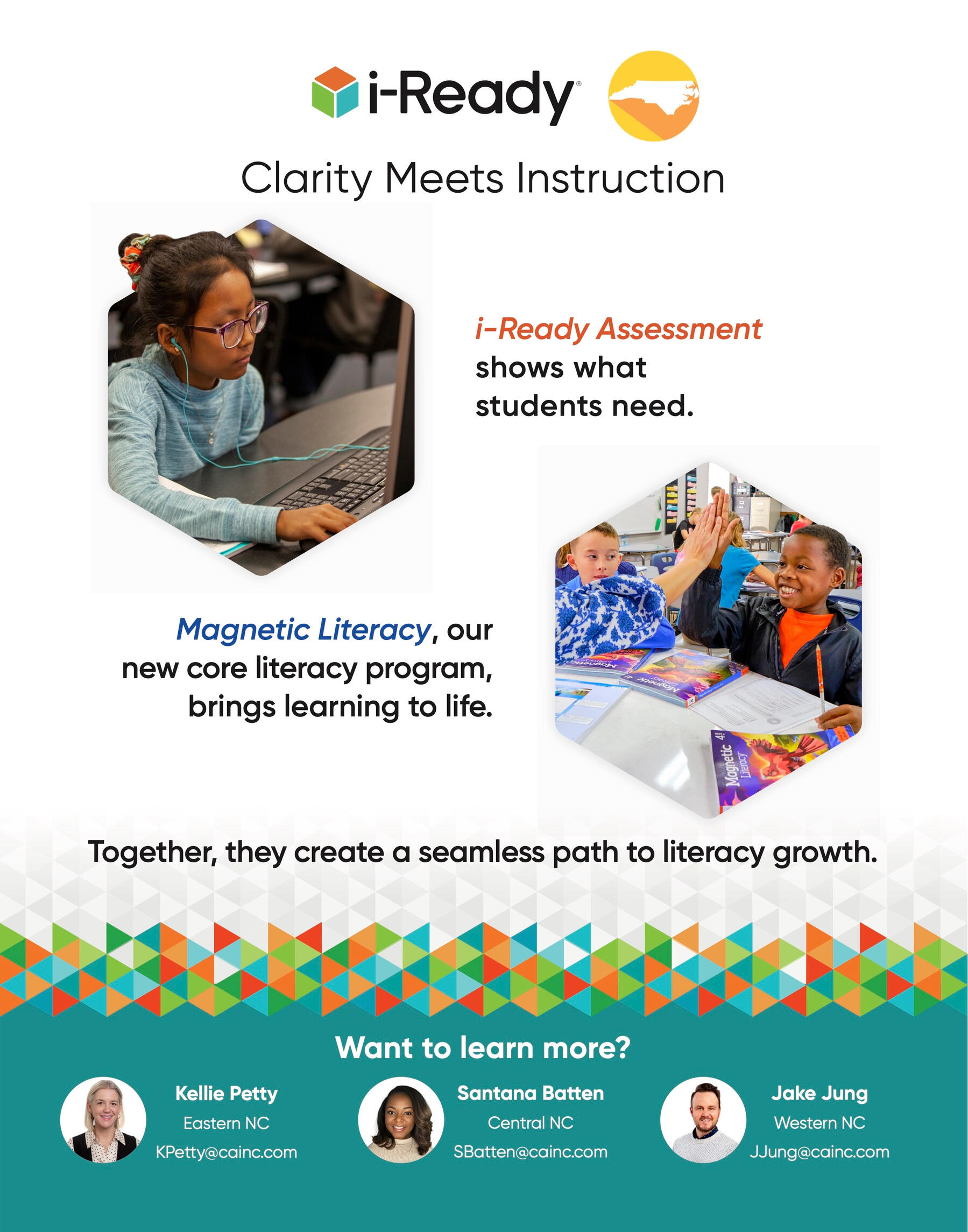
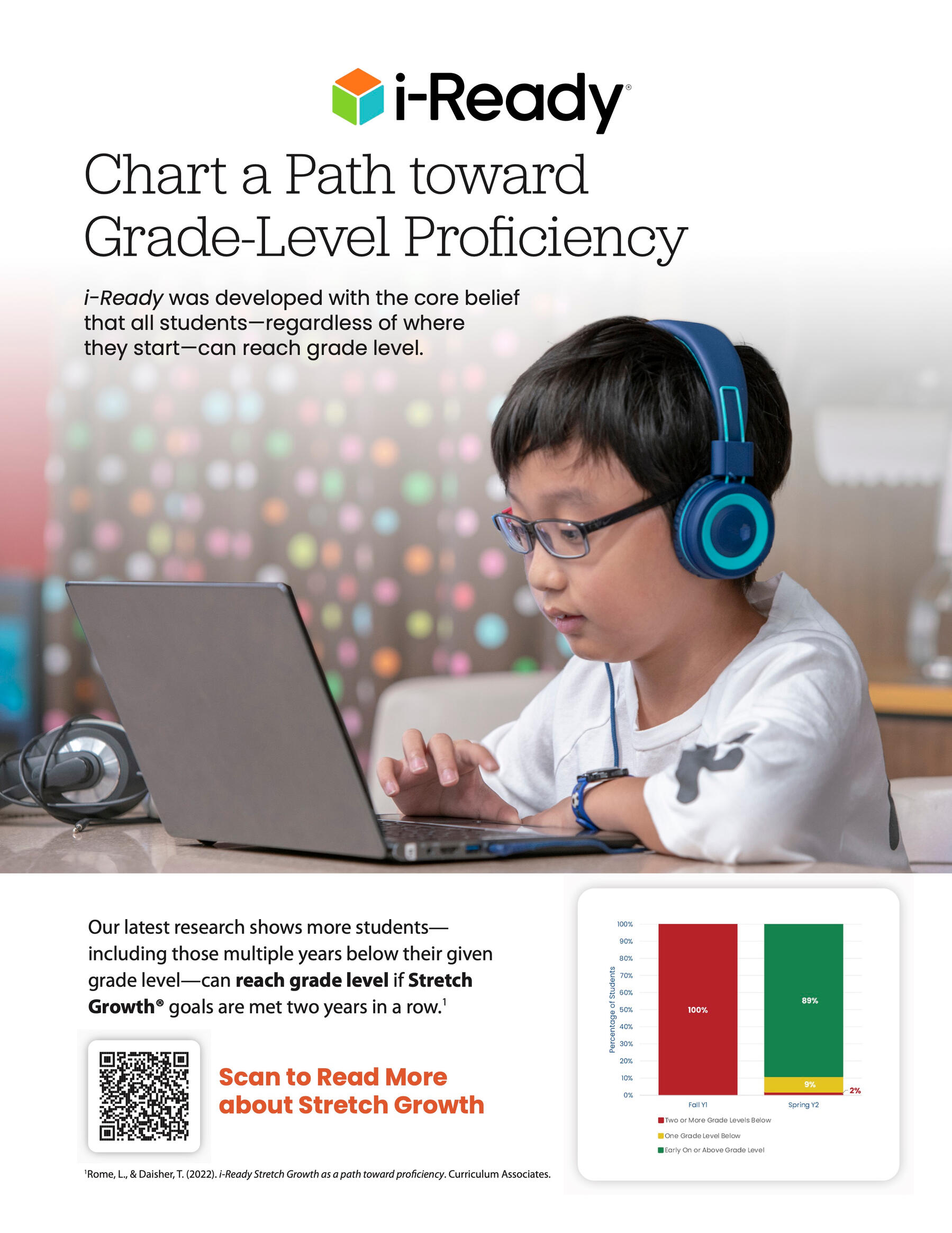
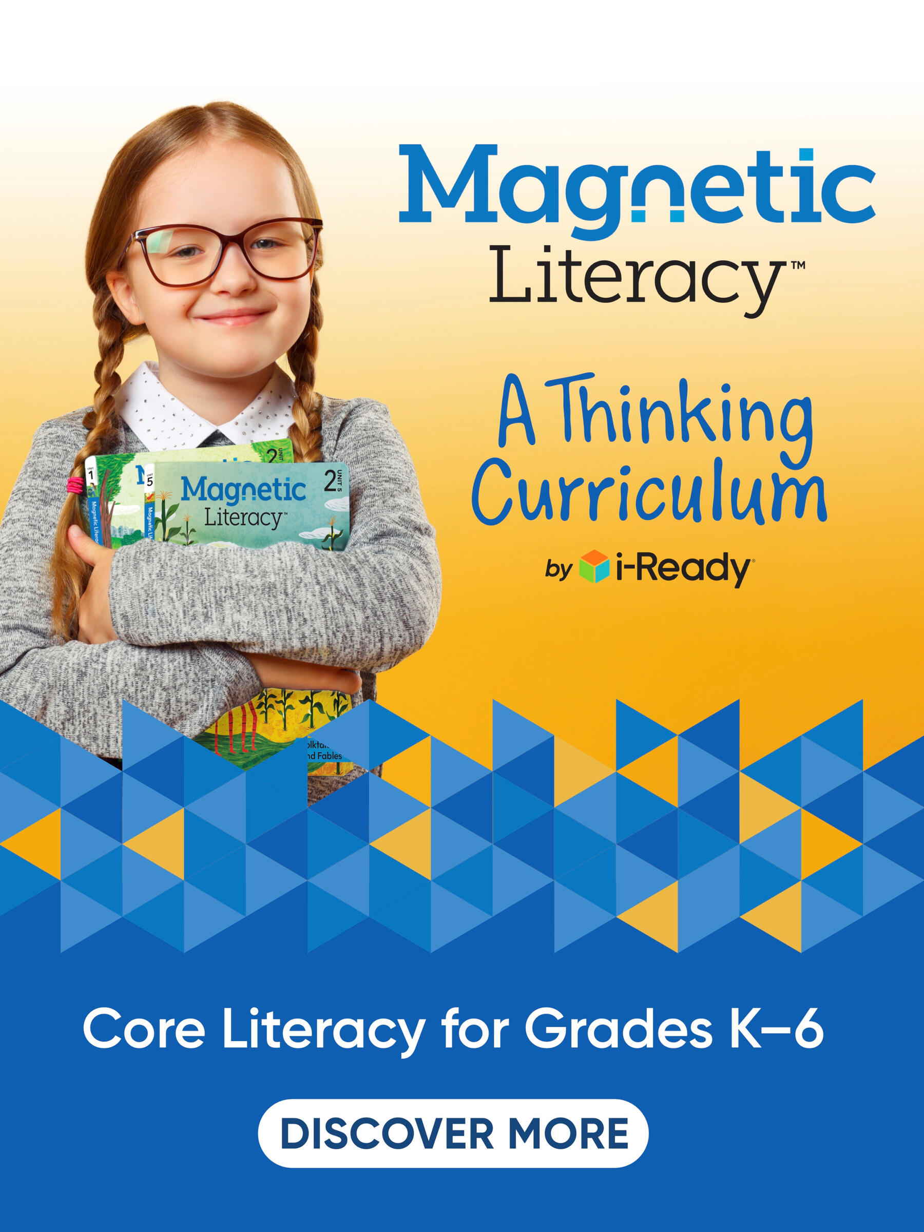
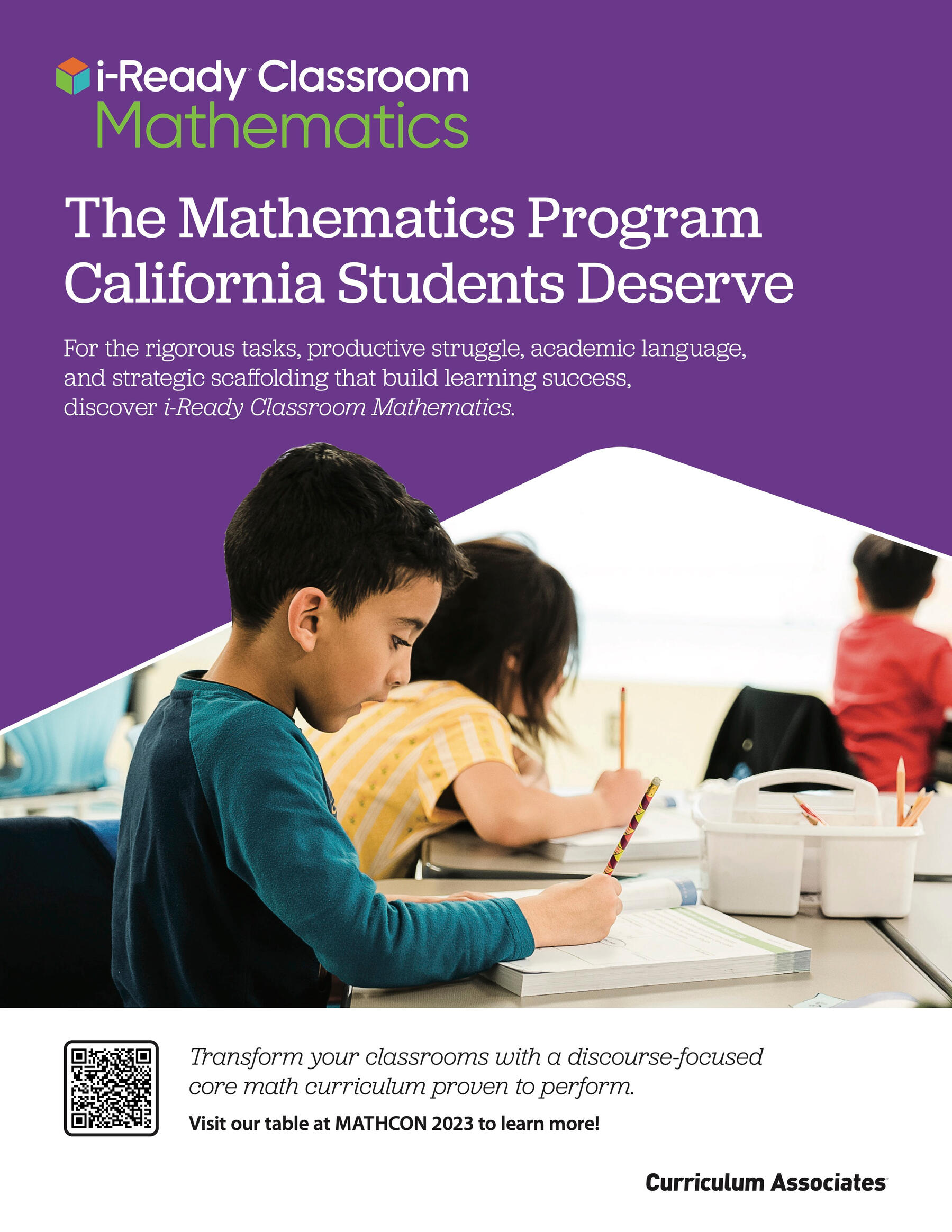
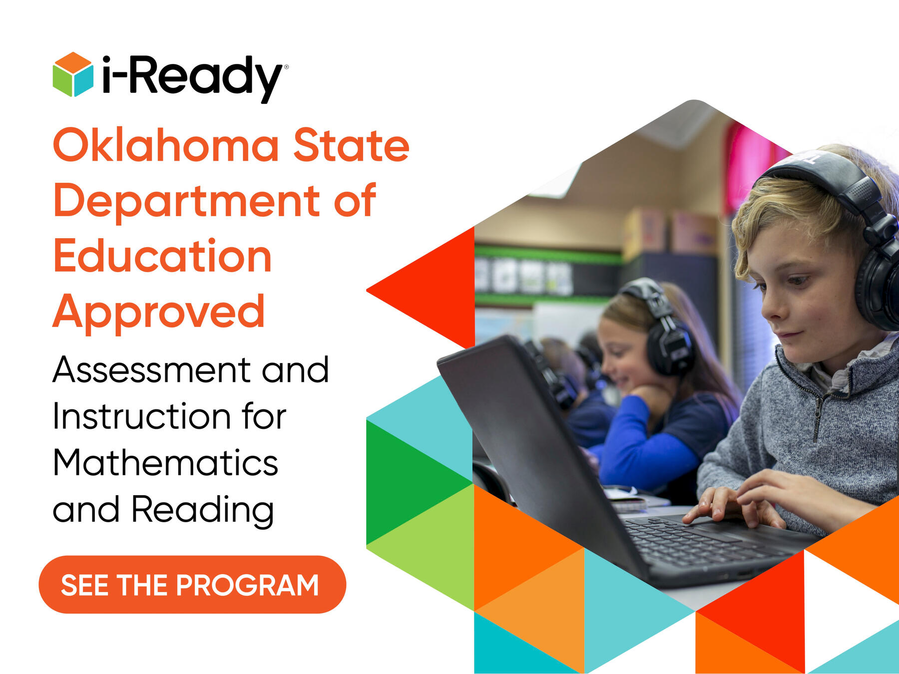
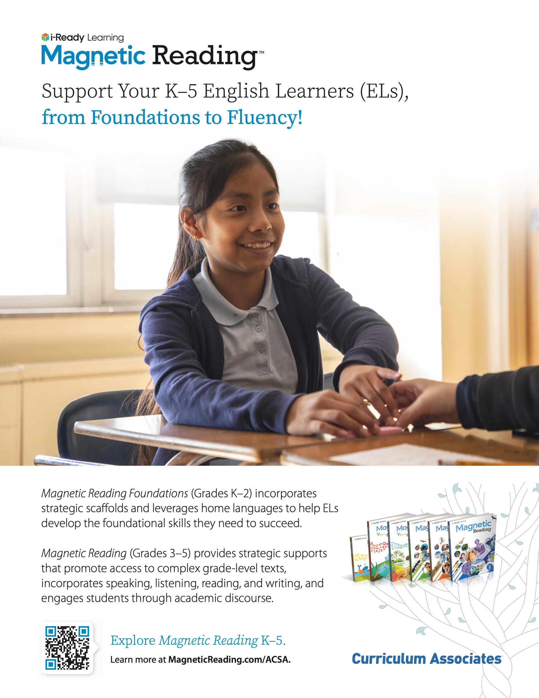
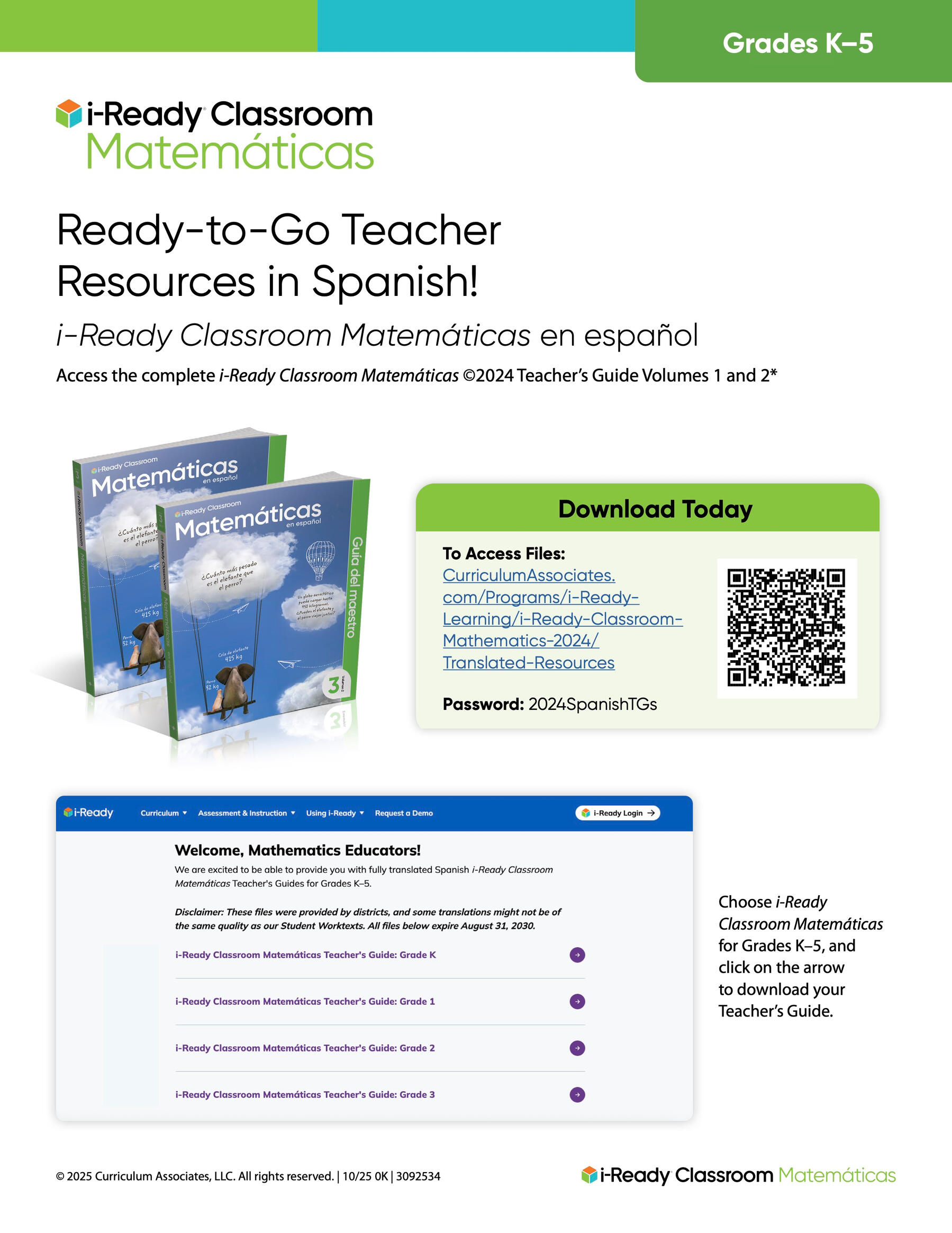
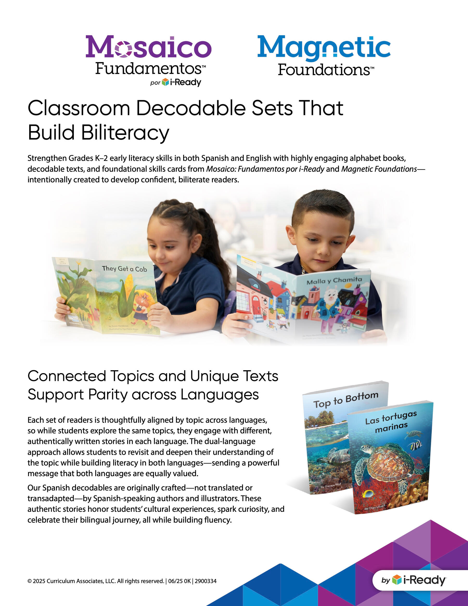
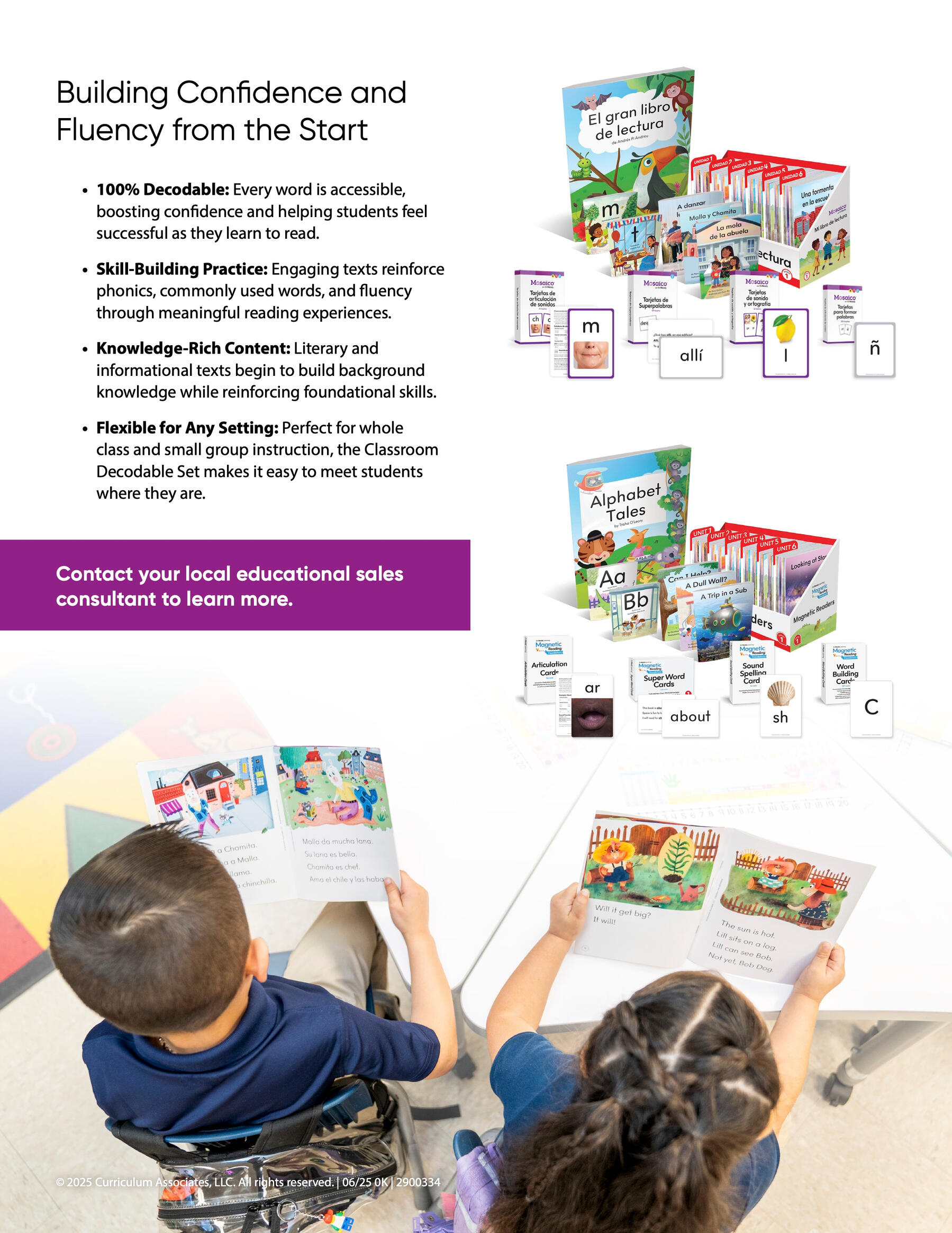
Curriculum Associates — Advertisements
In my role as Marketing Designer, one of my concentrations was Advertisements, both print and digital.
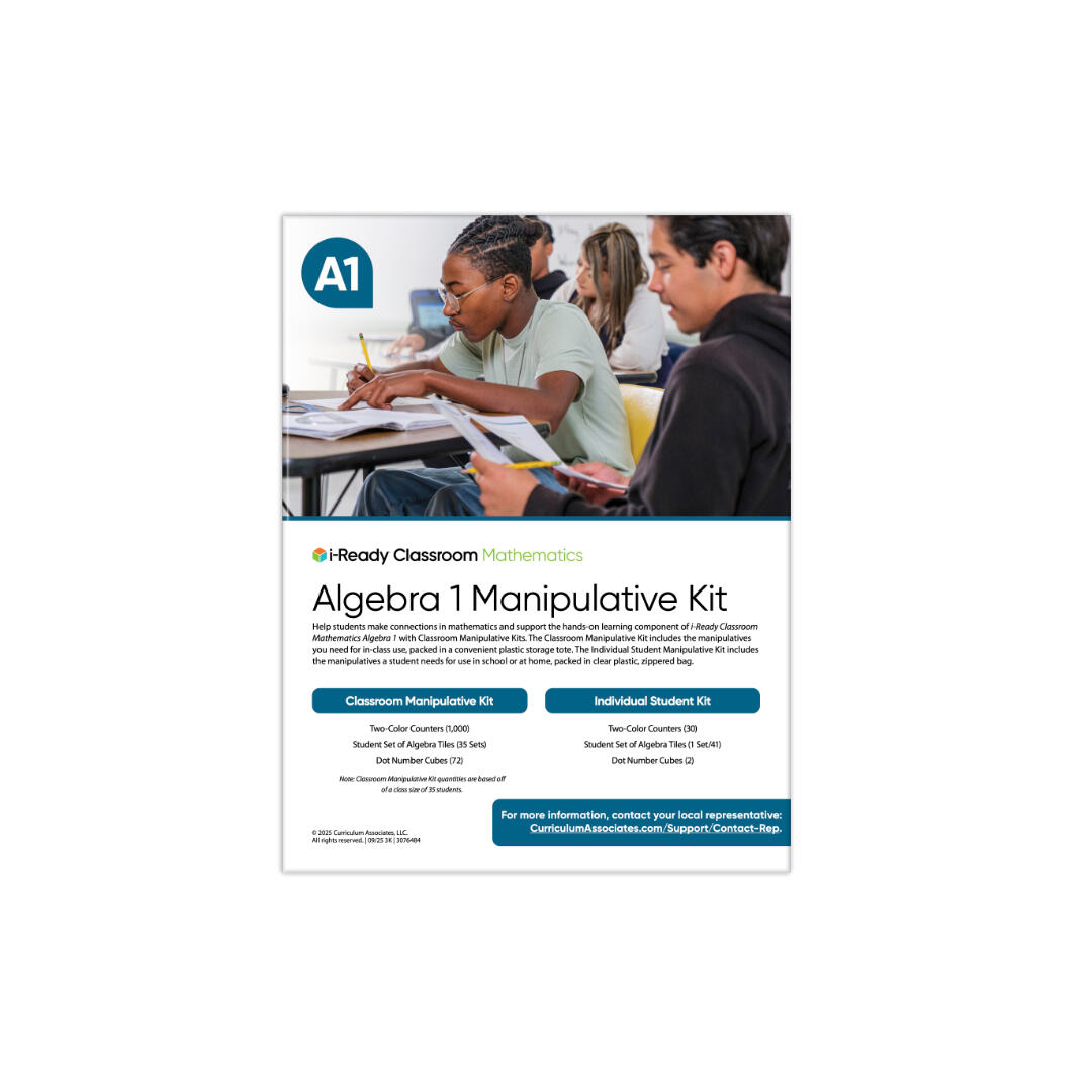
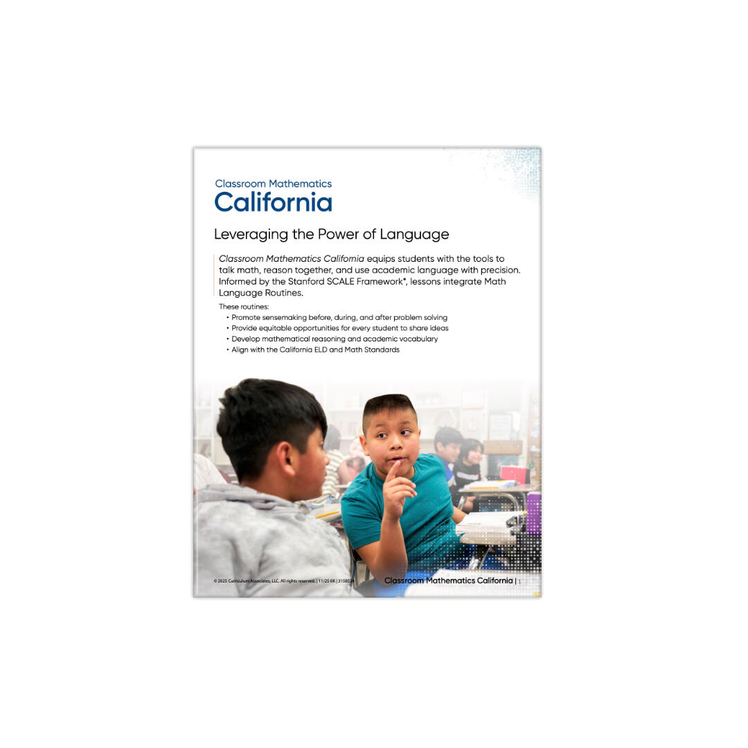
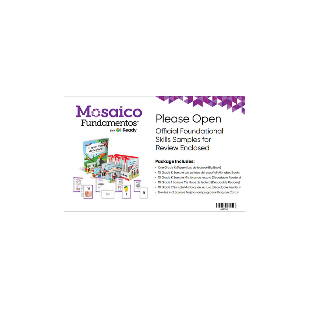
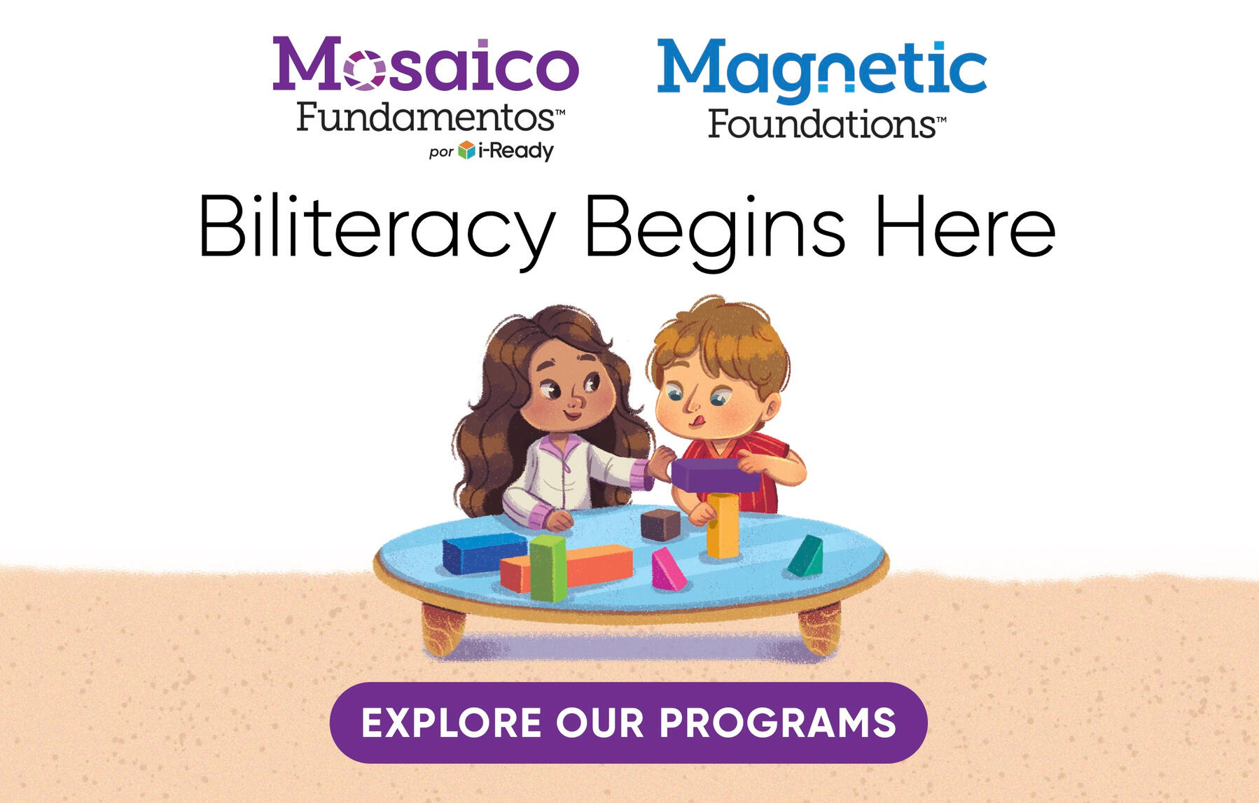
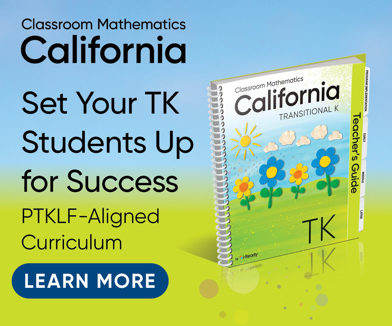
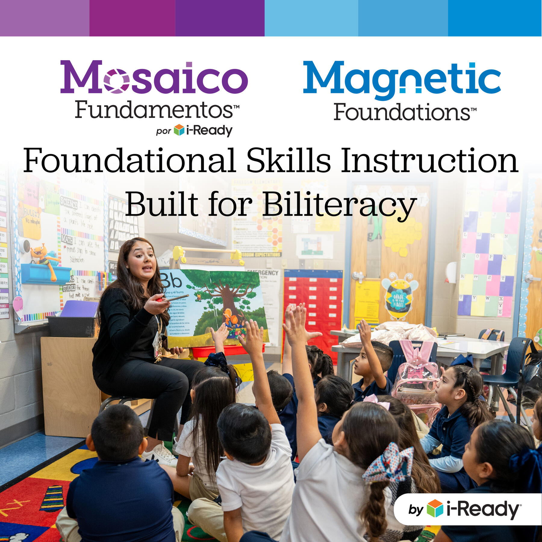
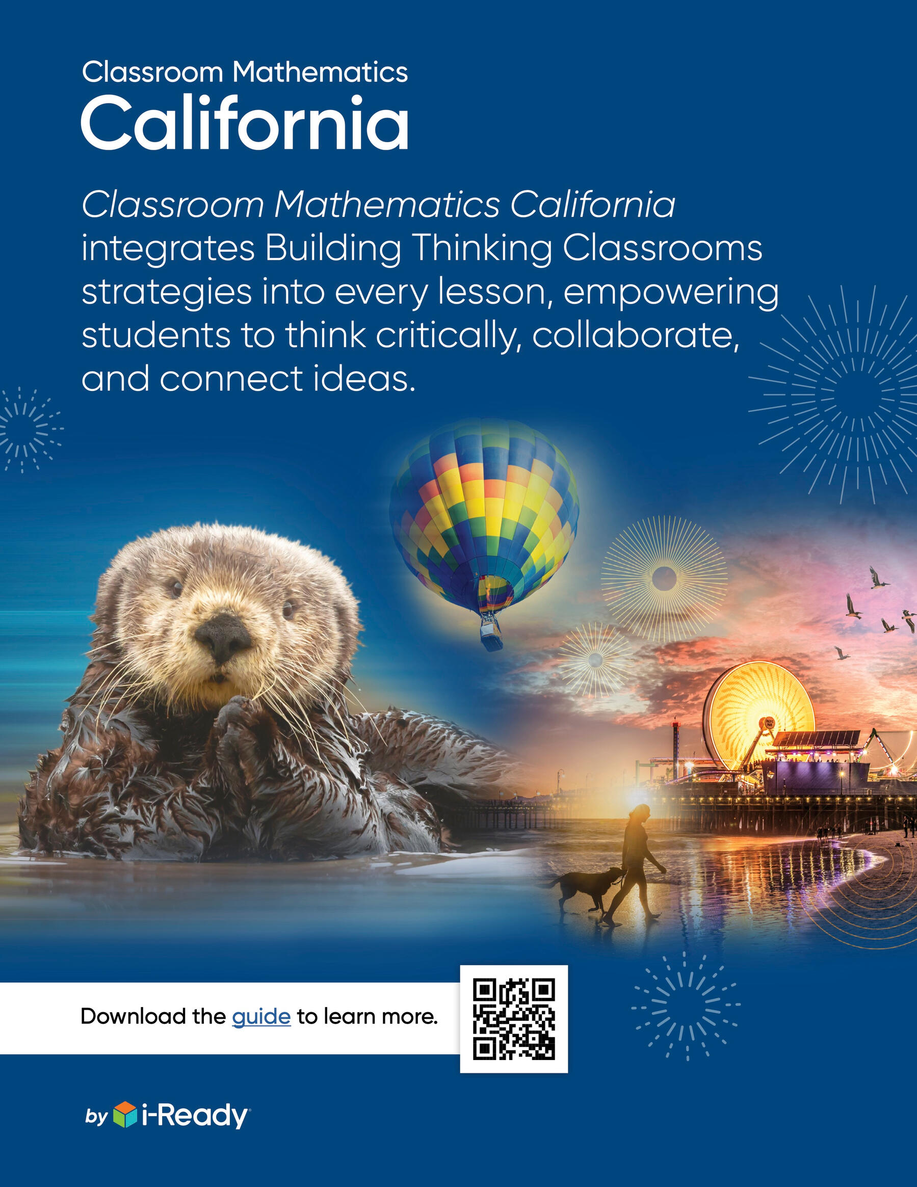
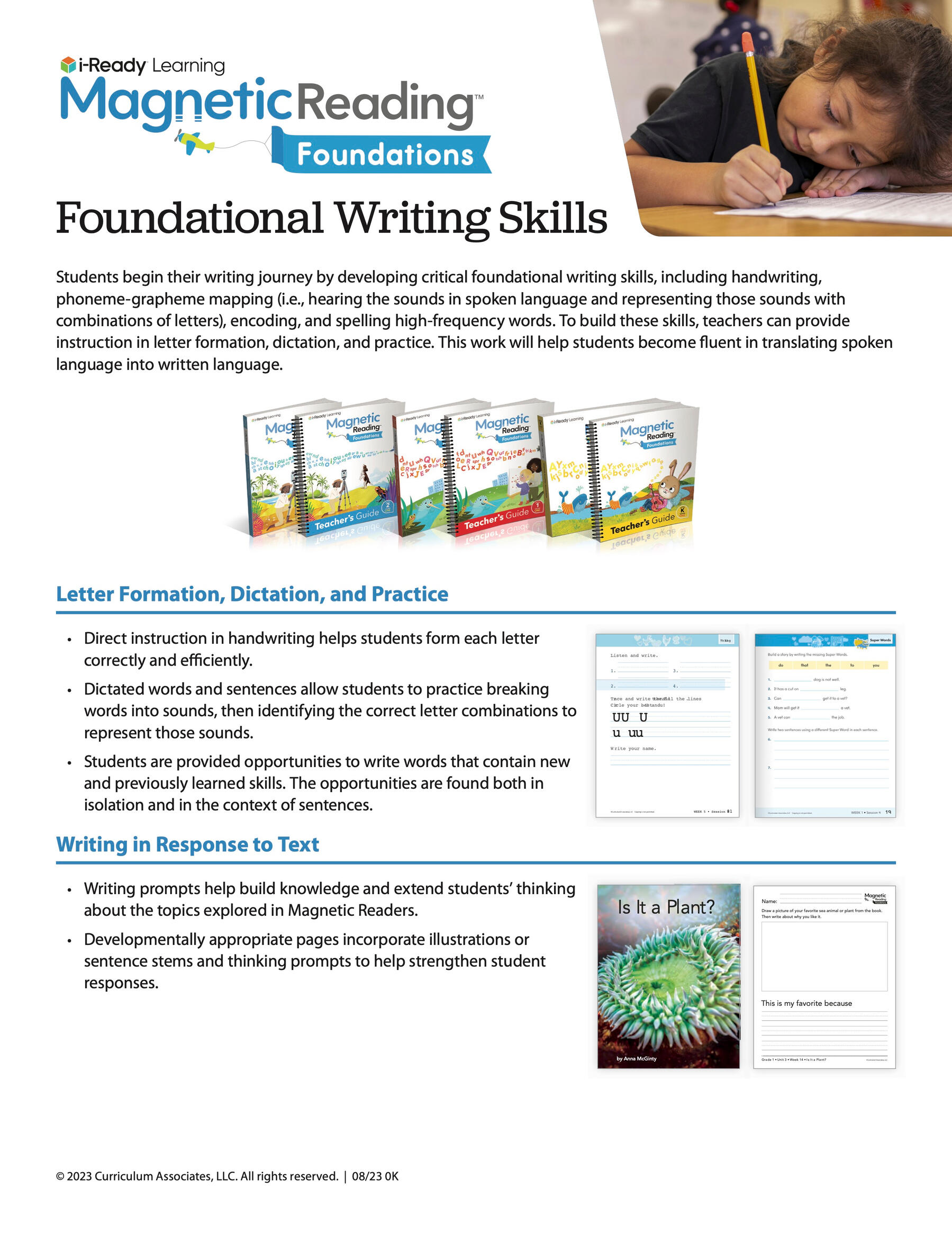
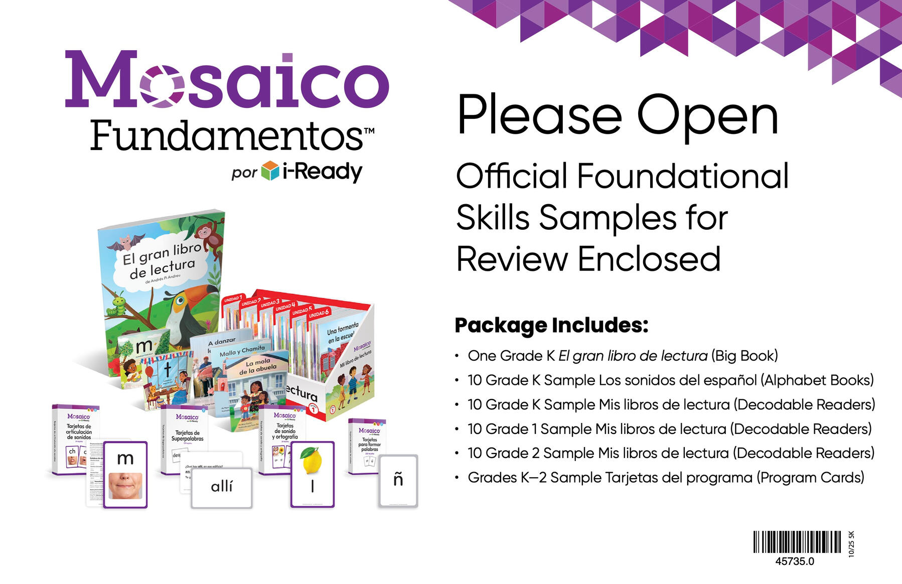
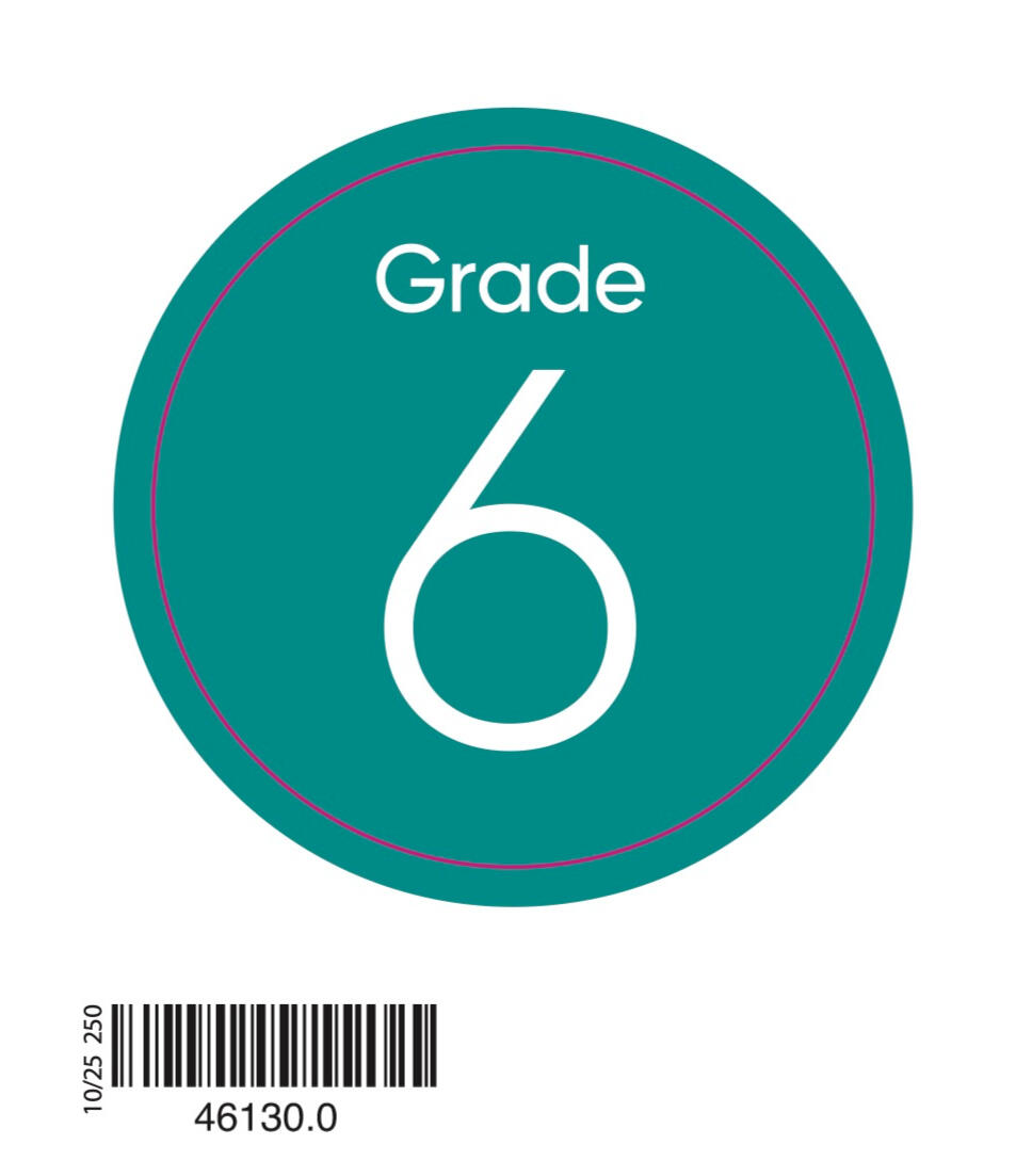
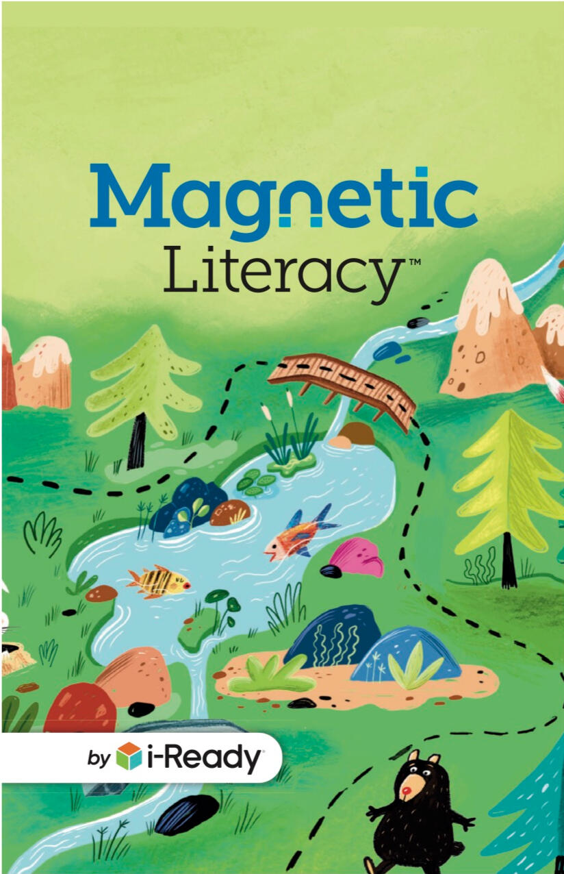
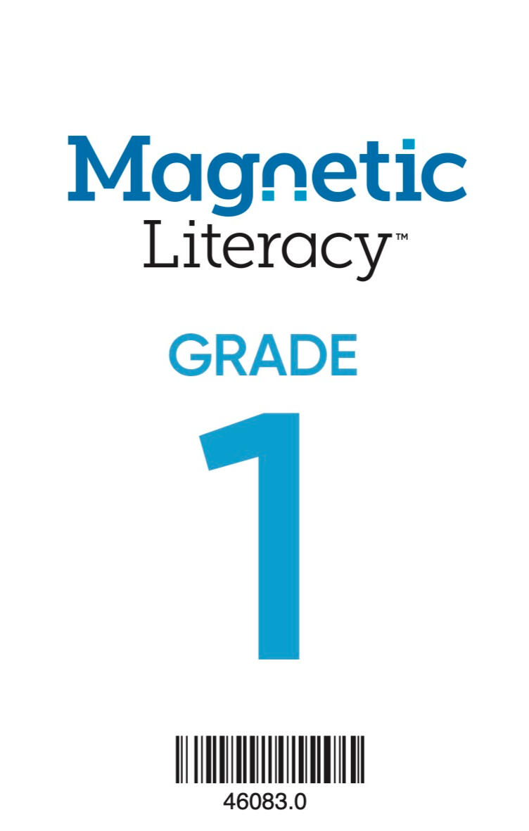
I worked on national and regional campaigns, including new product launches like Mosaico: Fundamentos and Magnetic Literacy.


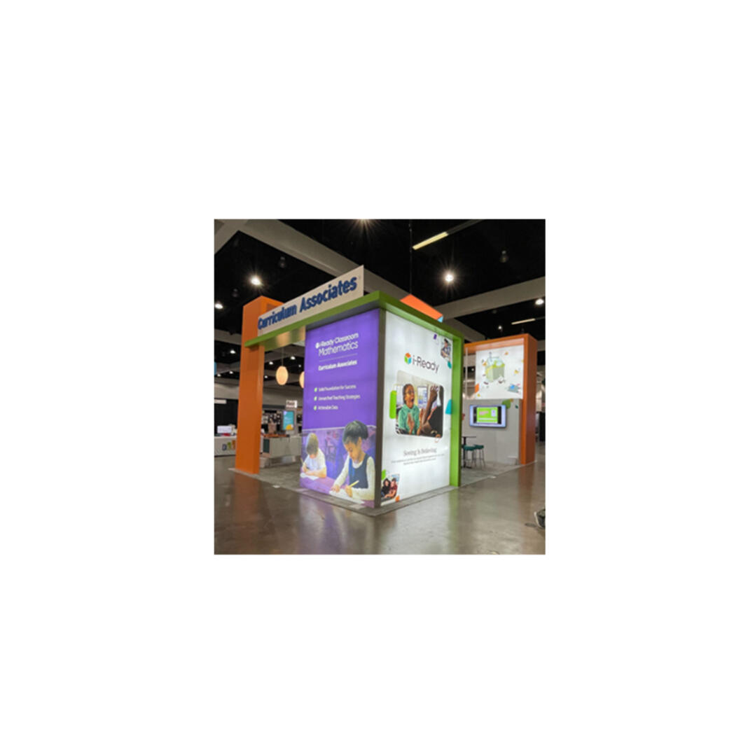
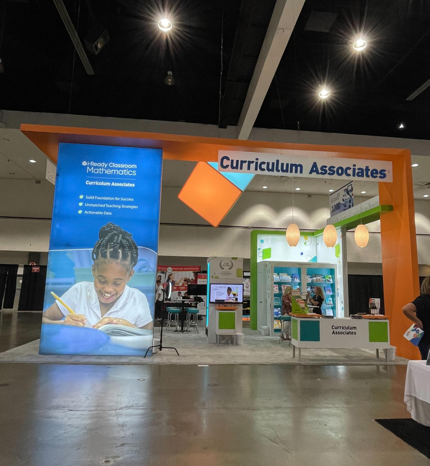
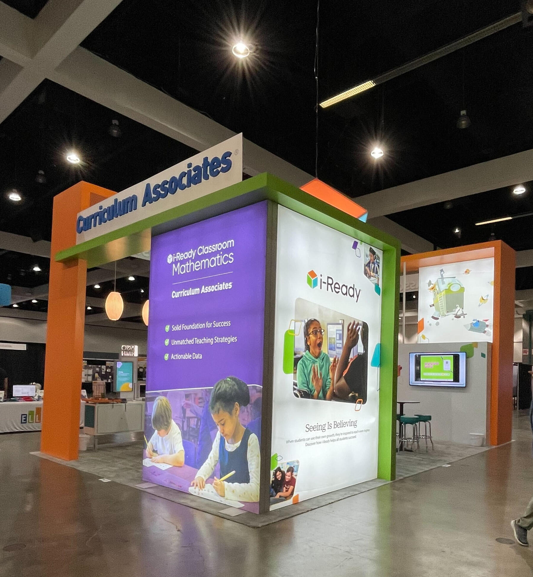
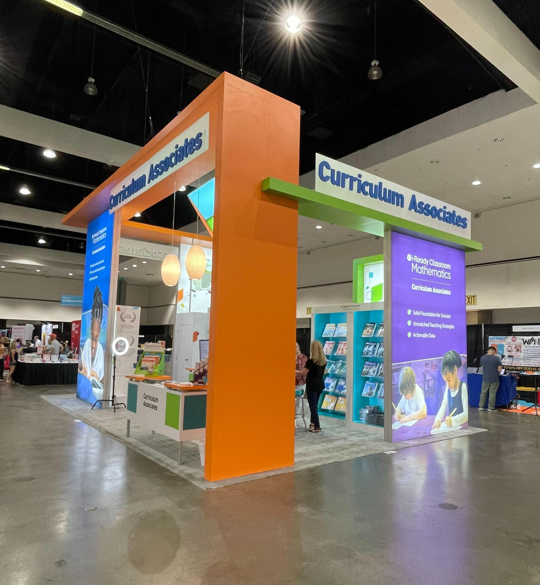
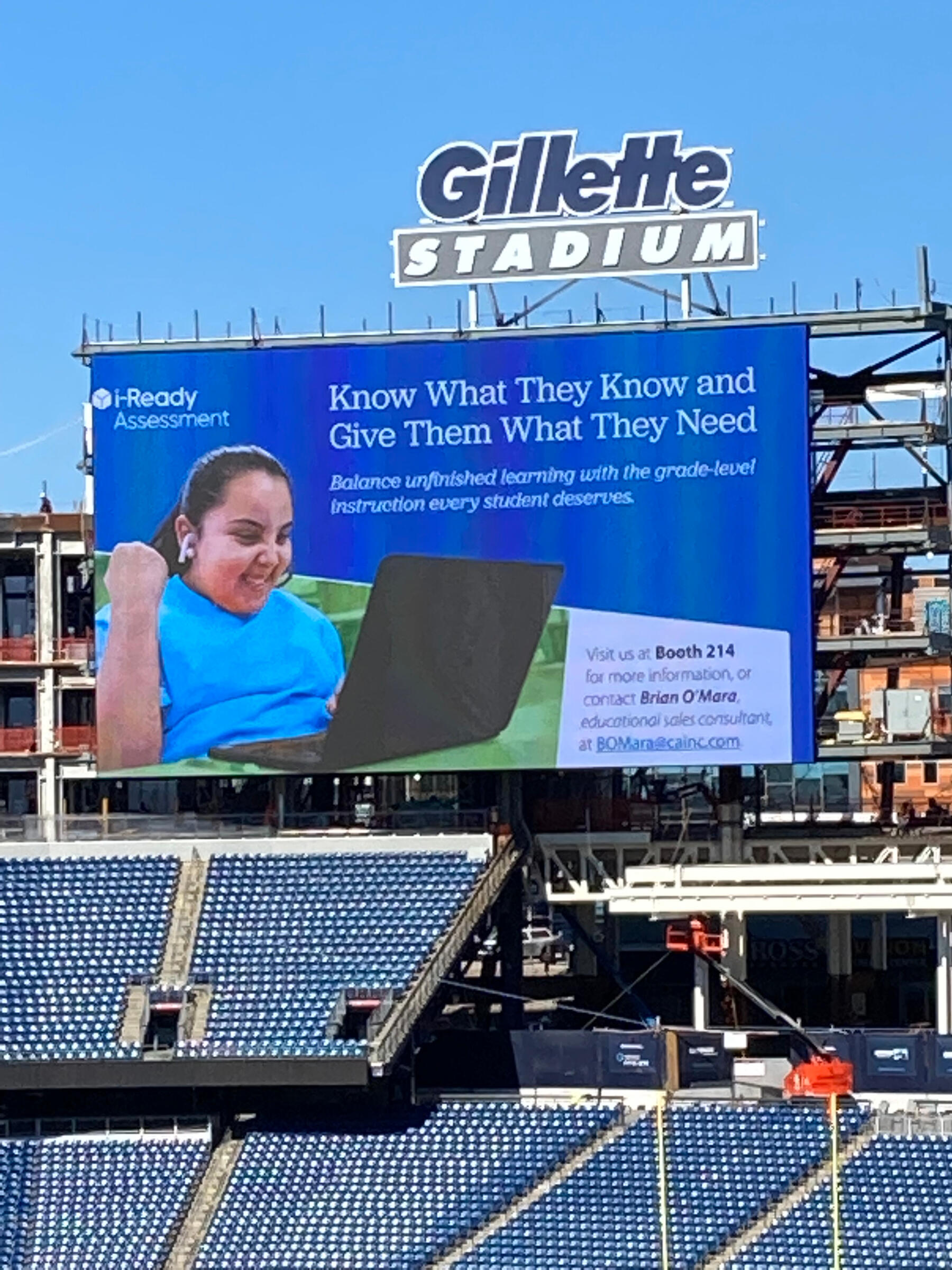
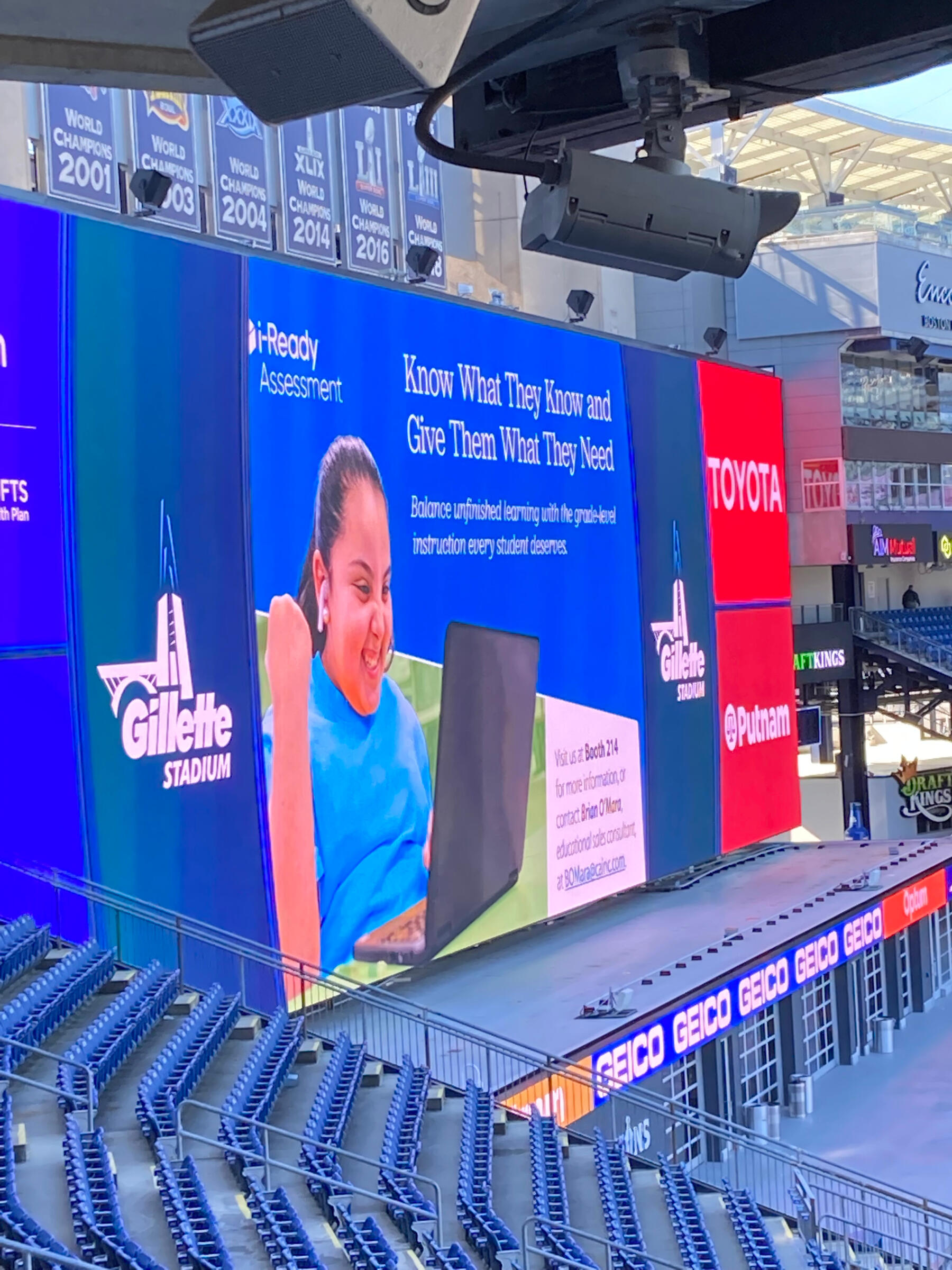
Curriculum Associates — Environmental Graphics
As Marketing Designer, I created large-format booth visuals for Curriculum Associates' presence at industry conferences and trade shows across the country. I also designed a billboard displayed at Gillette Stadium in Foxborough, MA
Curriculum Associates — Flyers
Curriculum Associates is present in all 50 states, which means flyers play a key role in communicating with our audience. I designed print and digital flyers across multiple sub-brands, maintaining brand consistency while adapting messaging for regional markets and targeted campaigns.
Curriculum Associates — Brochures
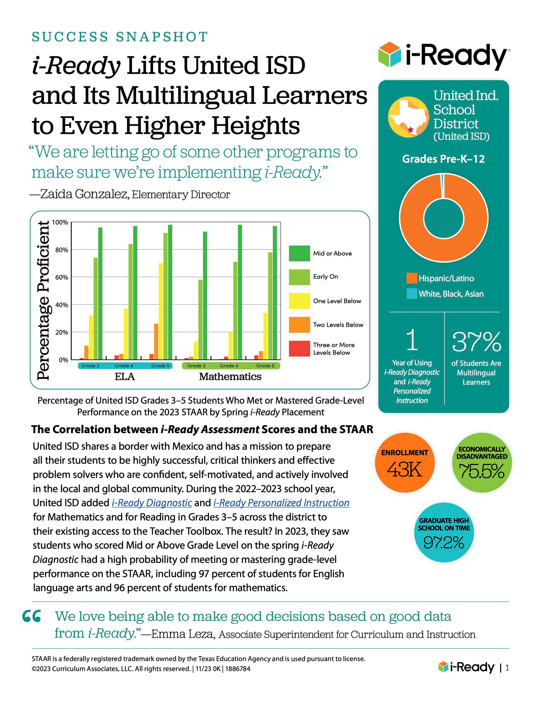
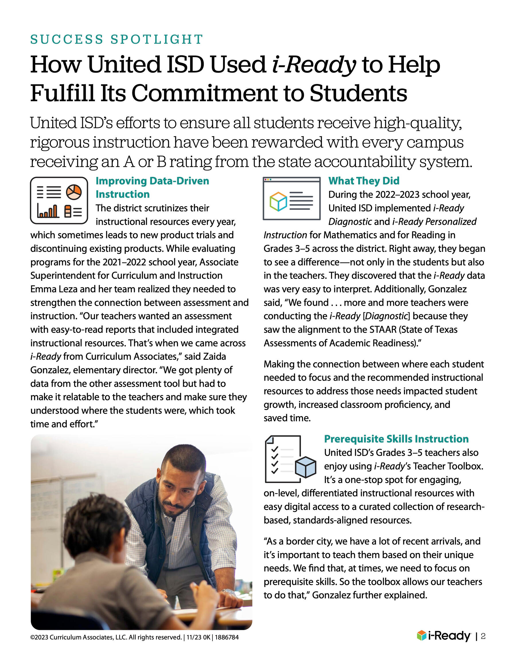
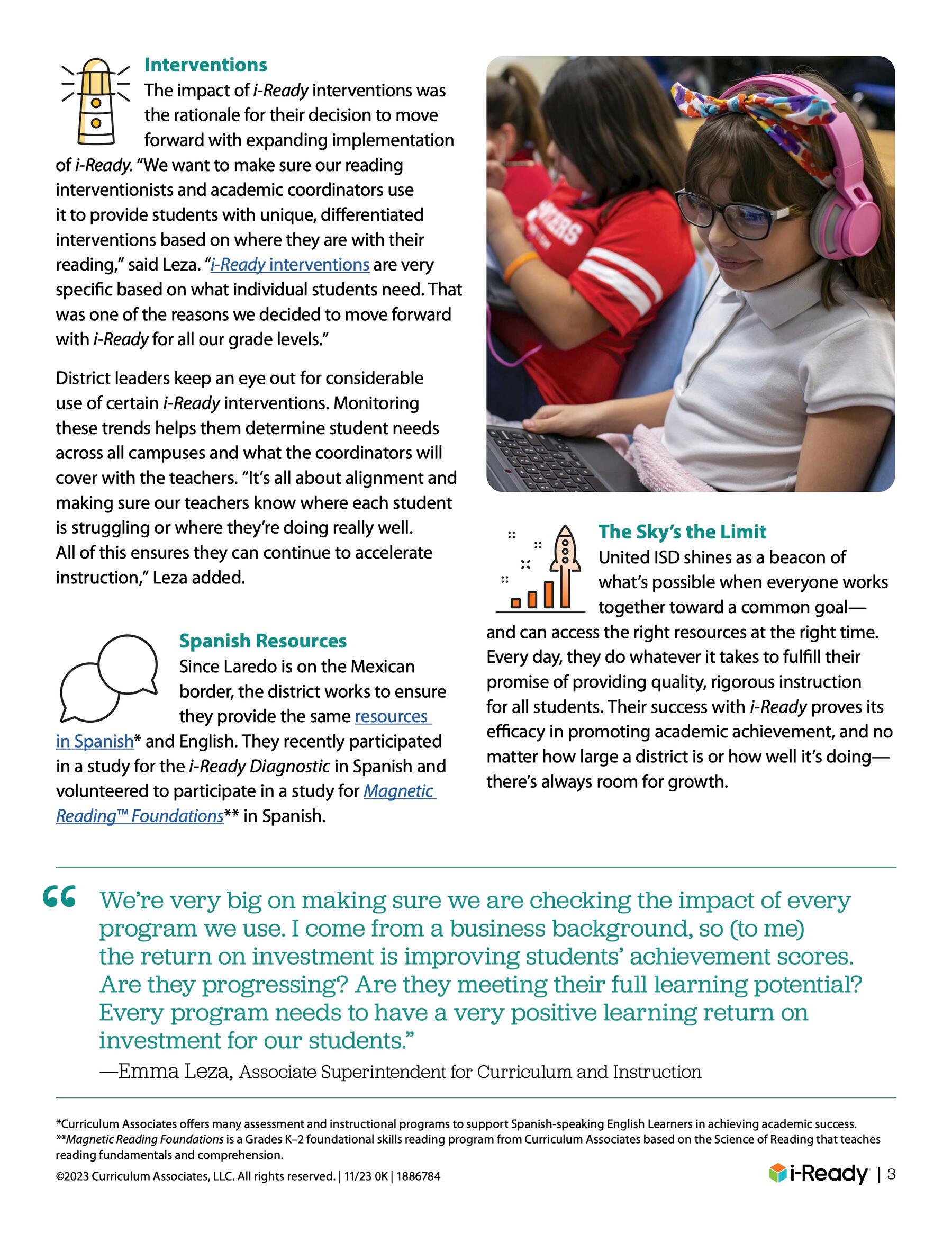
Curriculum Associates is an education technology company that provides more than 13 million K-12 students nationwide with personalized learning materials to prepare them for success.I had the opportunity to work on a range of visuals: corporate brand guidelines, social media, Gillette Stadium billboards, case studies, brochures, booklets, e-books, logos, research papers, and animations.

Curriculum Associates — Smaller Collateral
Print collateral such as stickers, badges, postcards, shipping labels.
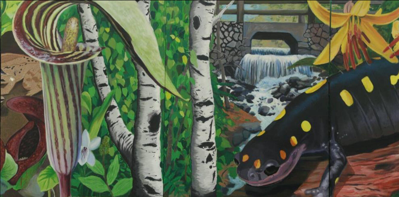
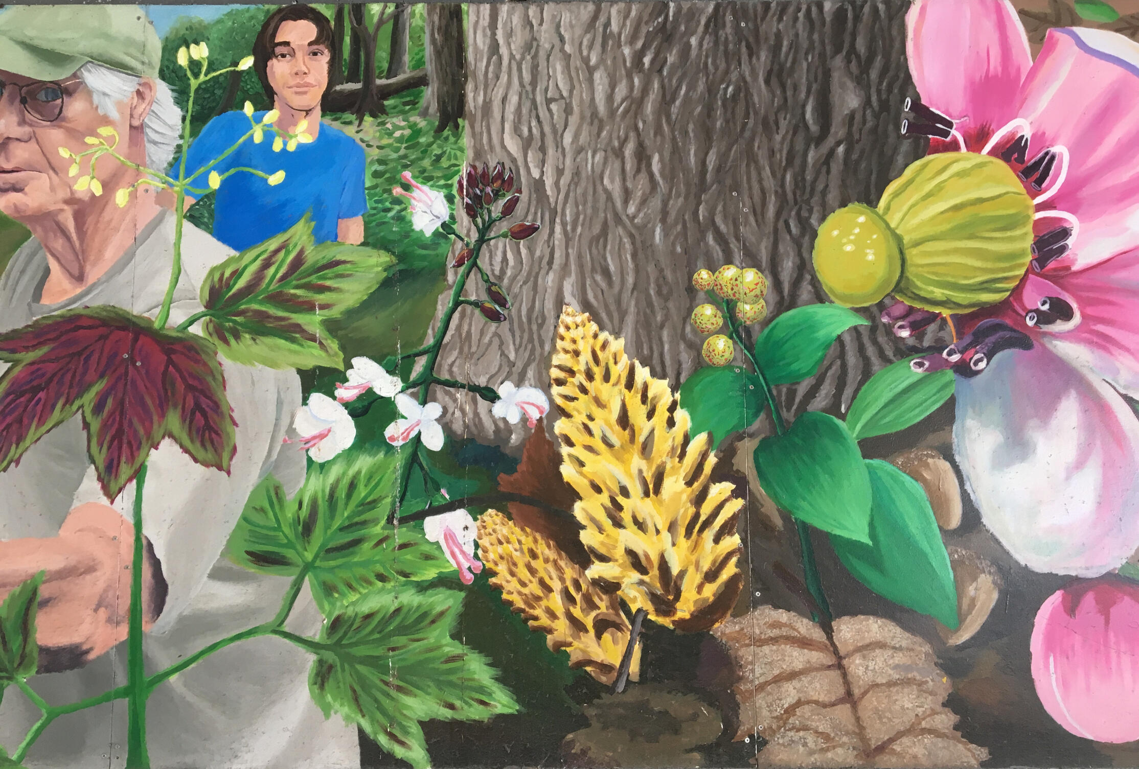
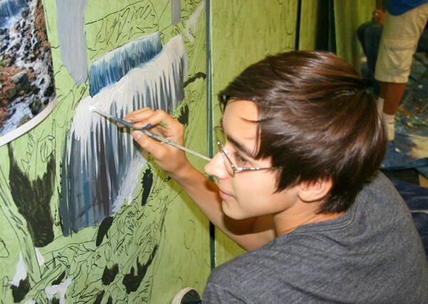
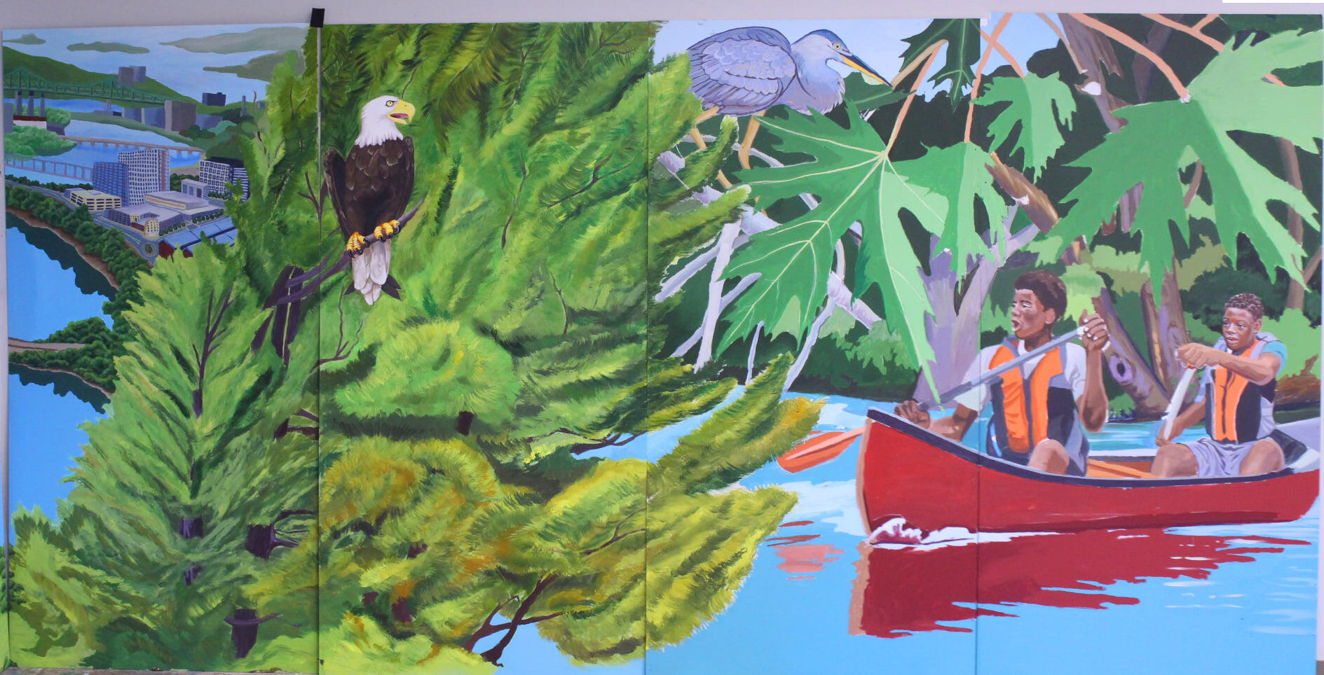
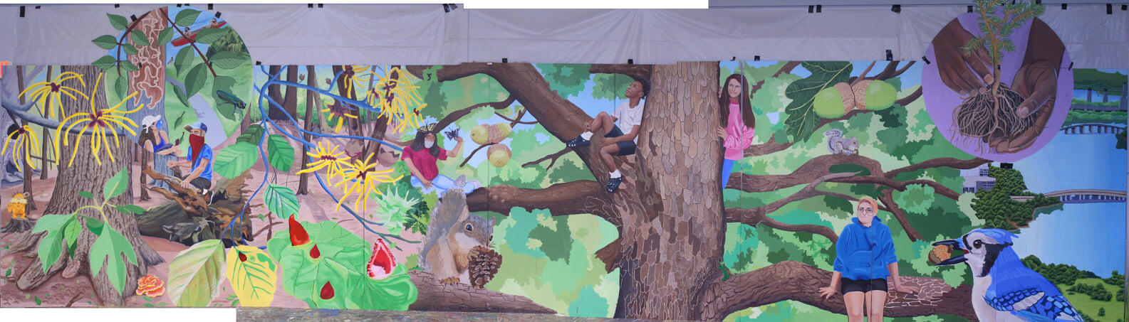
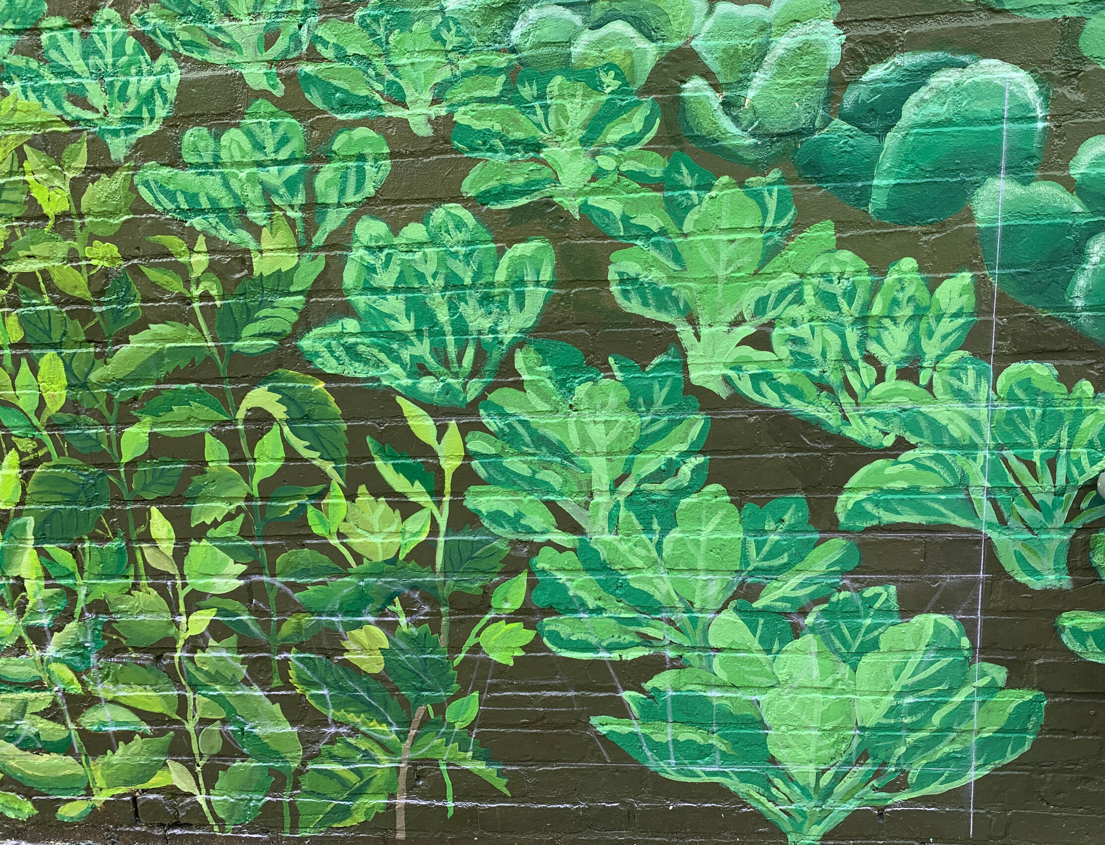
Murals & Paintings
Here are some of my murals.
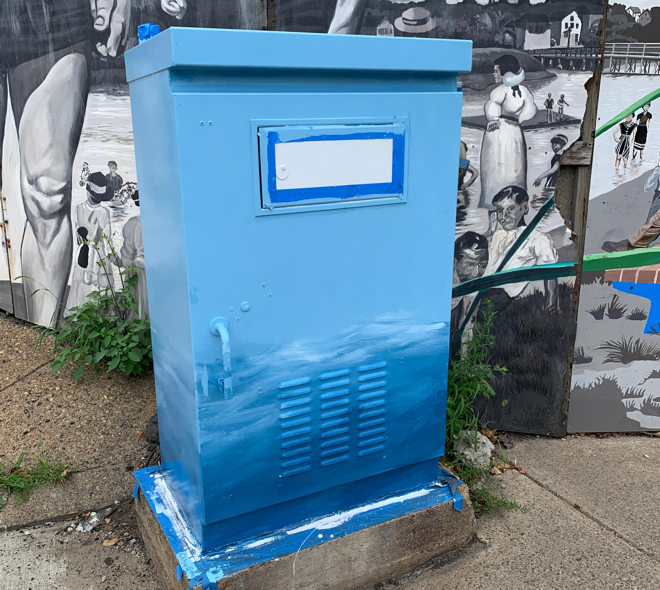
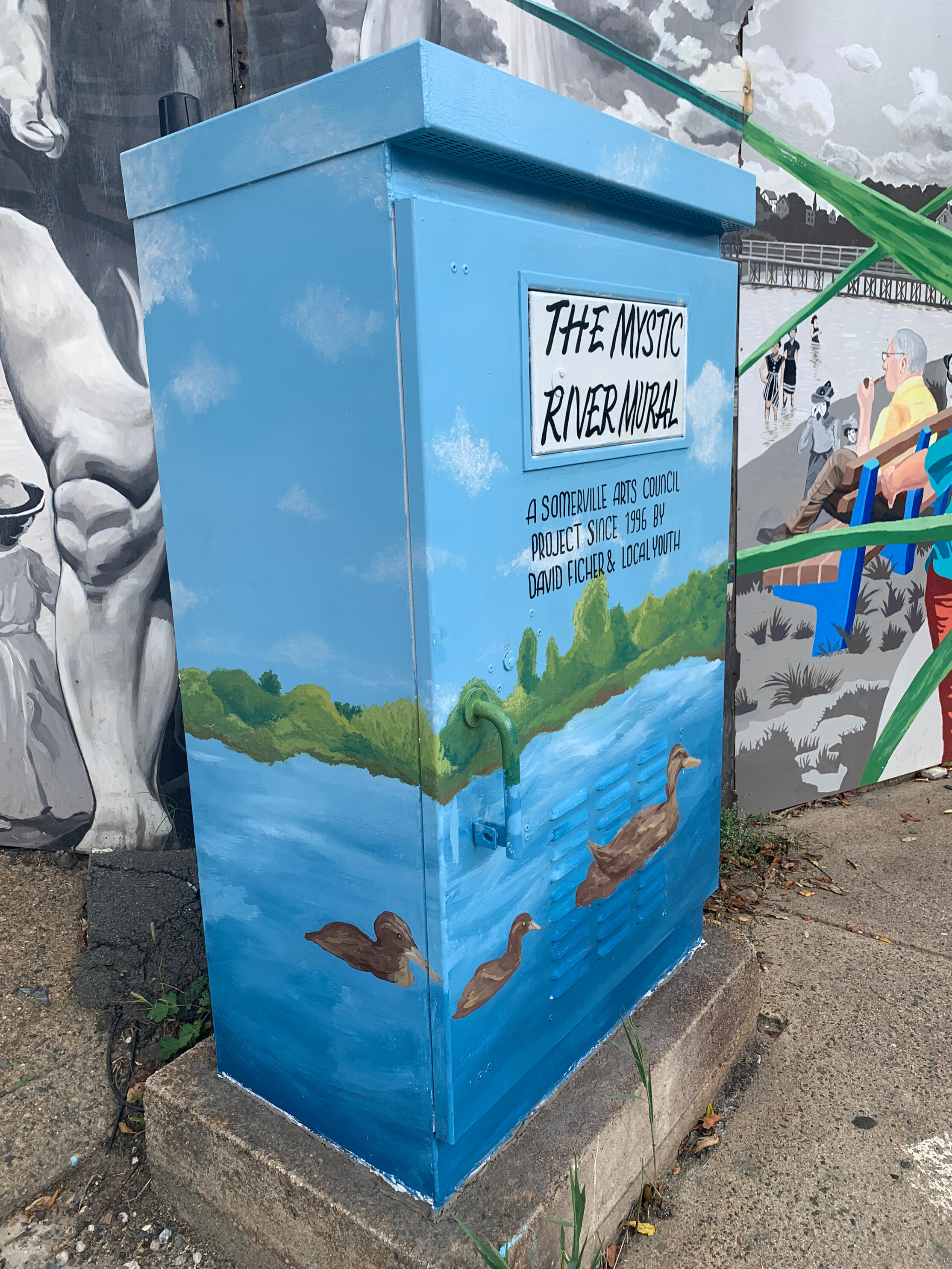
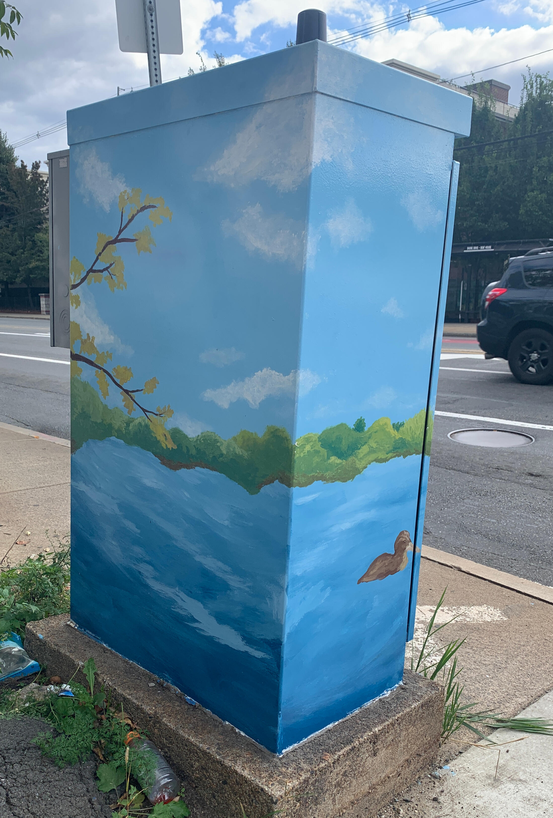
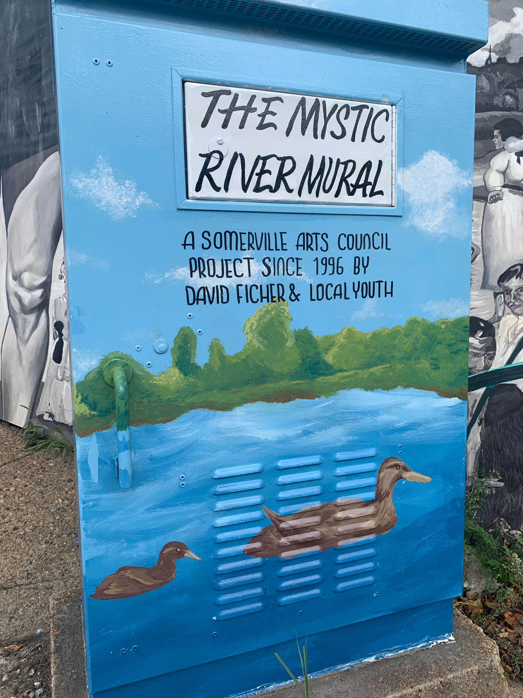
Mystic Mural (2014, 2015, 2020) and Mystic Mural 25th Anniversary Lightbox (2022) via Gregory Jenkins, David Fichter and the City of Somerville Arts Council. I was responsible for sections of the mural and designed the Lightbox.
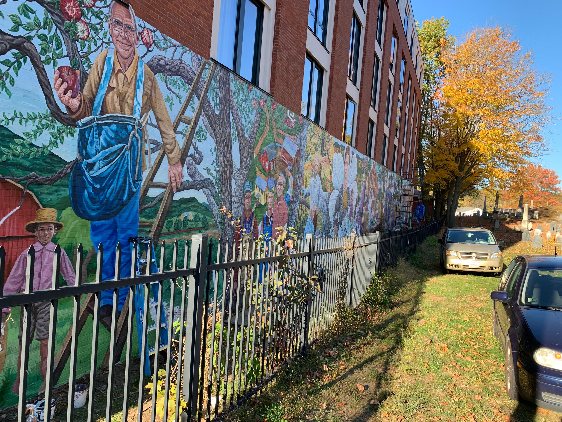
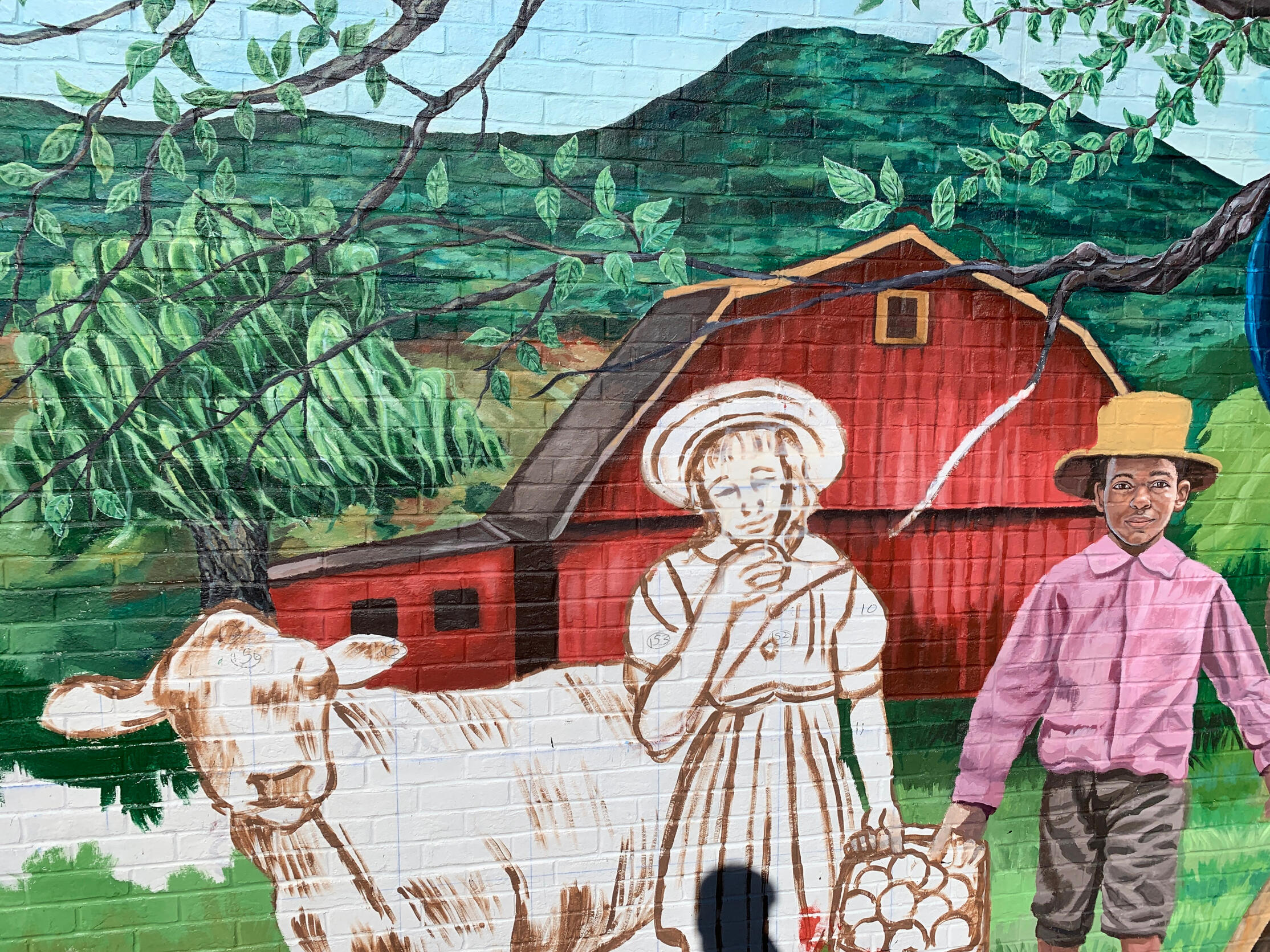
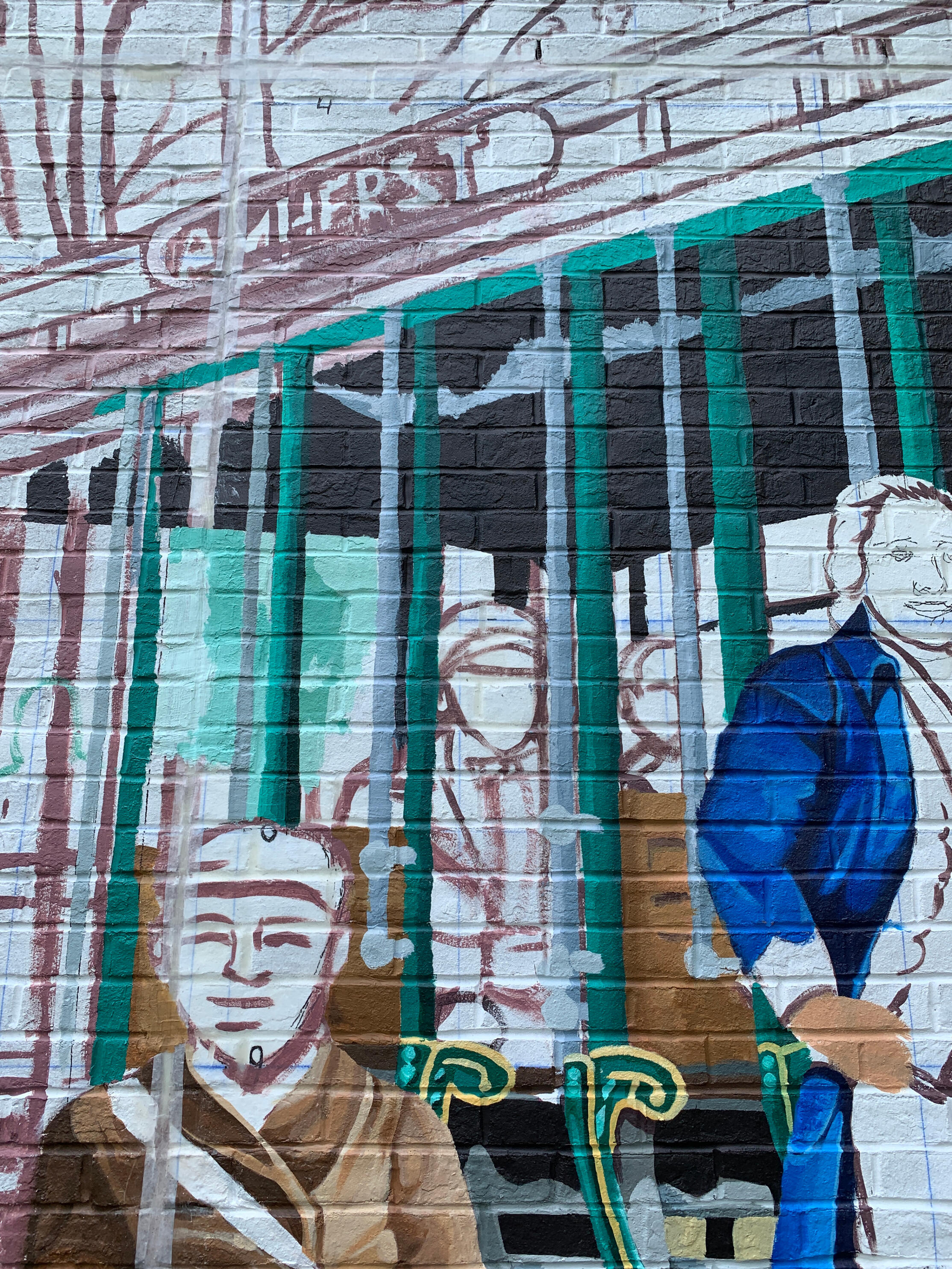
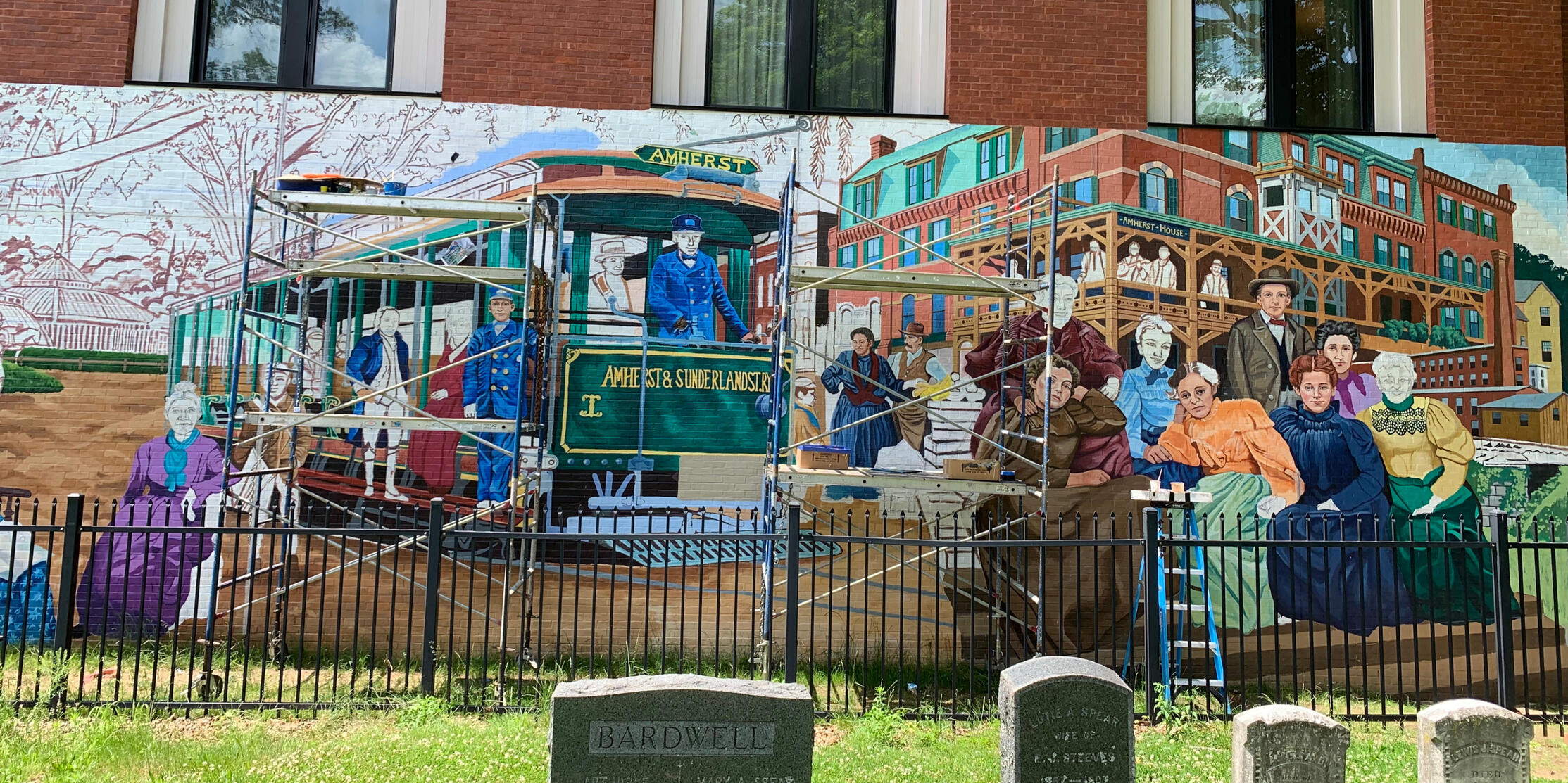
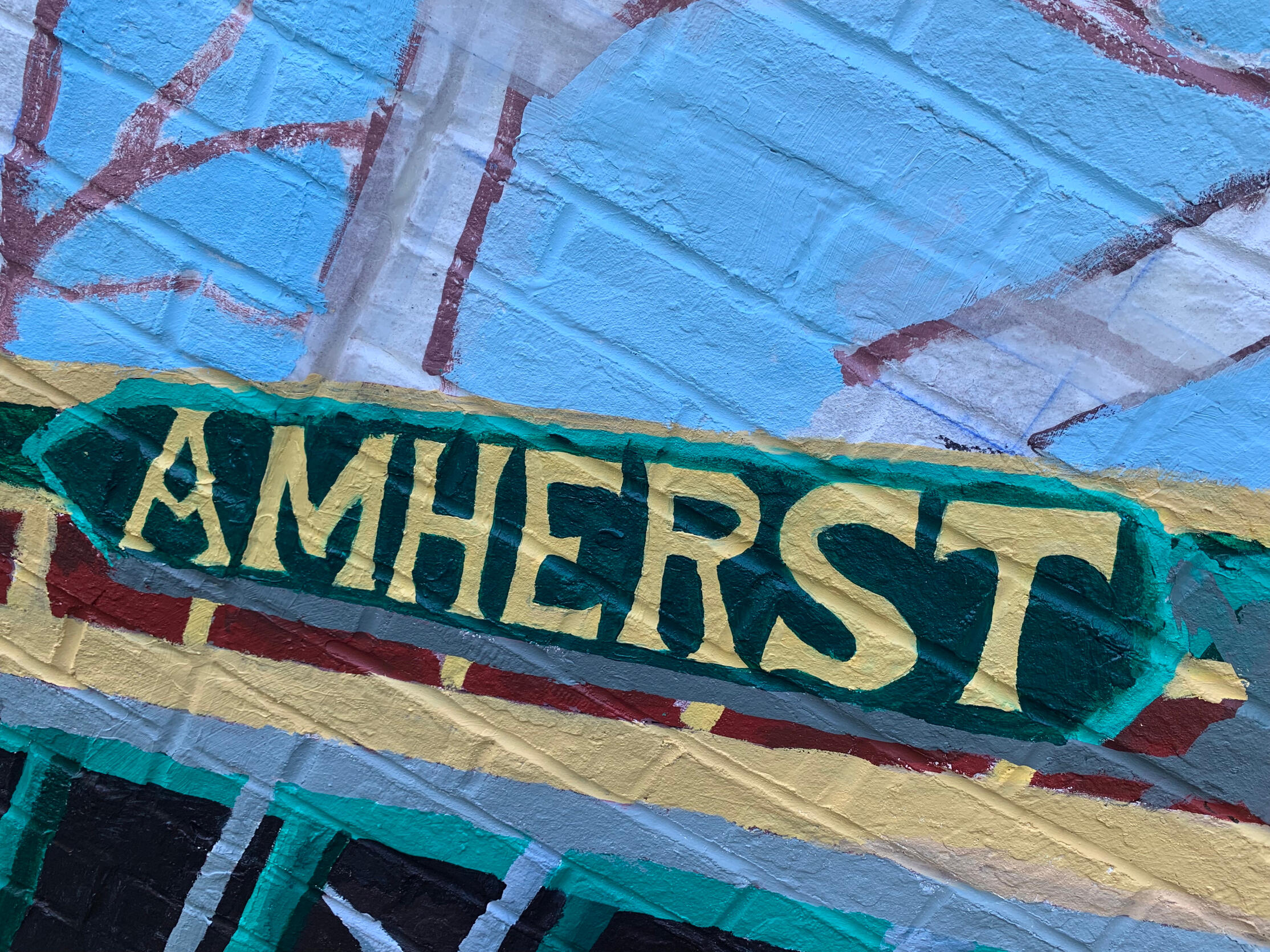
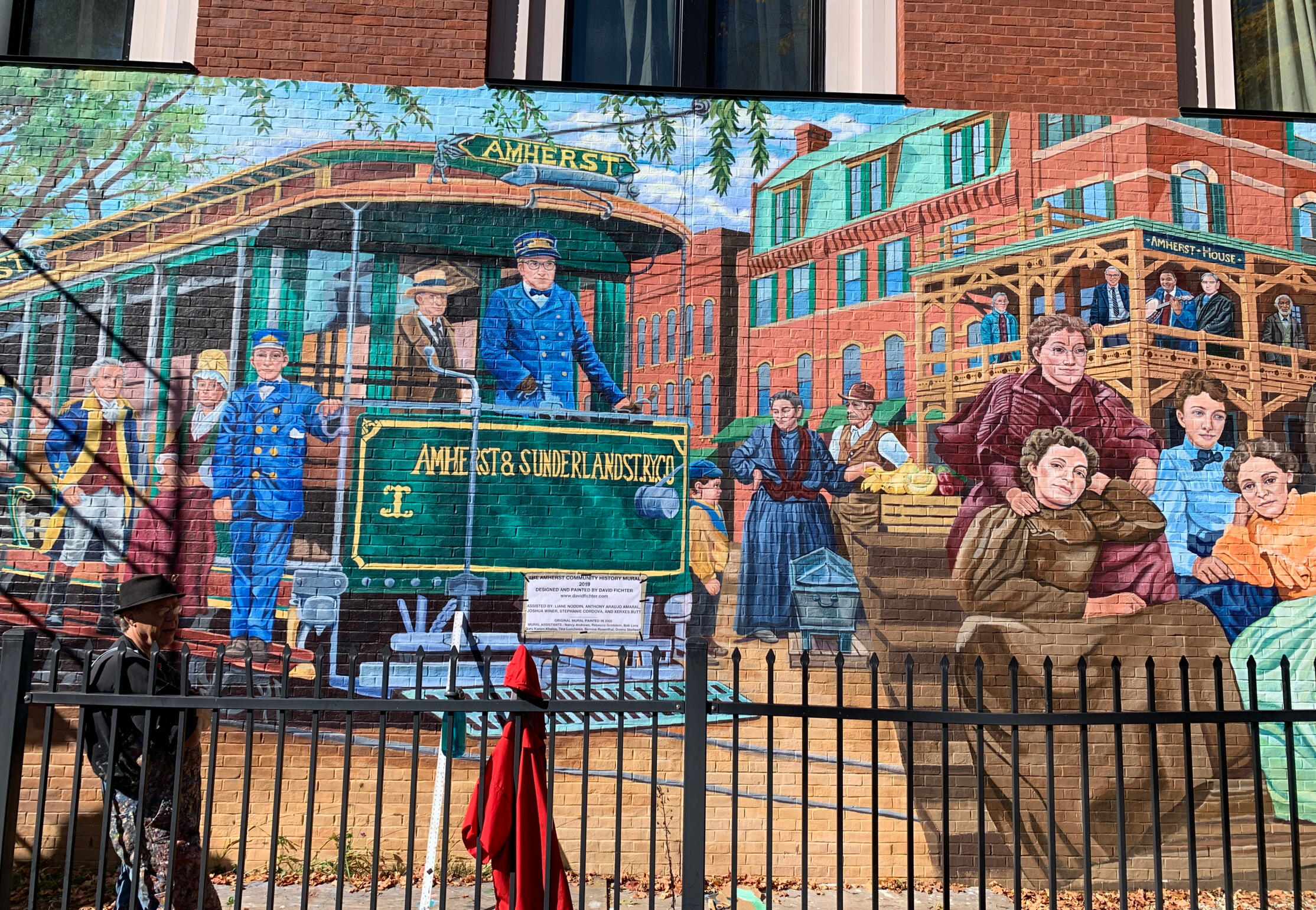
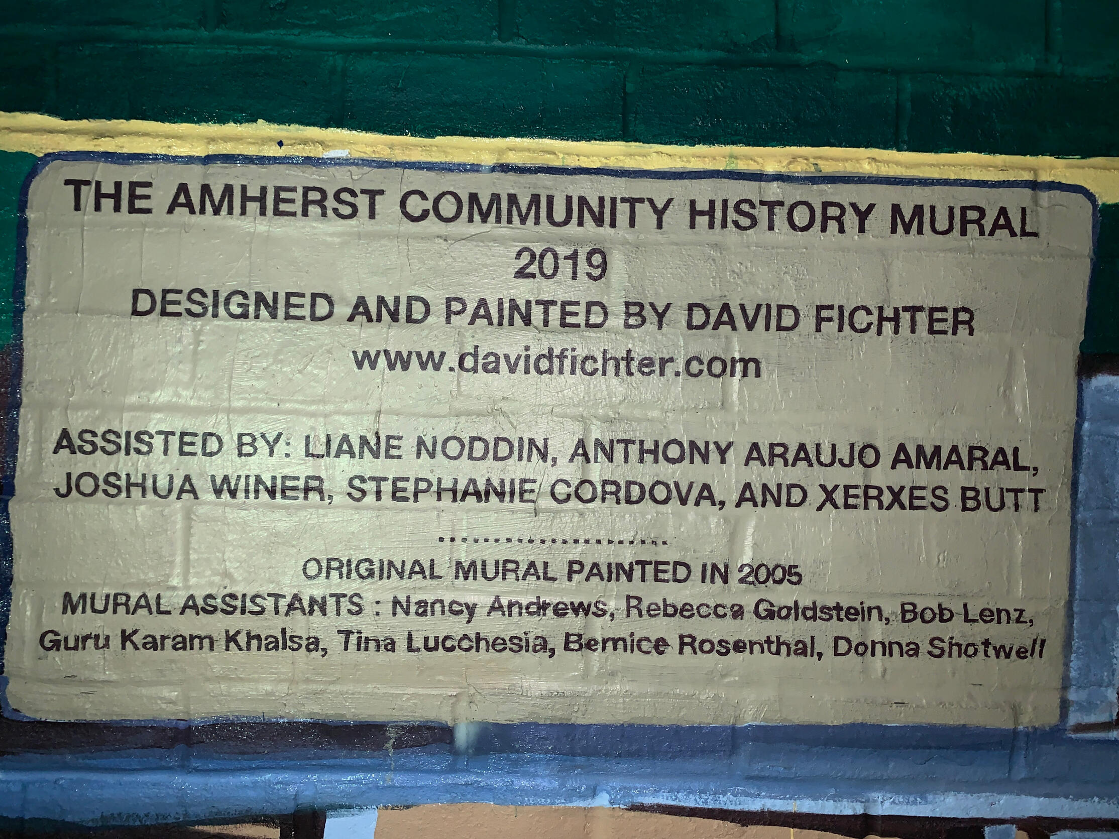
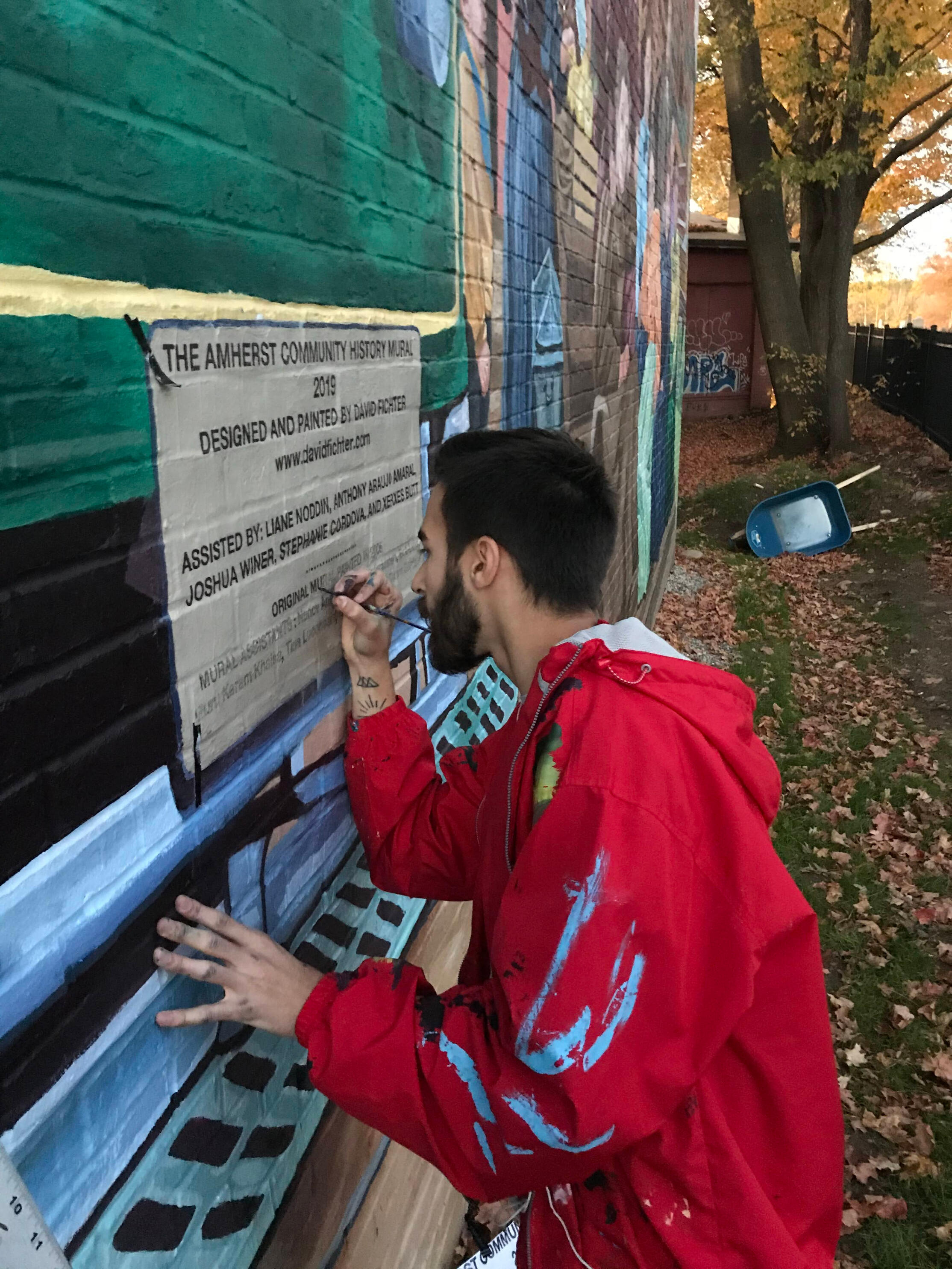
Amherst Community Mural
The original was painted in 2005 but due to new construction, it was repainted in 2019 and David Fichter invited me to work for him on this project. Amherst was home to Emily Dickinson and Robert Frost, both depicted in the mural, as well as various Civil War veterans. I was responsible for executing the trolley, the barn, a handful of figures and background elements, and the lettering on the acknowledgments sign.2019
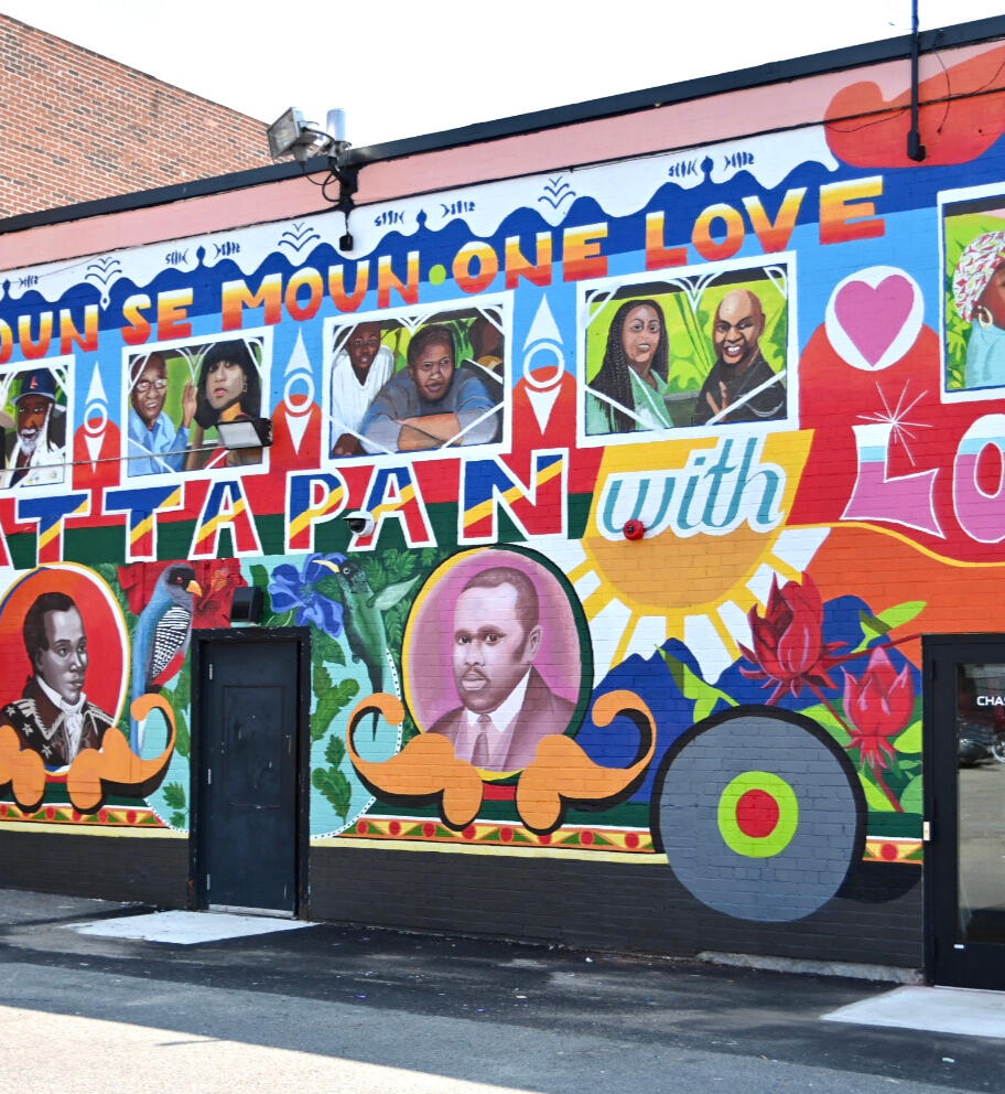
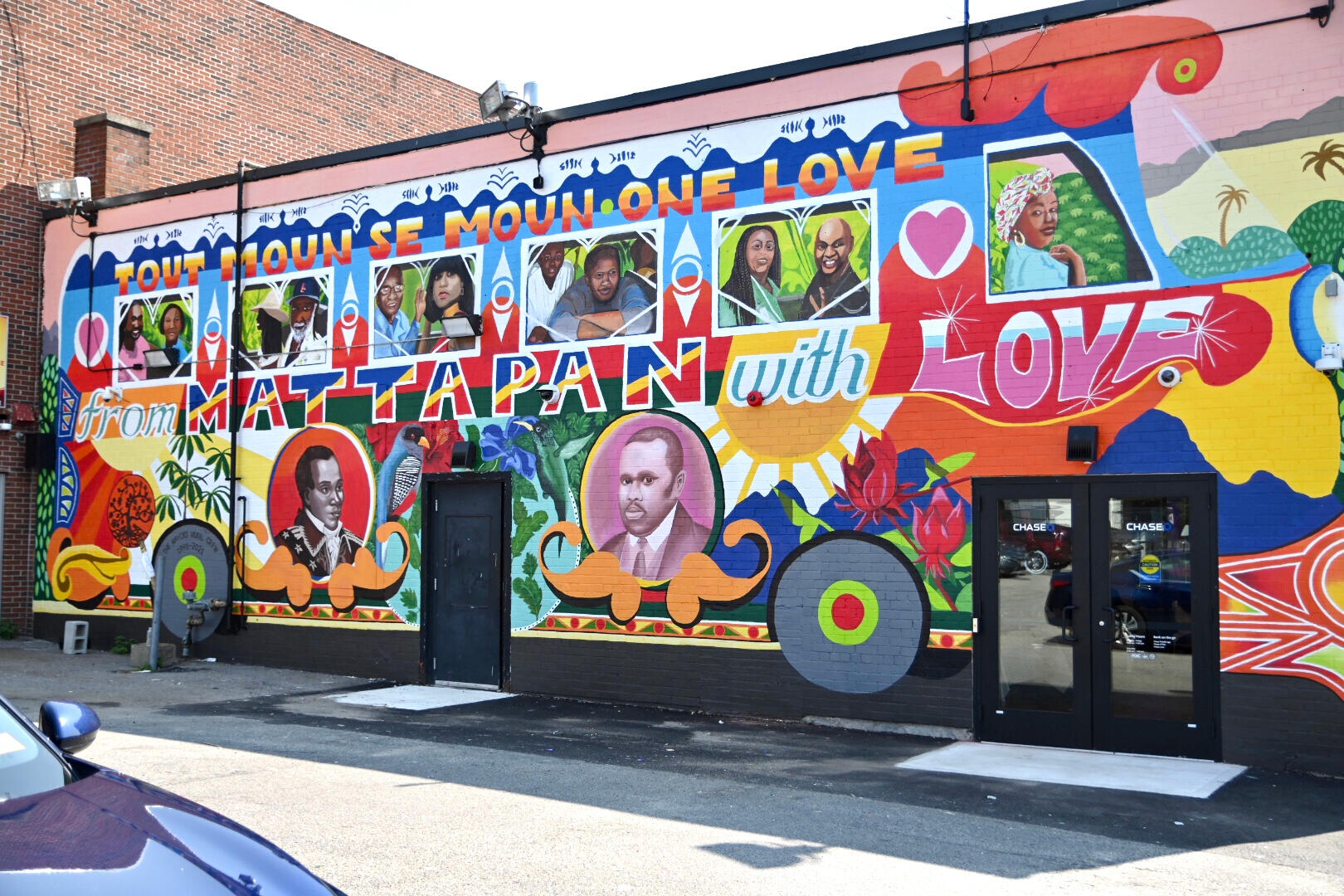
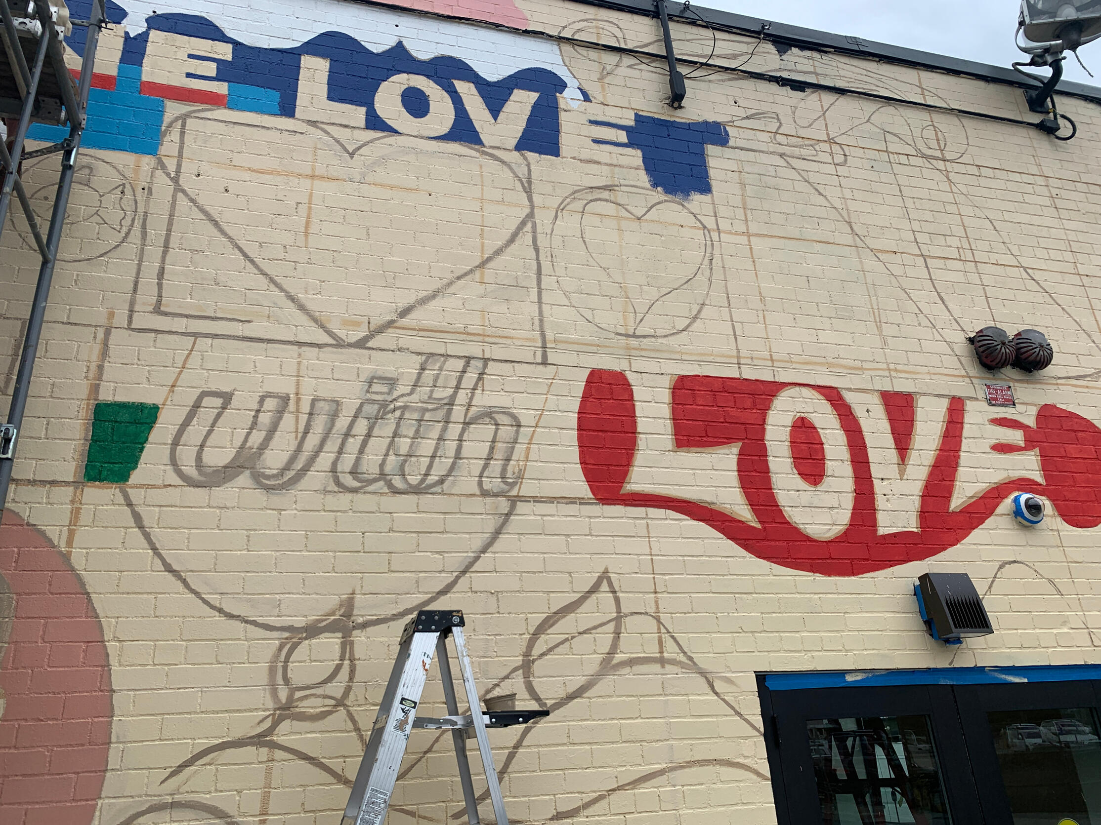
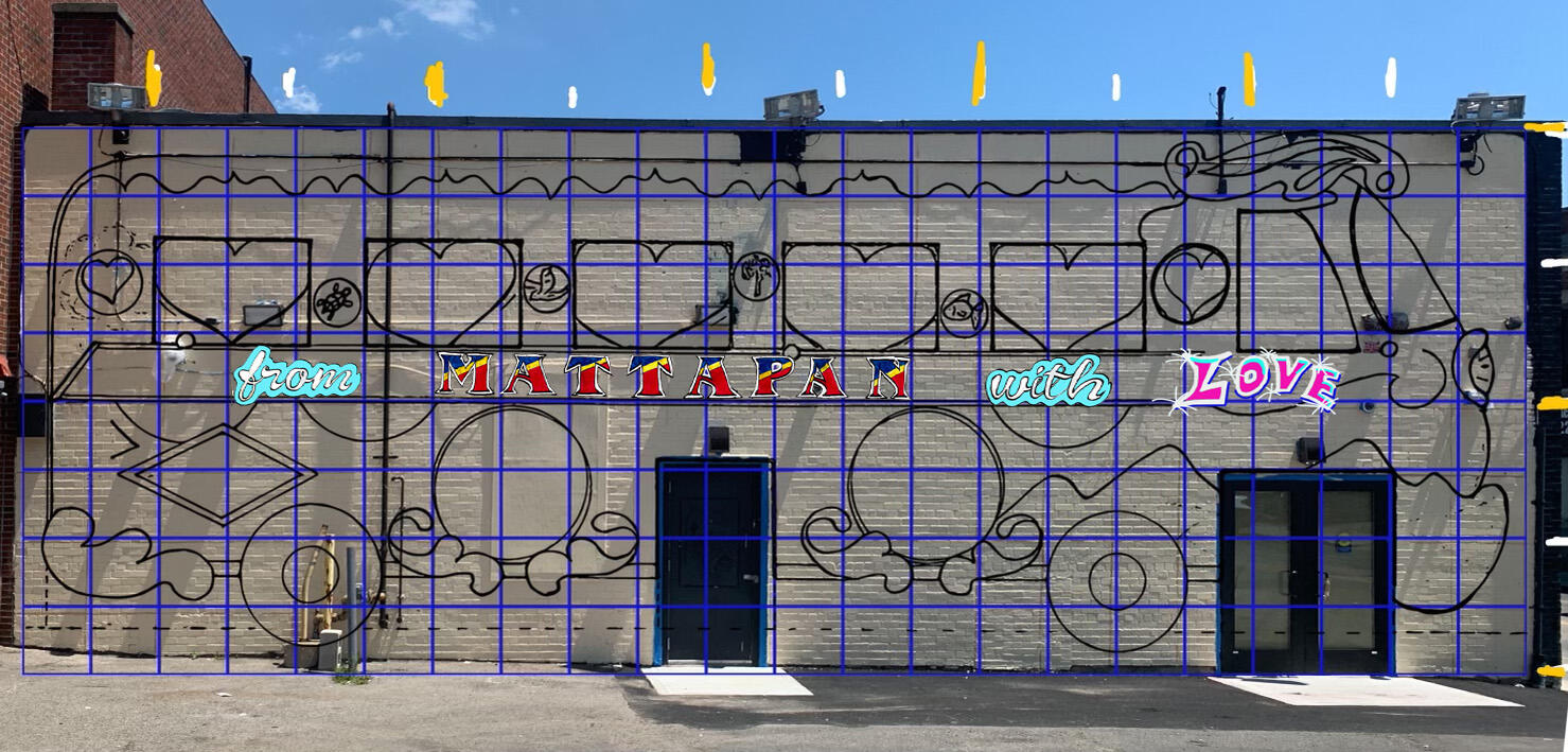
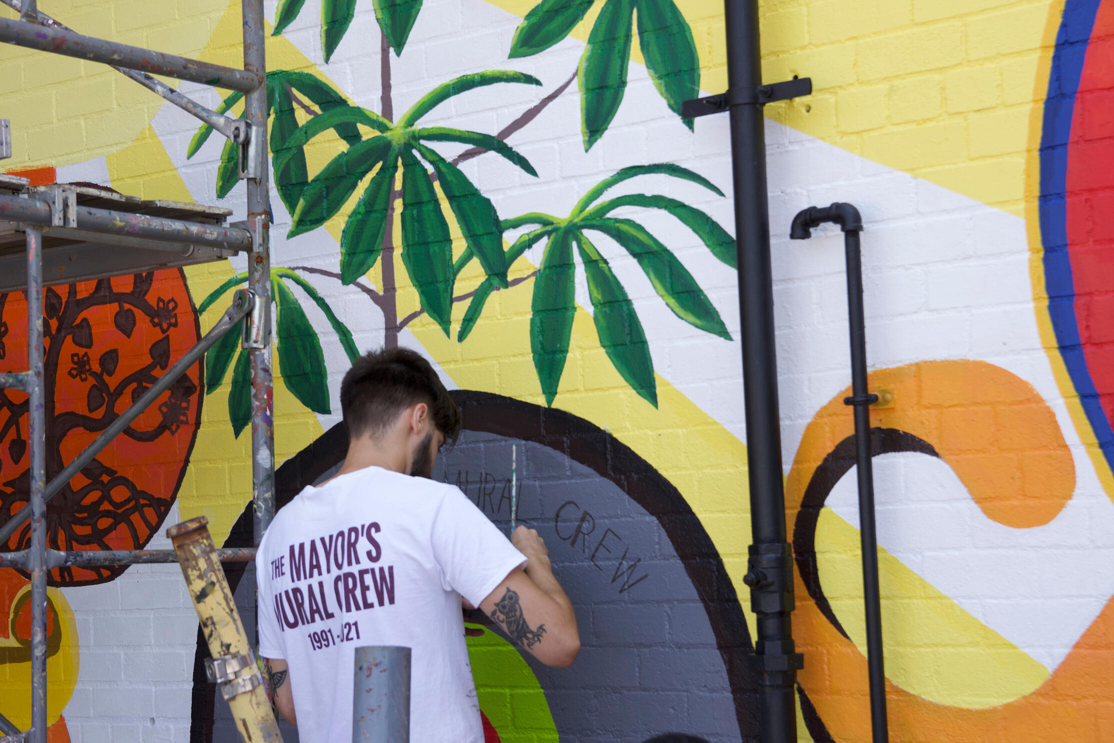
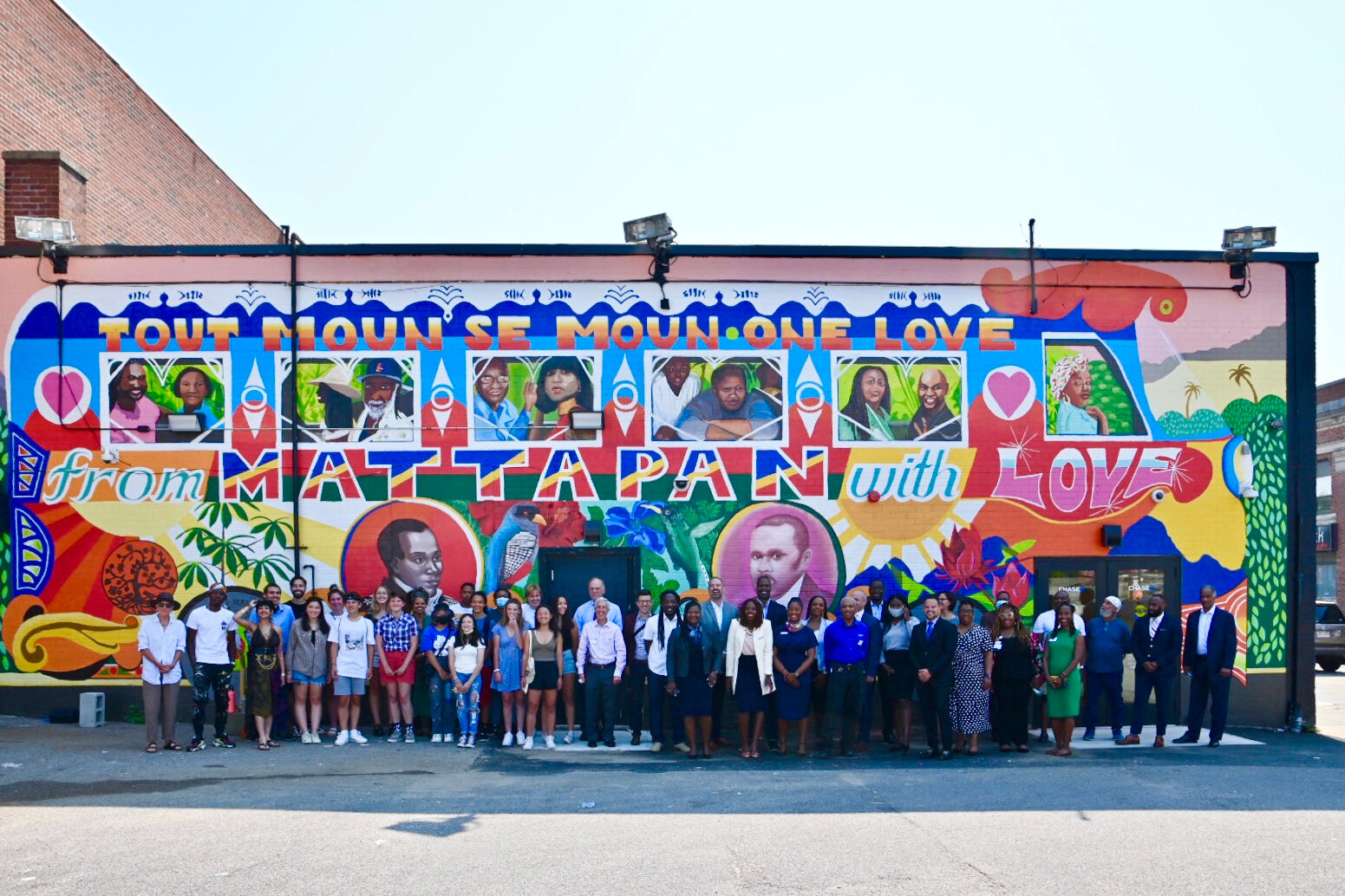
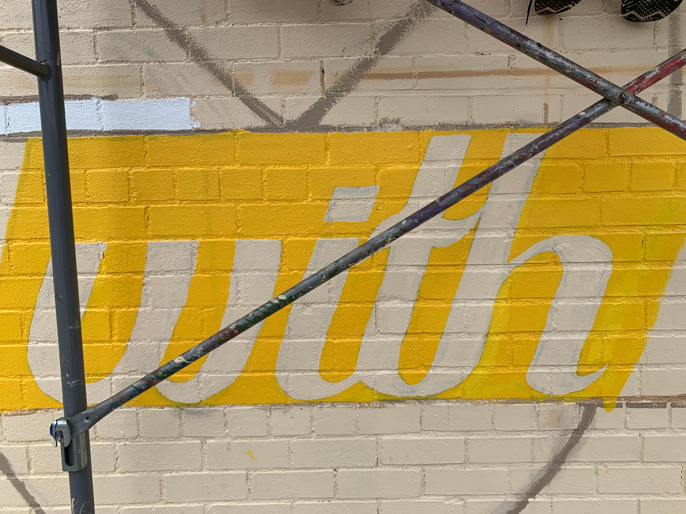
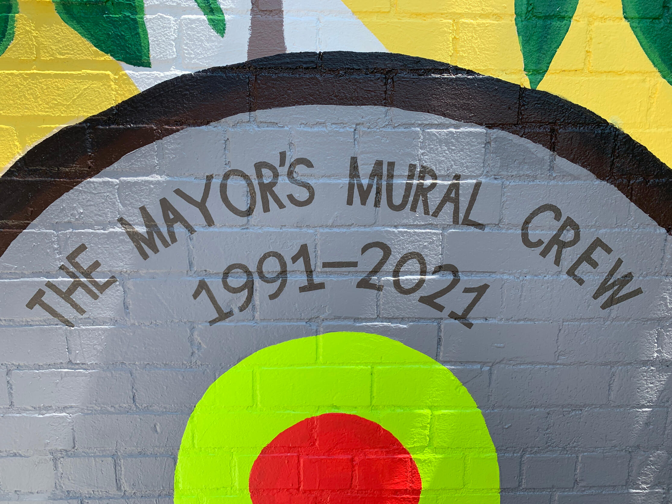
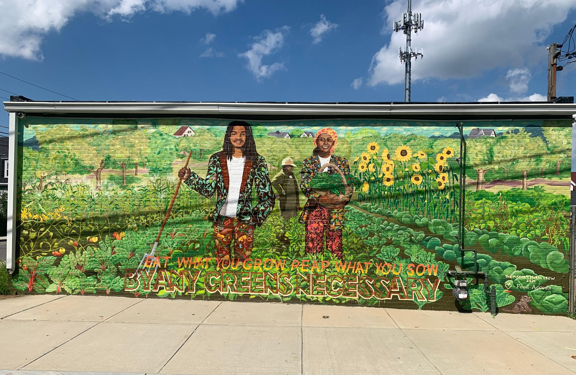
Mattapan Chase Bank Tap Tap Bus (2021) and Edgewater Community Garden (2021) via Heidi Schork and the City of Boston Mayor's Mural Crew, as a Crew Supervisor for Boston youth. I helped plan, design and coordinate both murals, with an emphasis on the lettering.
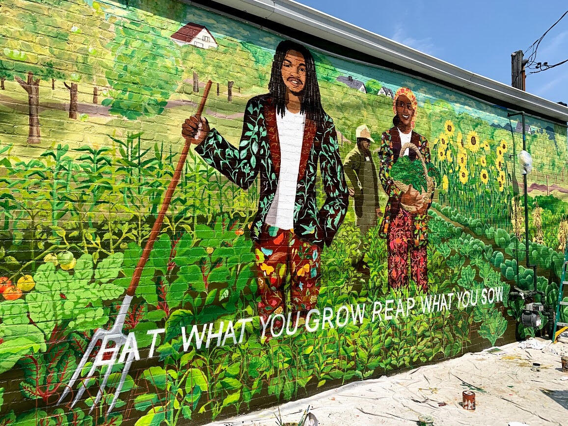
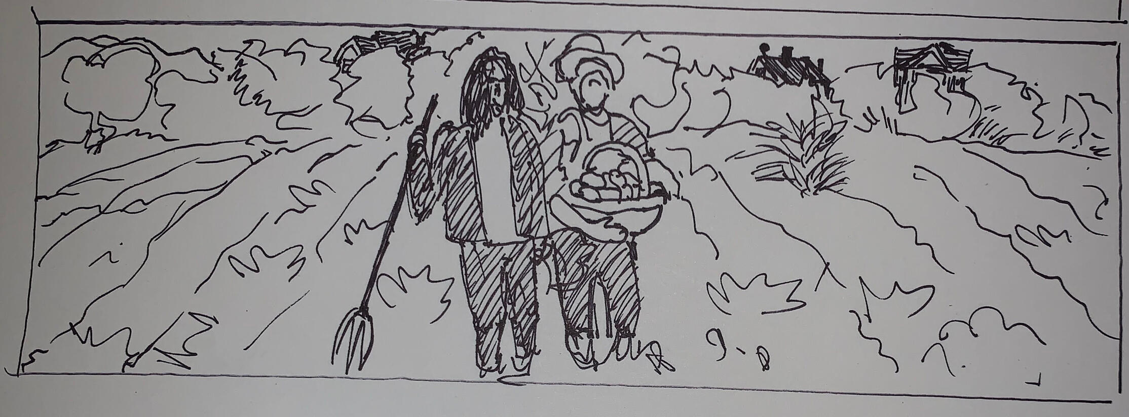
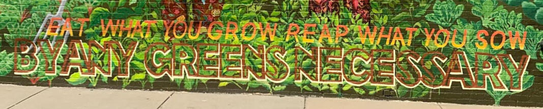
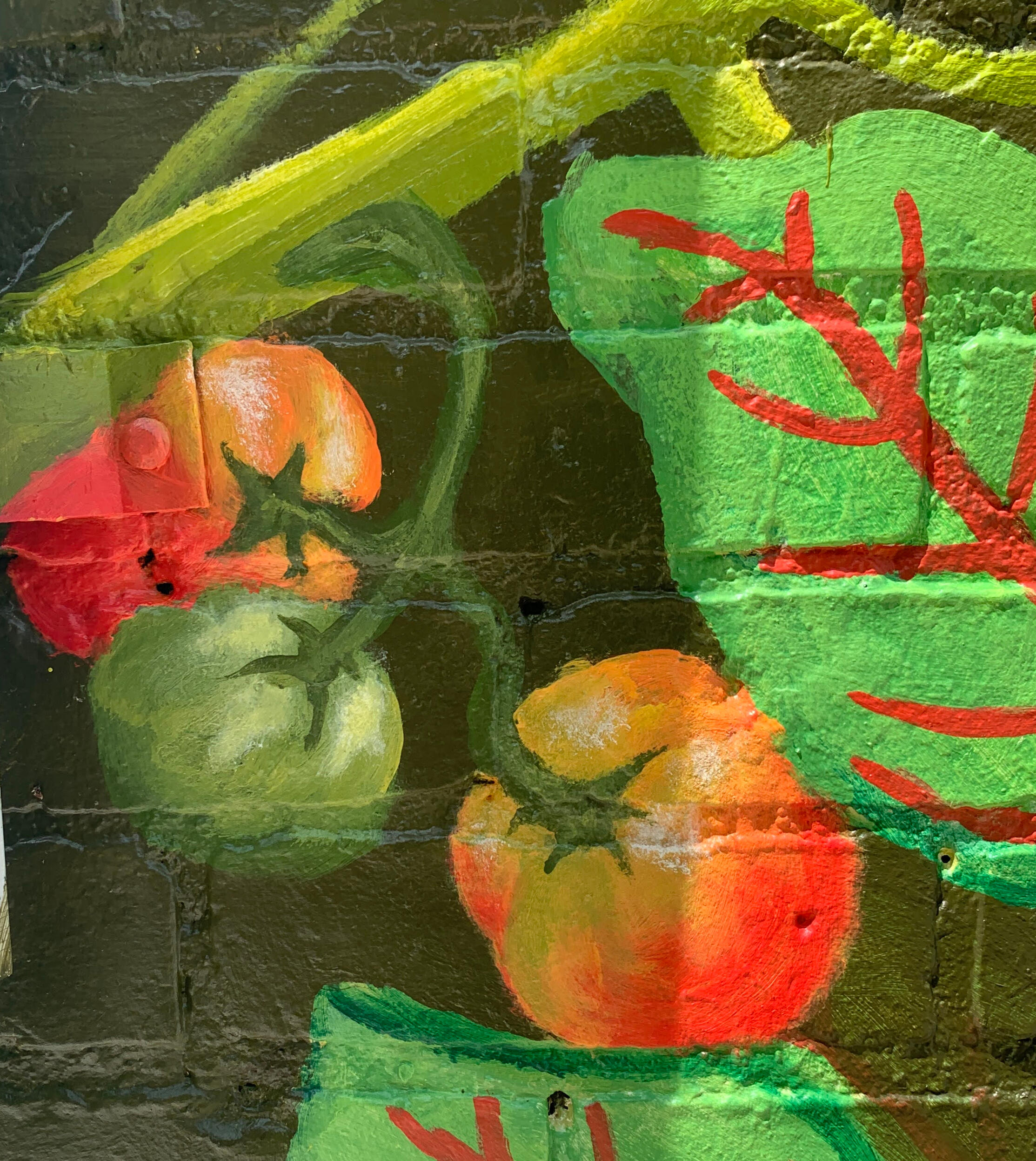
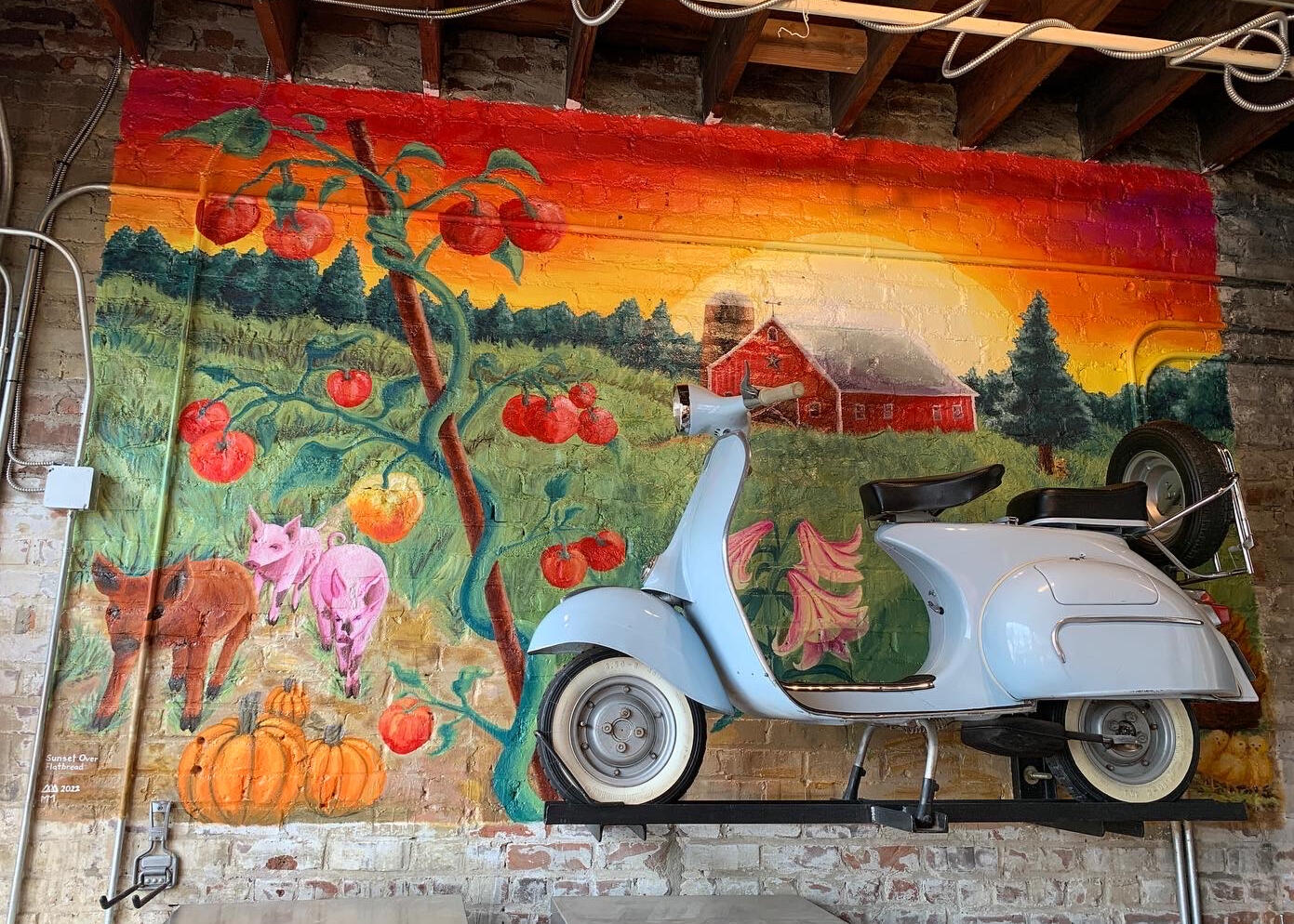
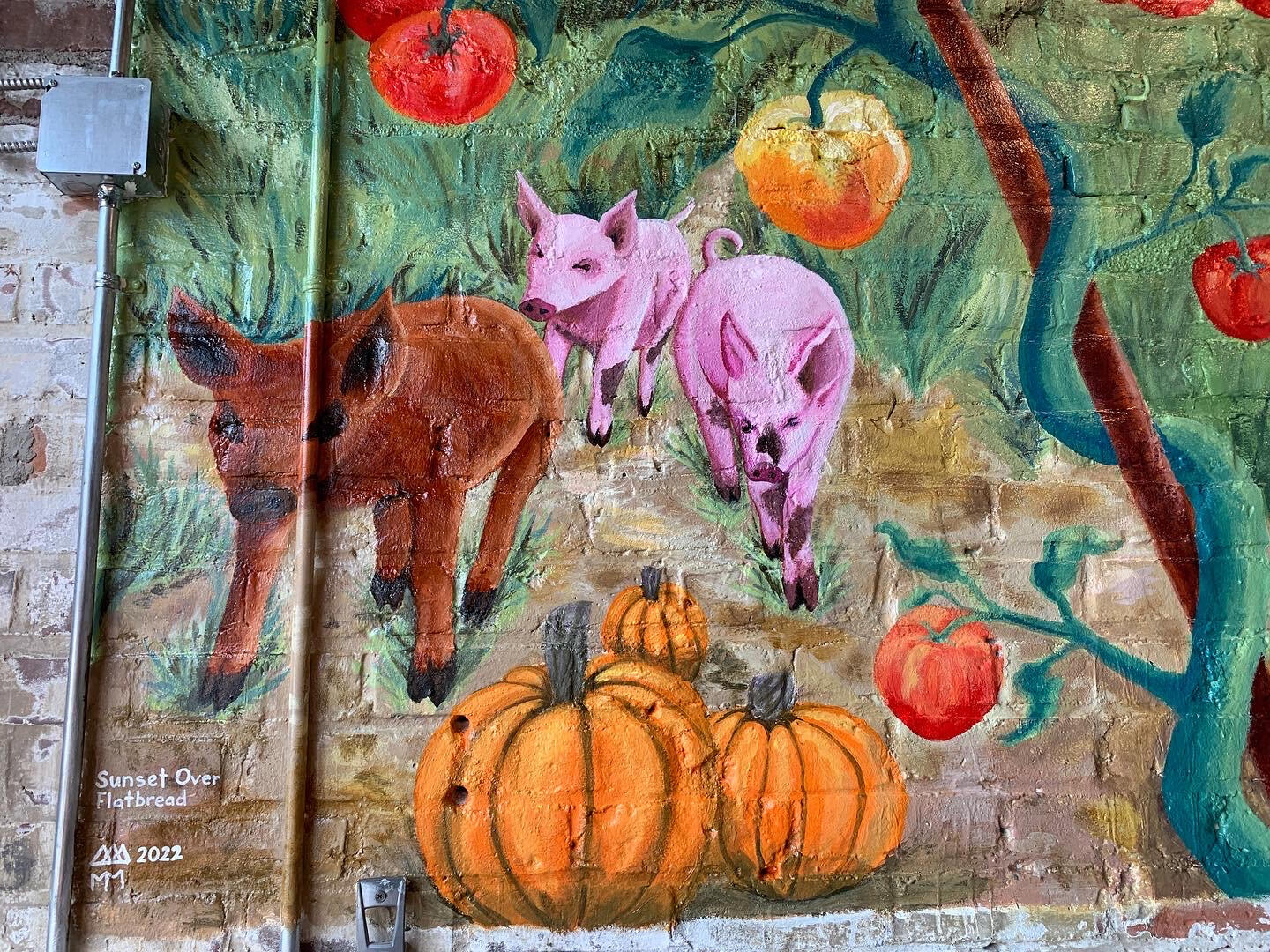
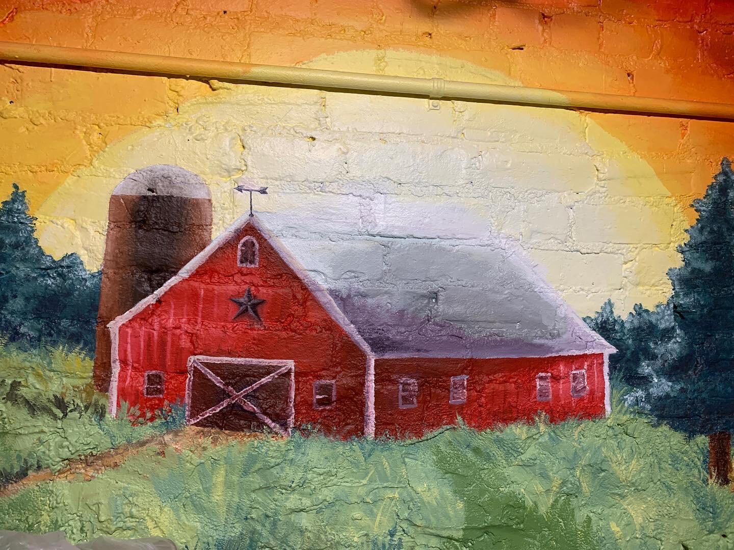
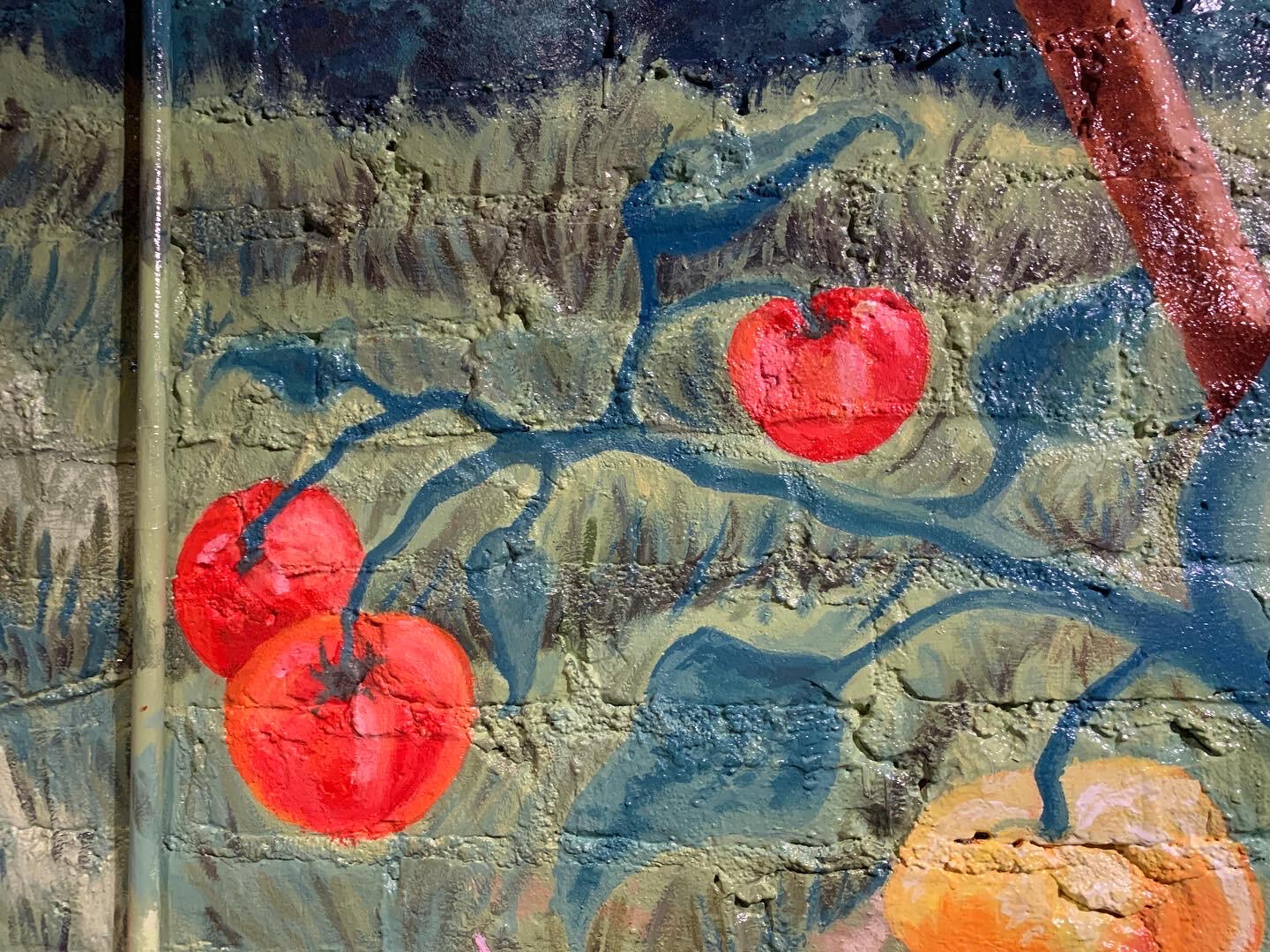
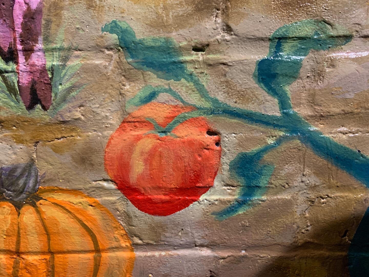
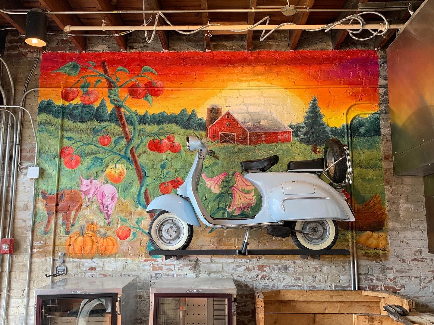
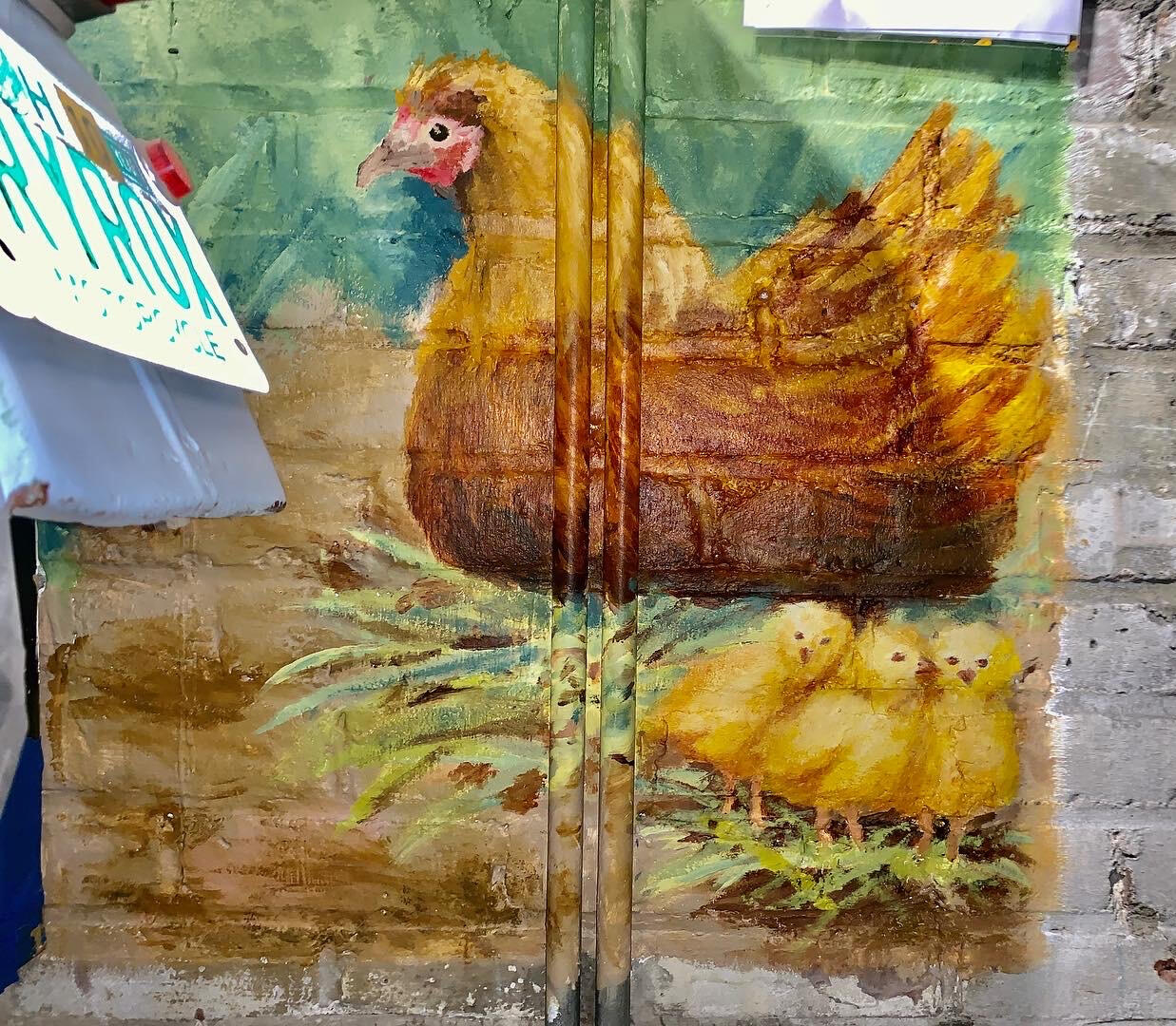
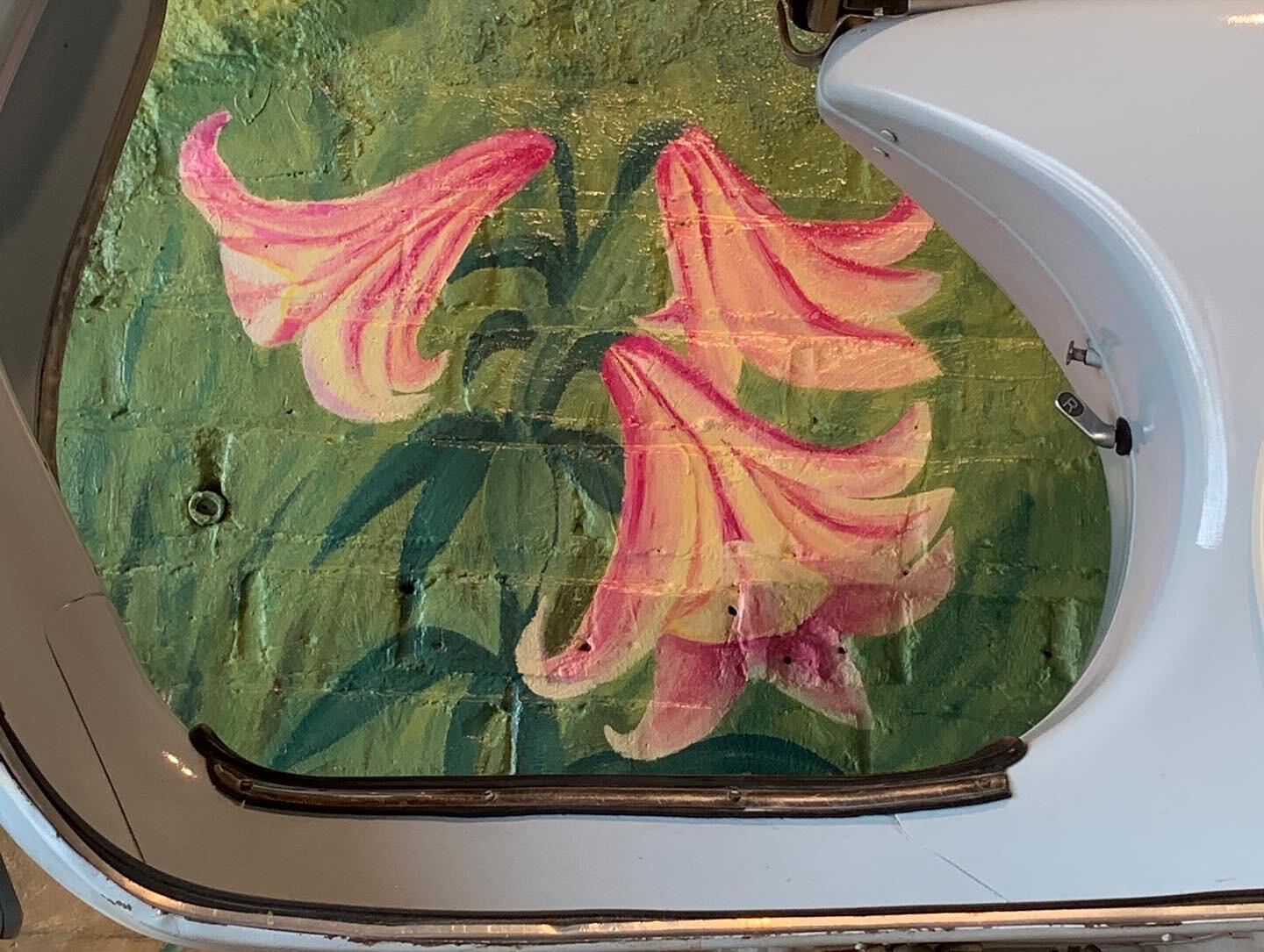
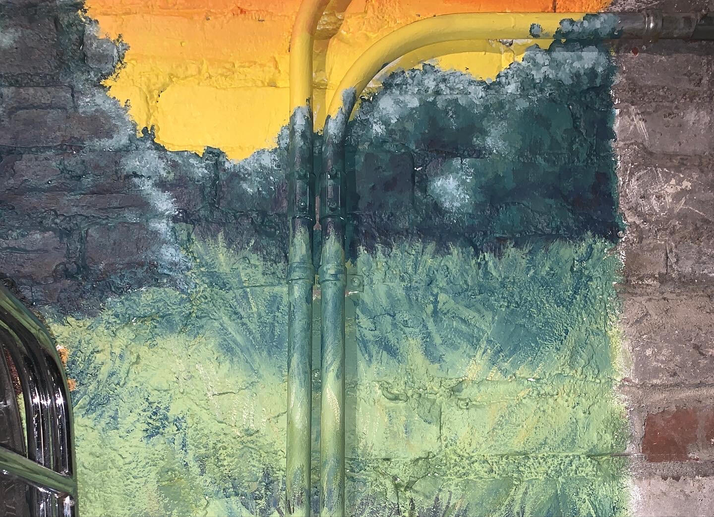
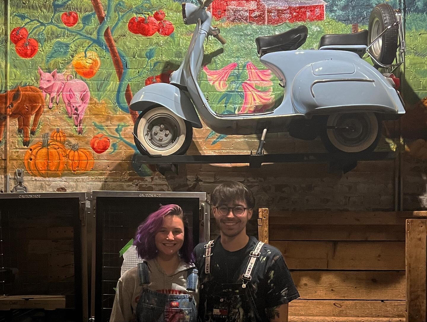
Sunset Over Flatbread — Davis Square, Somerville MA
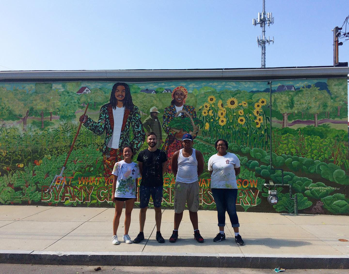
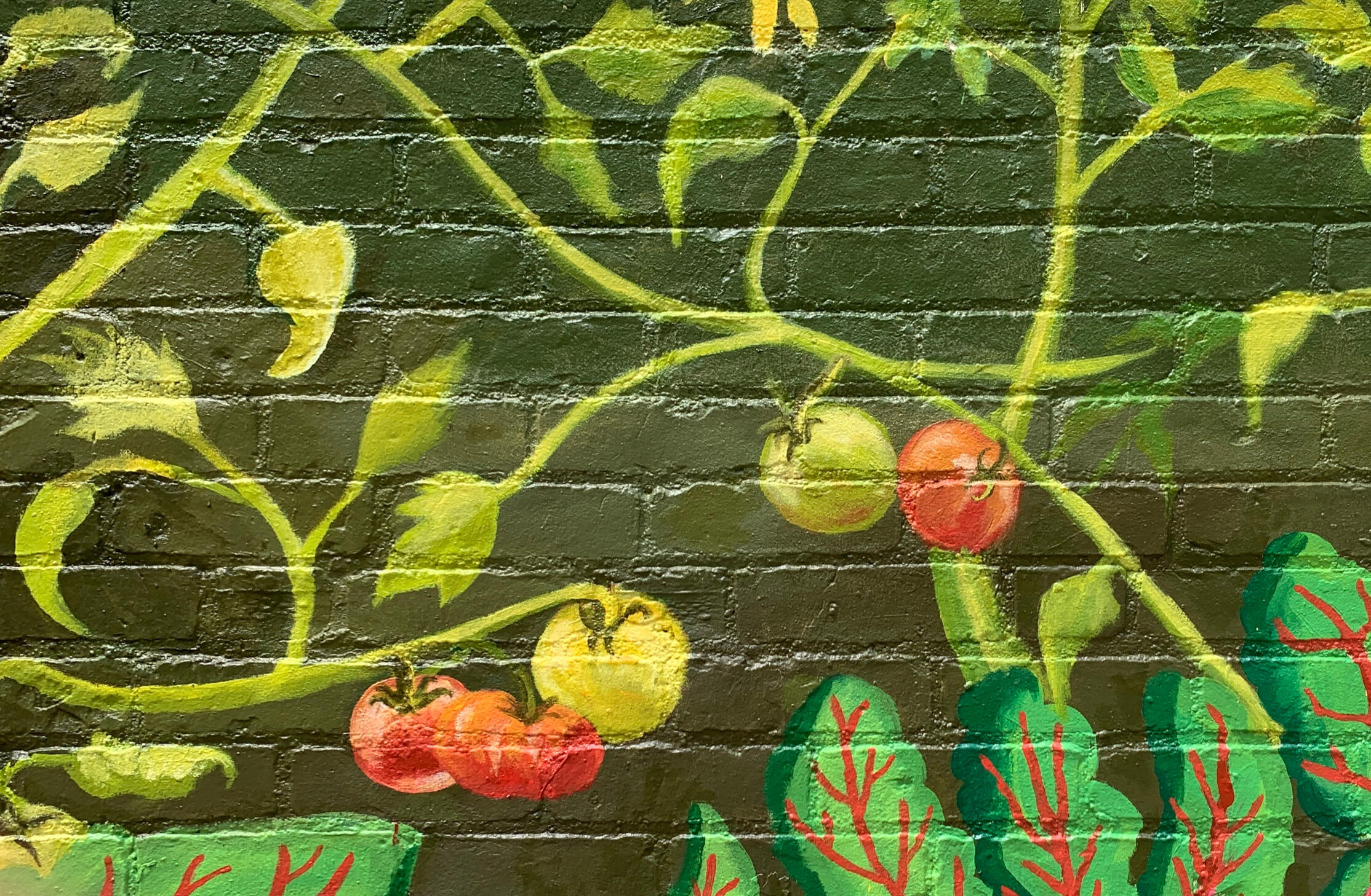
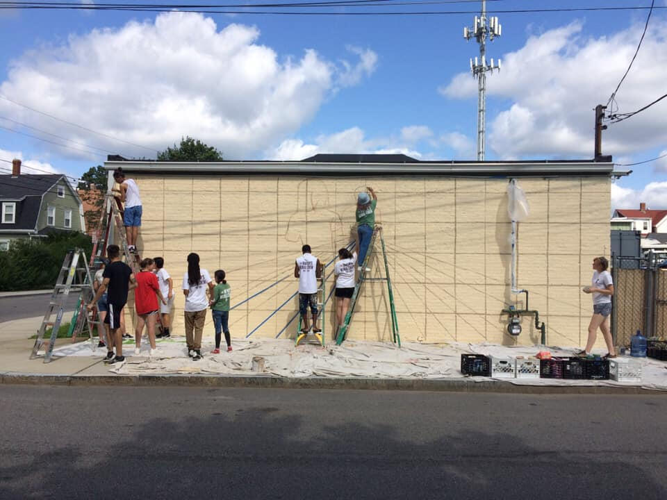
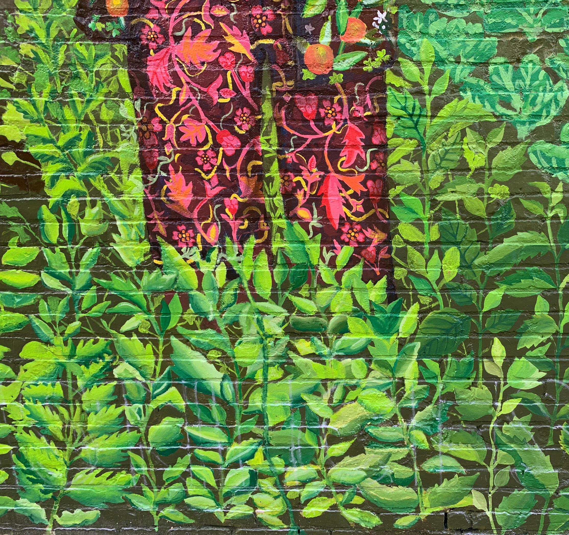
I completed this farmhouse landscape mural (12ft x 8ft) for American Flatbread to highlight the fresh farm-to-table food that AFB prides itself on.It is the mission of American Flatbread to provide good, flavorful, nutritious food that gives us both joy and health, and to share this food with others in ways sustainable to all. This mural is the visual representation of that.Executed with the help of Madelyn Mulreaney, B.A. Emerson College2022
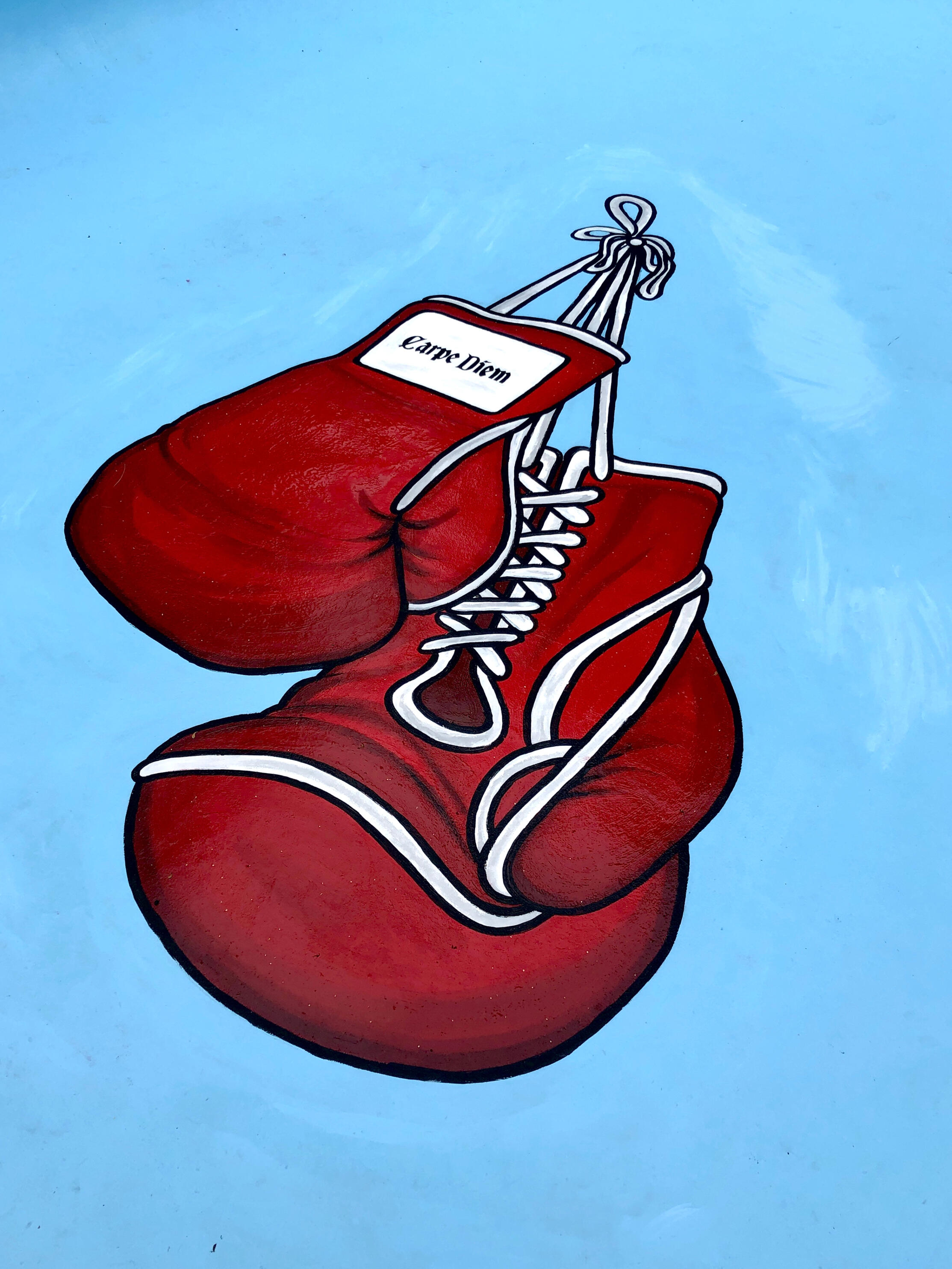
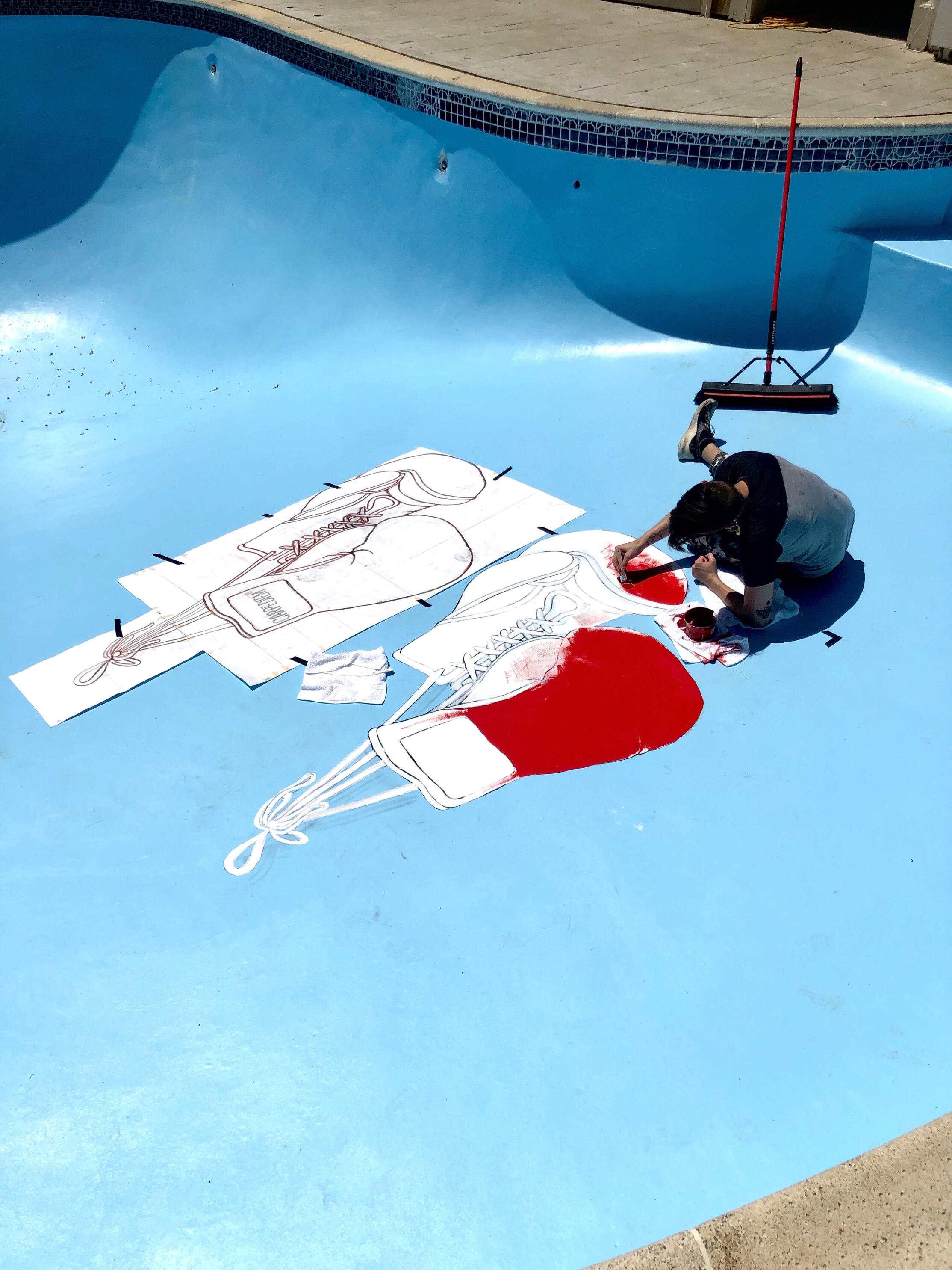
Carpe DiemPainted this for the owner of a local boxing club.
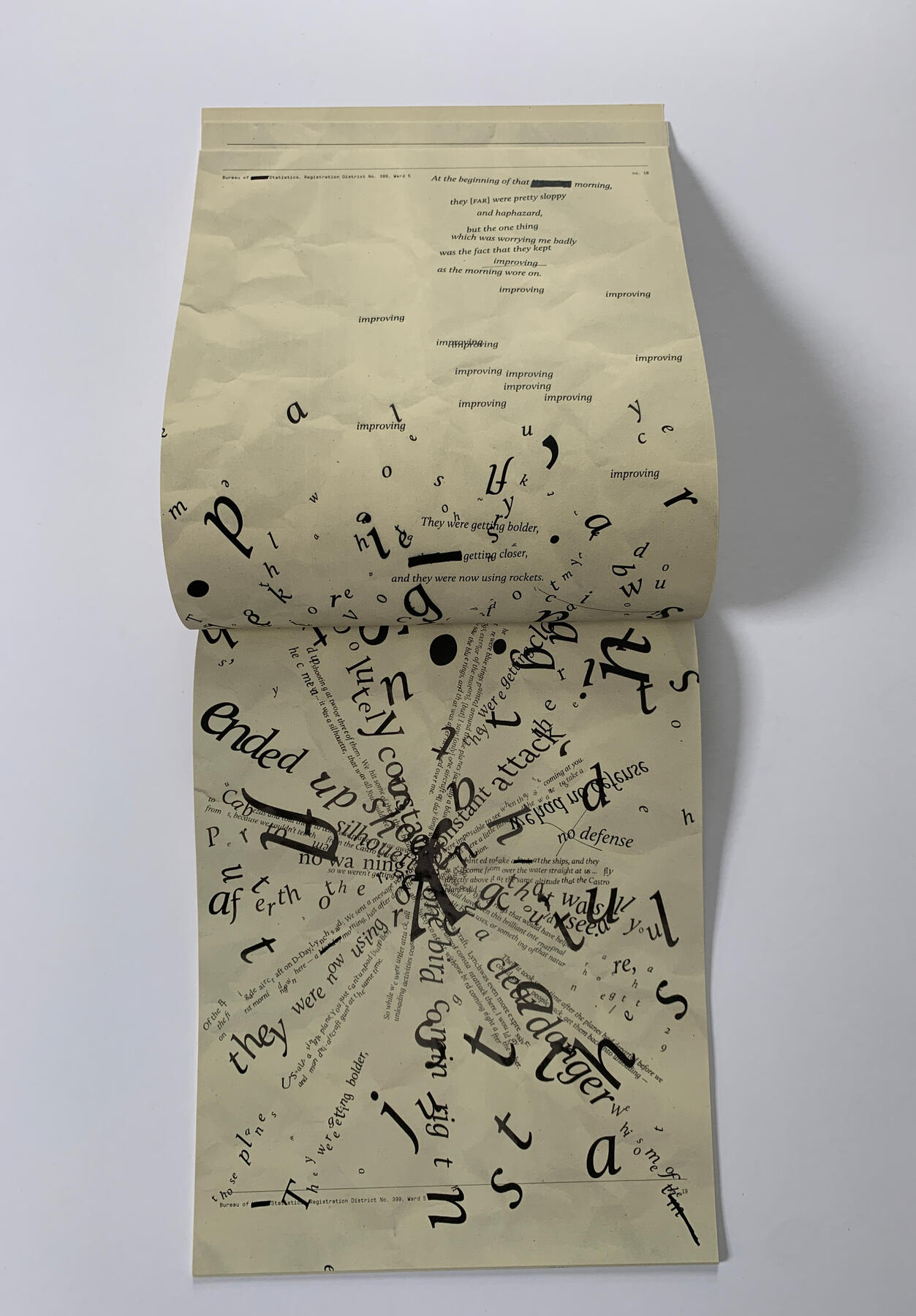
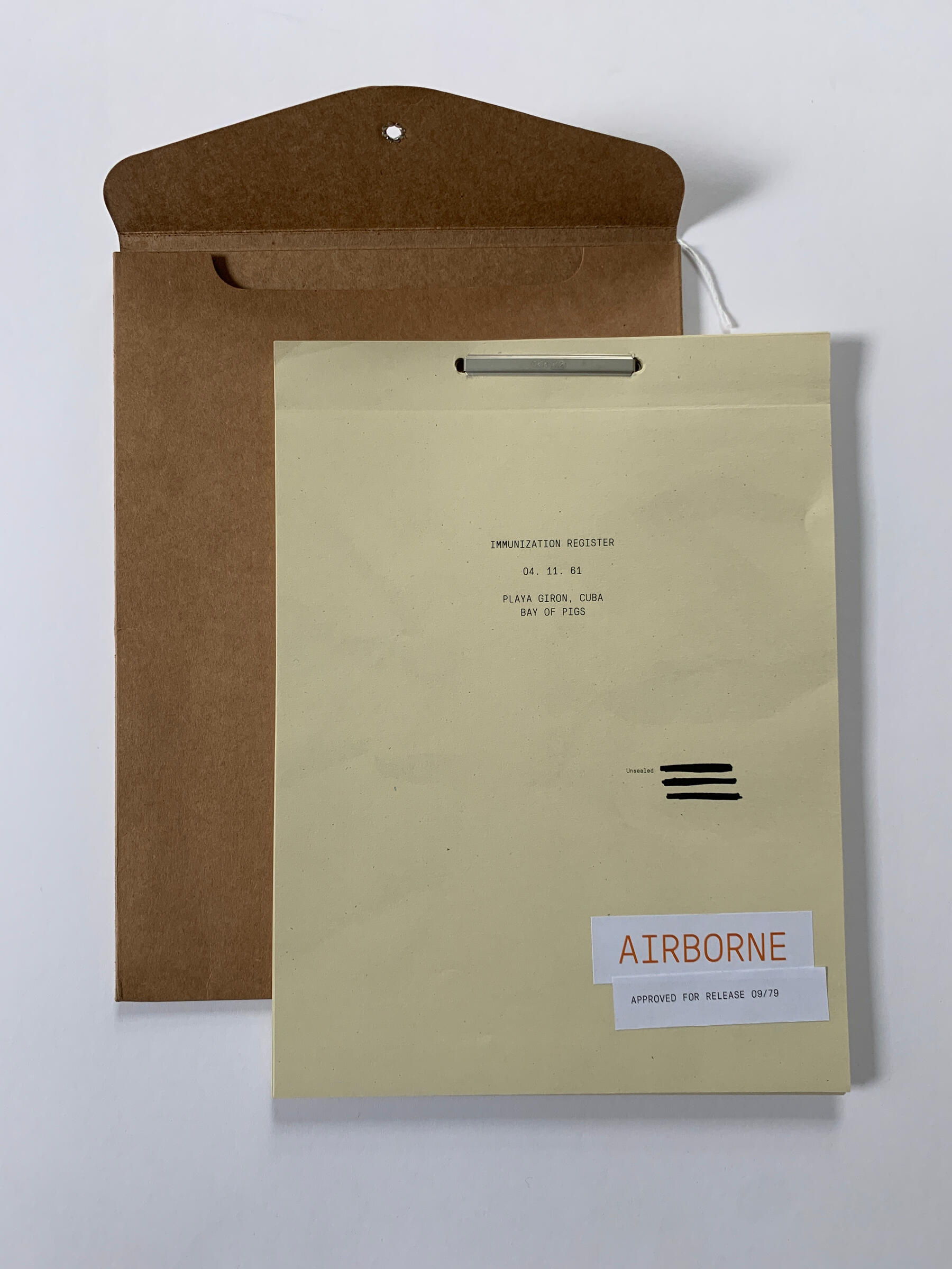
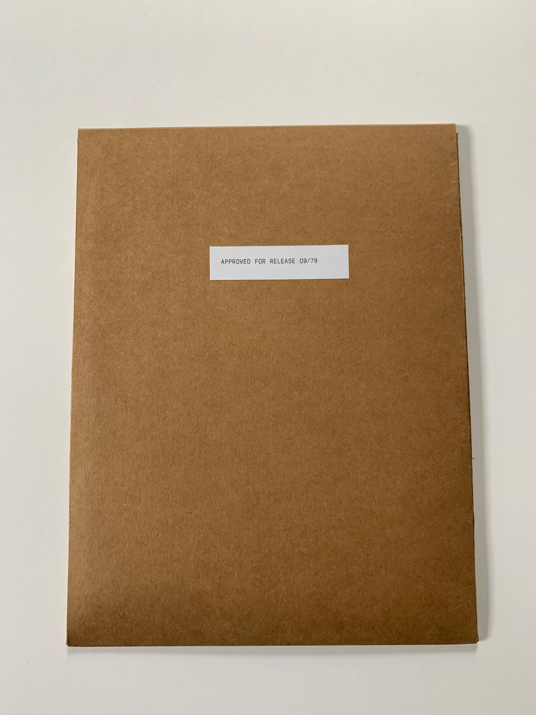
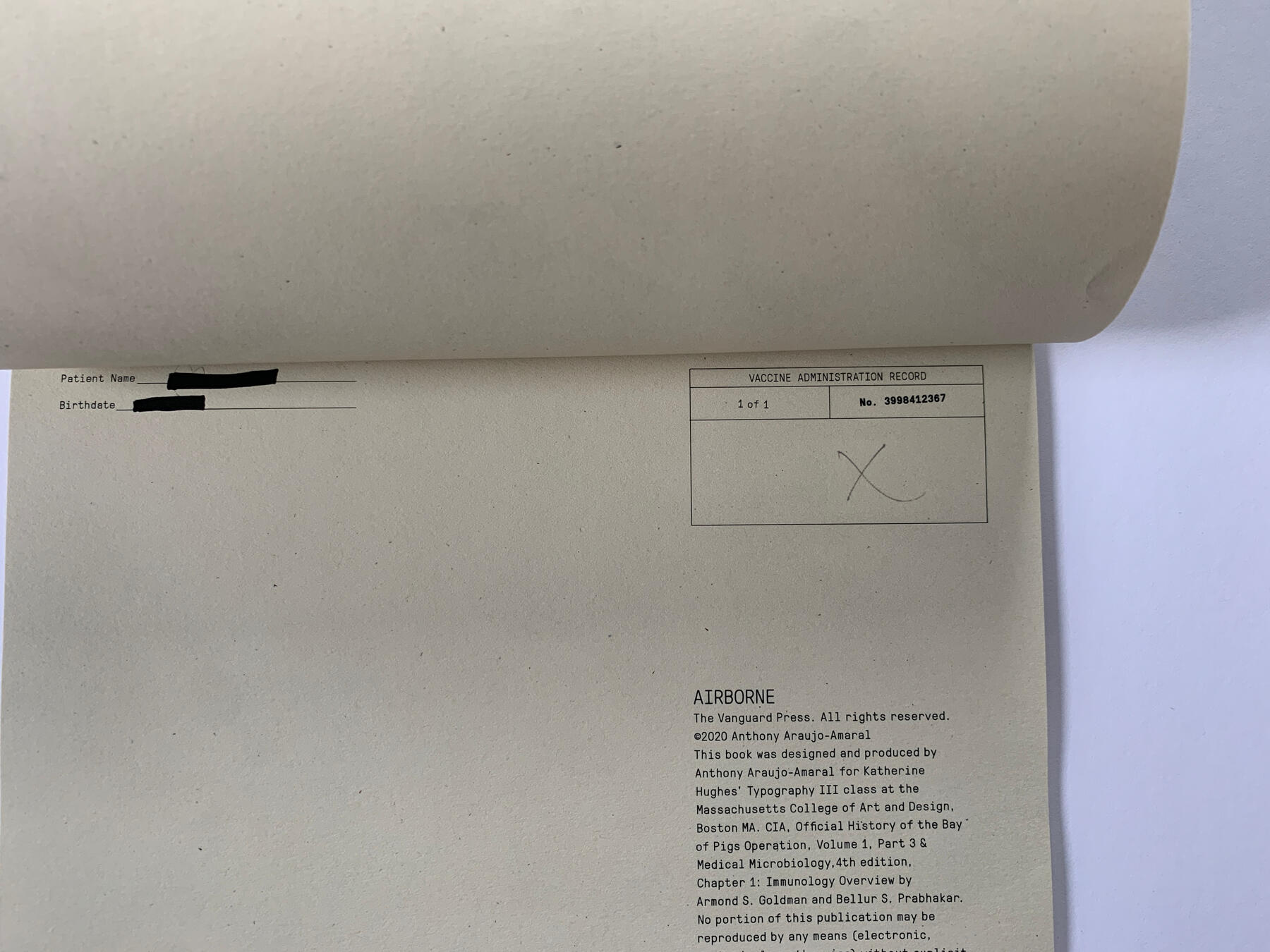
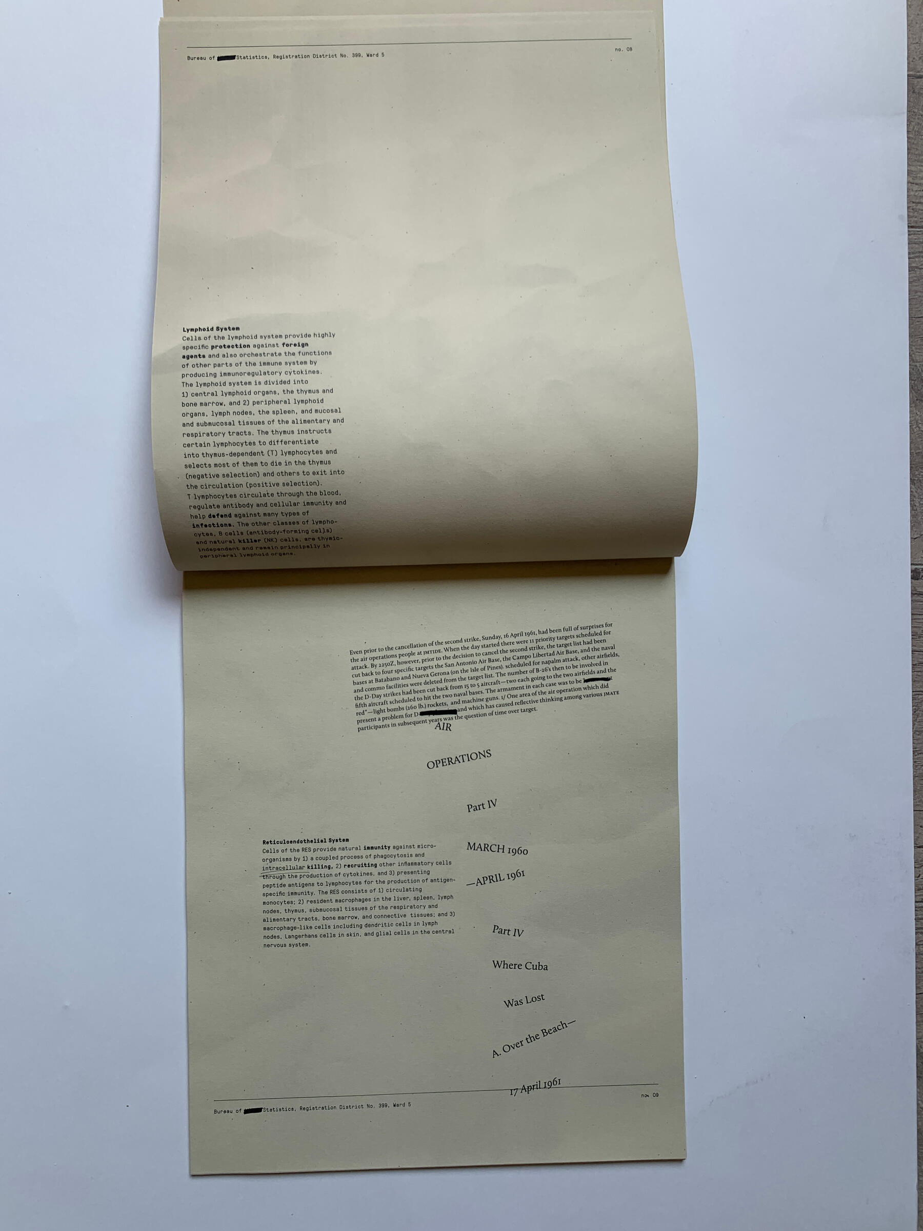
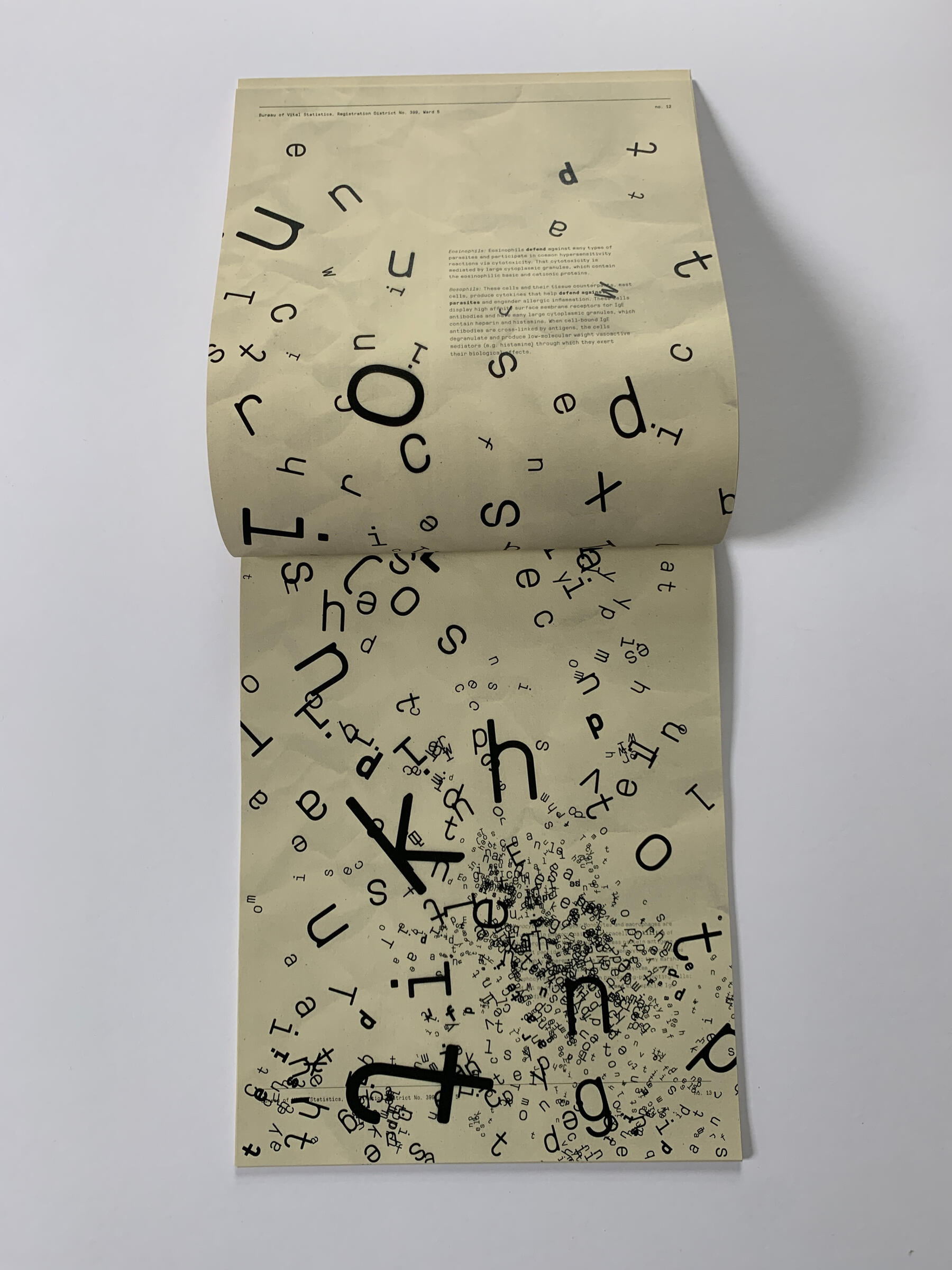
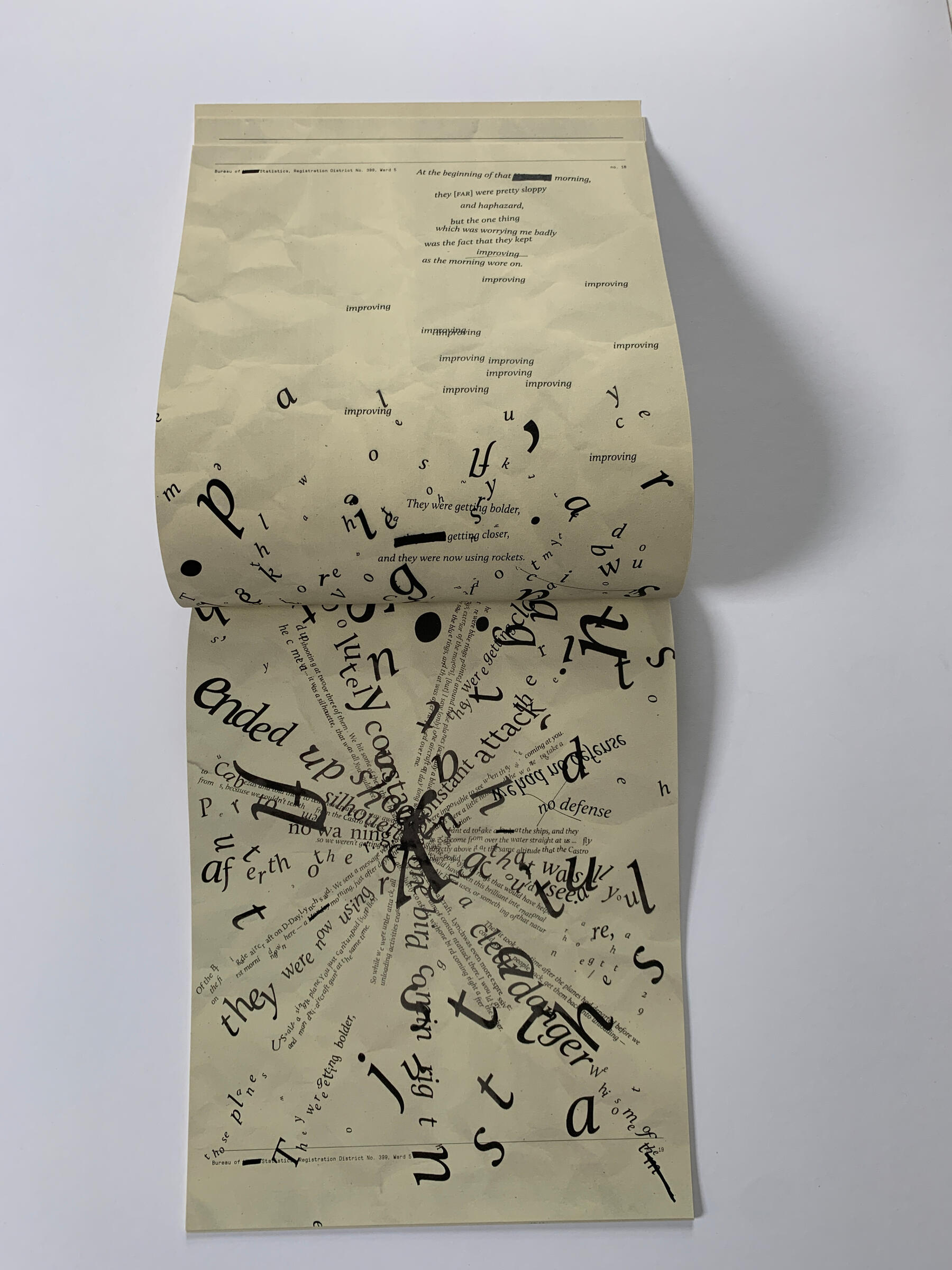
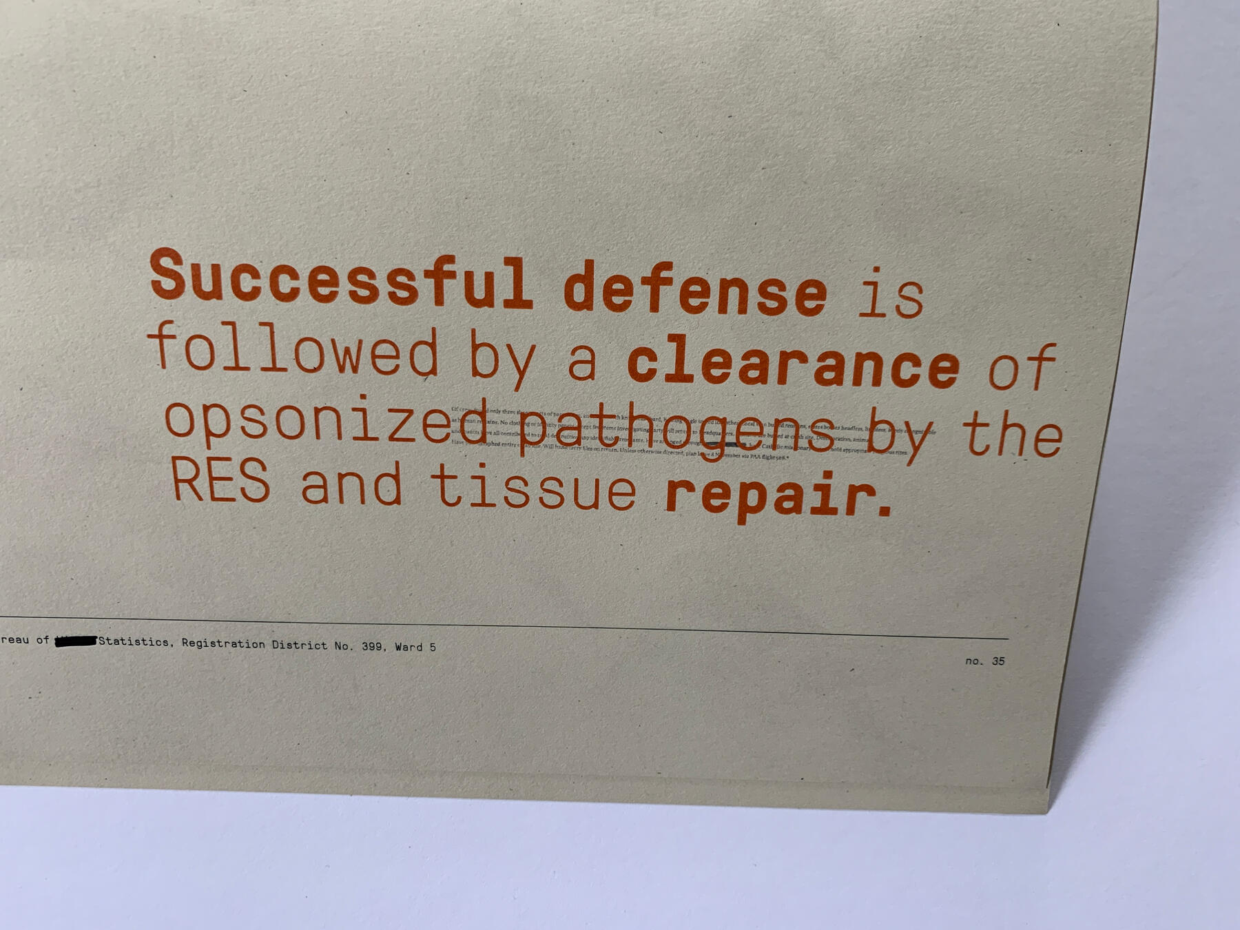
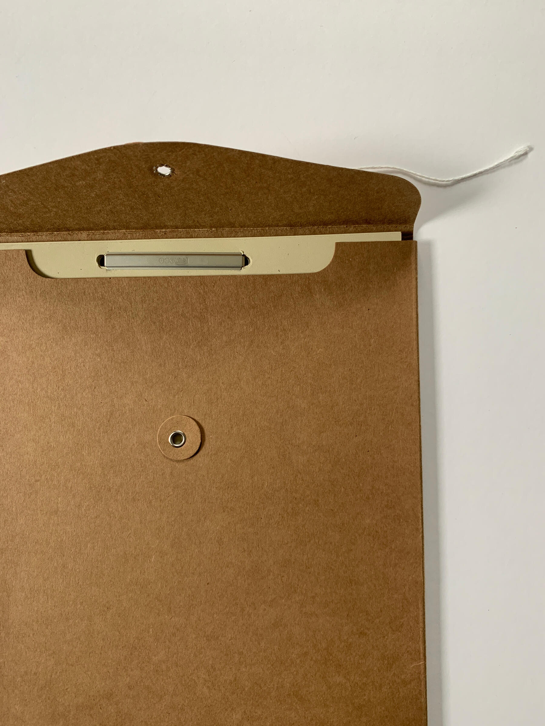
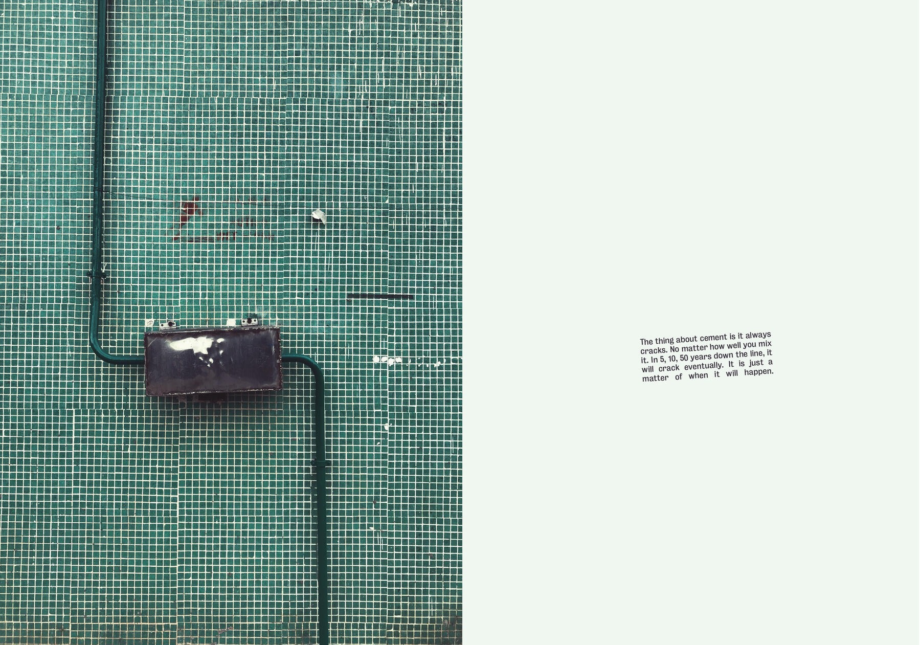
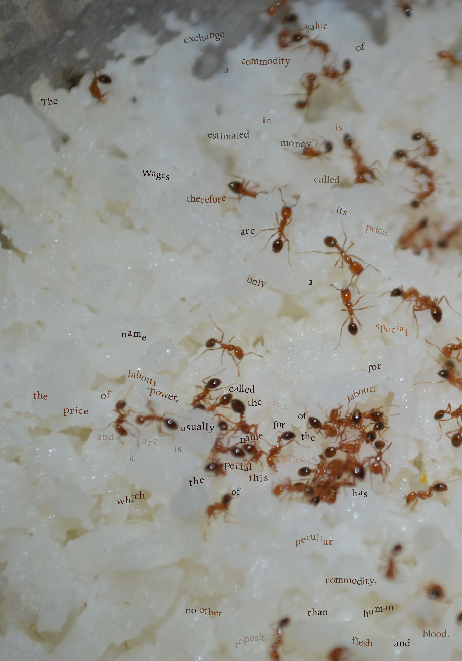
Airborne: Approved for Release 09/79 — An Artist Book
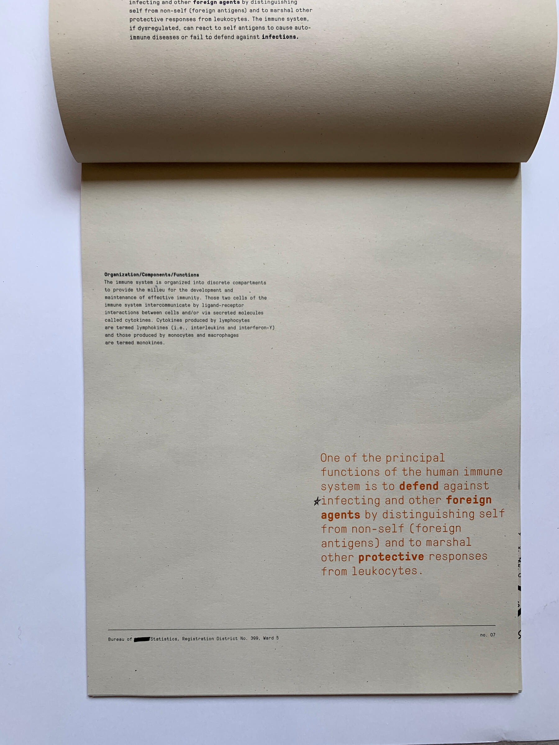
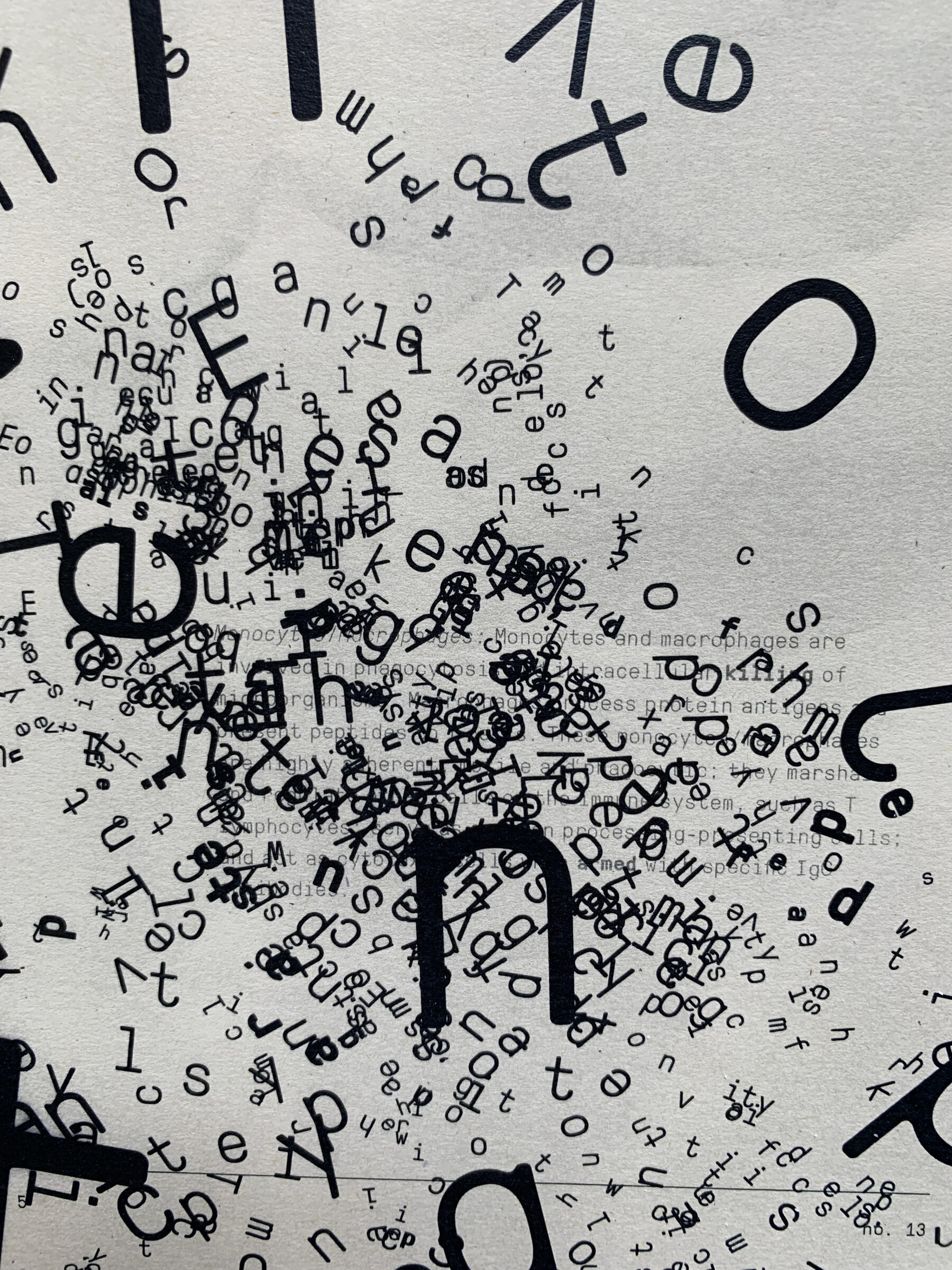
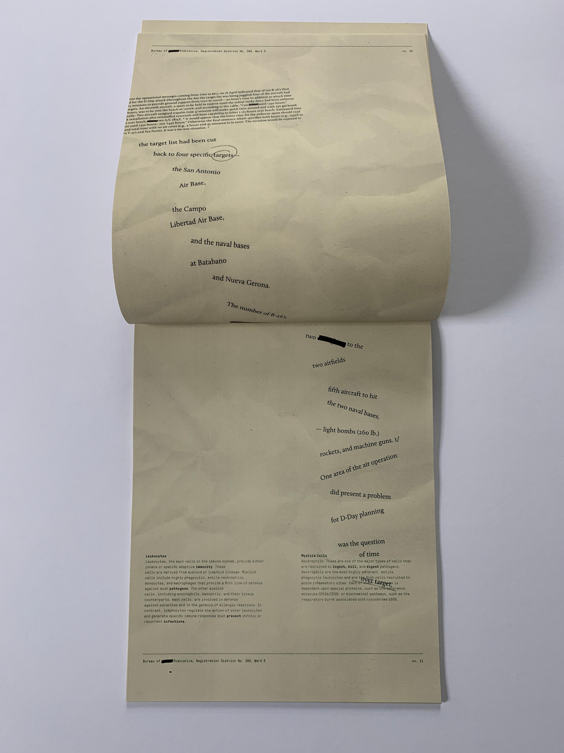
Conceived two months before COVID-19 was declared a pandemic, this artist book combines two texts into one story: the Bay of Pigs invasion and a medical textbook on how the human body fights airborne pathogens, all told without a single image.2020
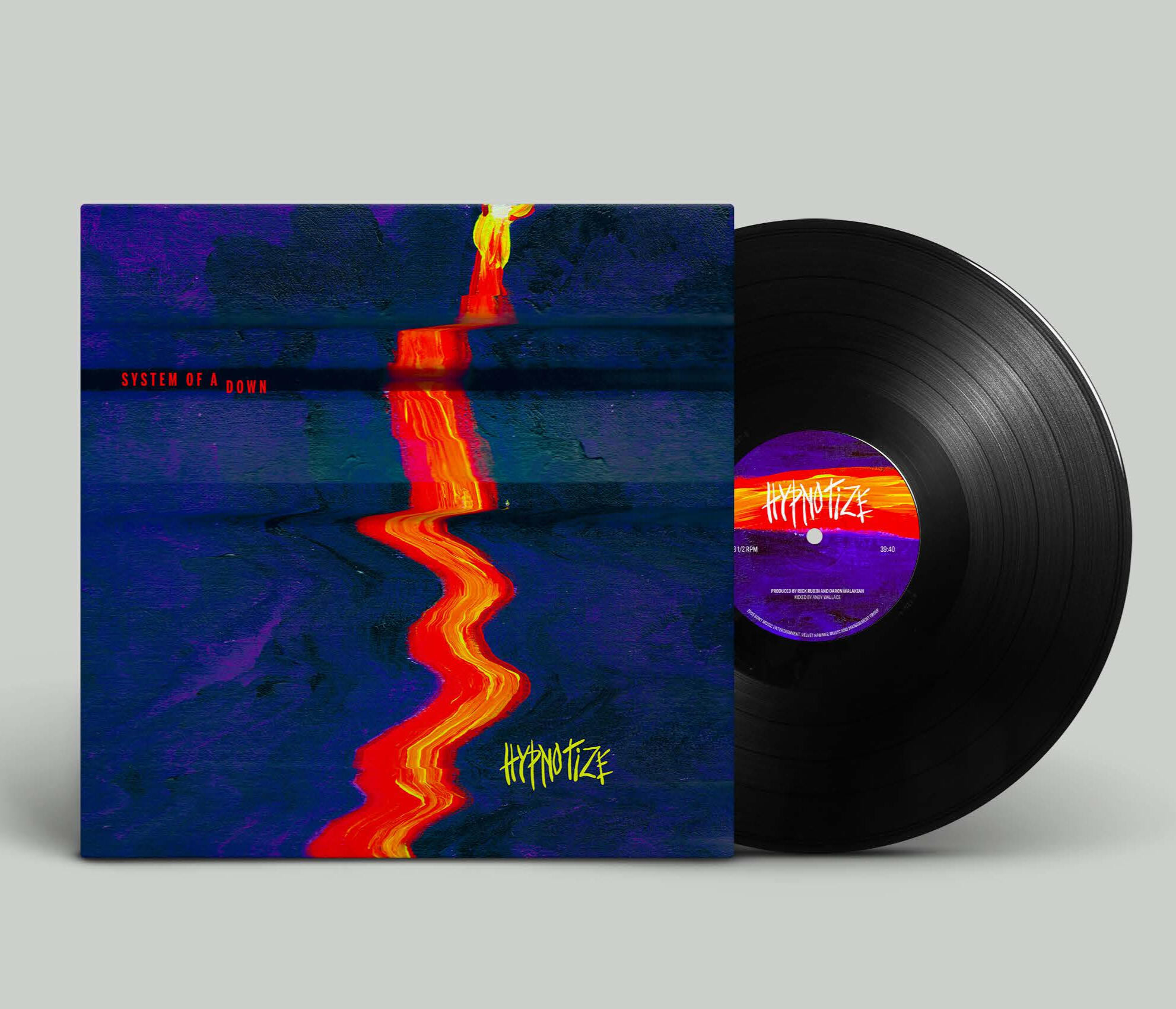
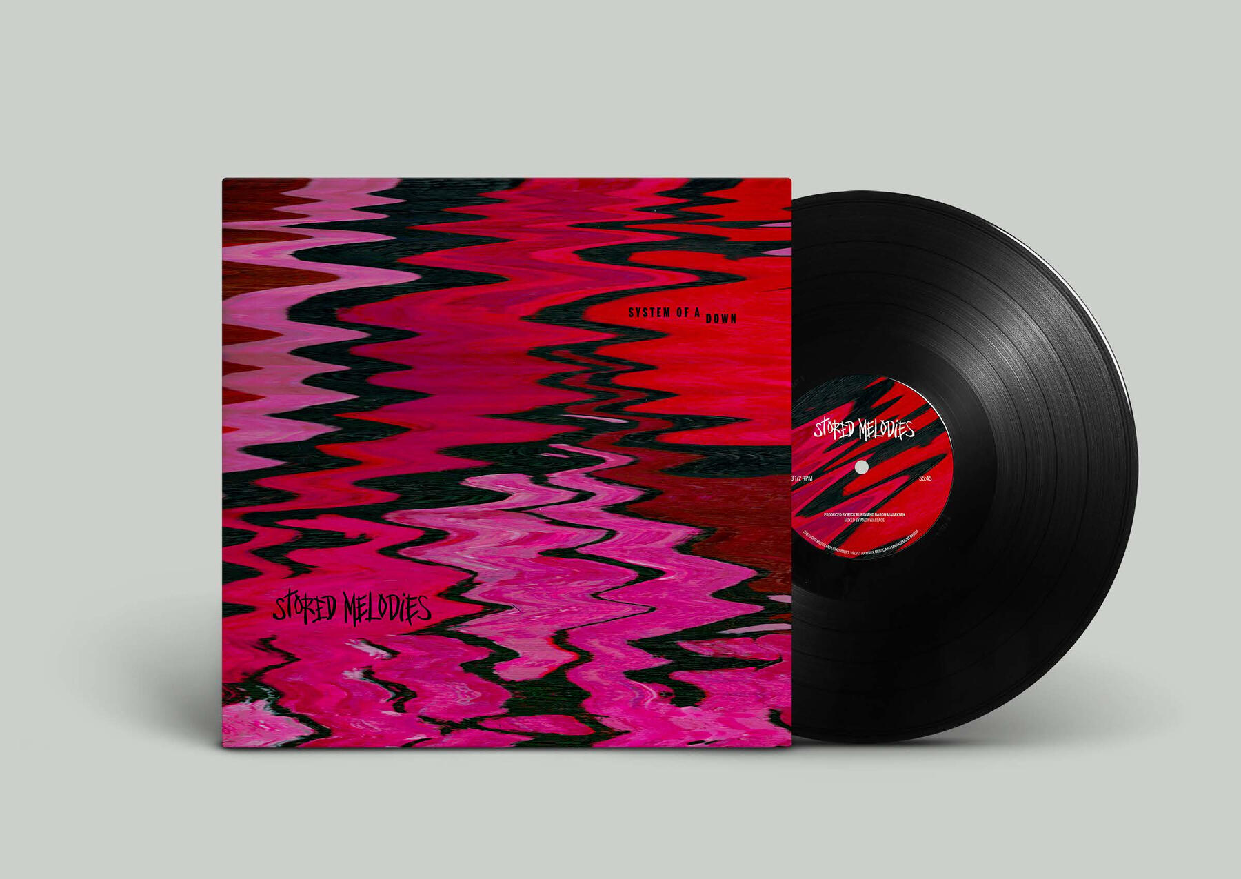
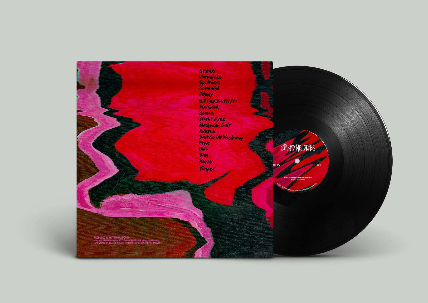
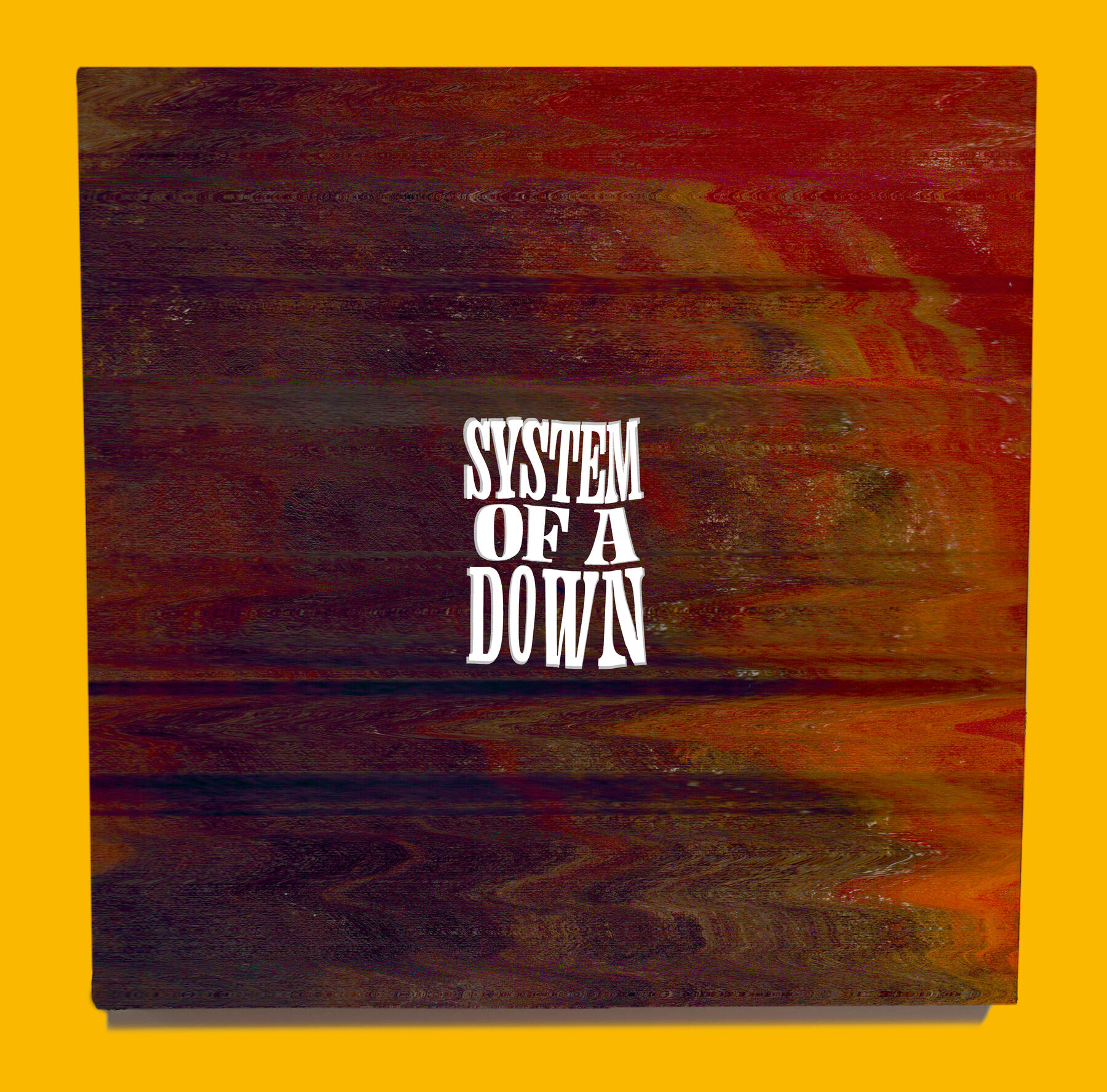
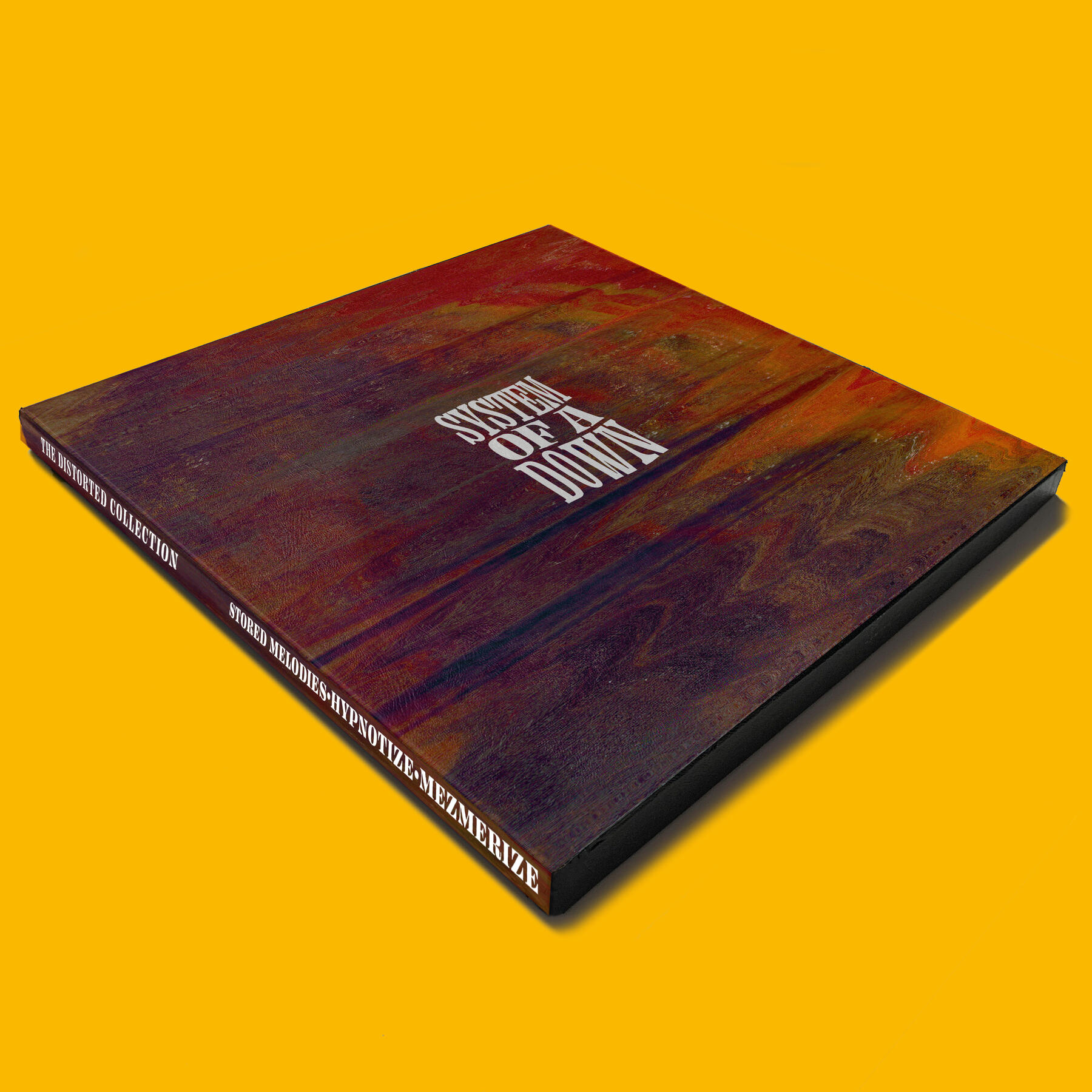
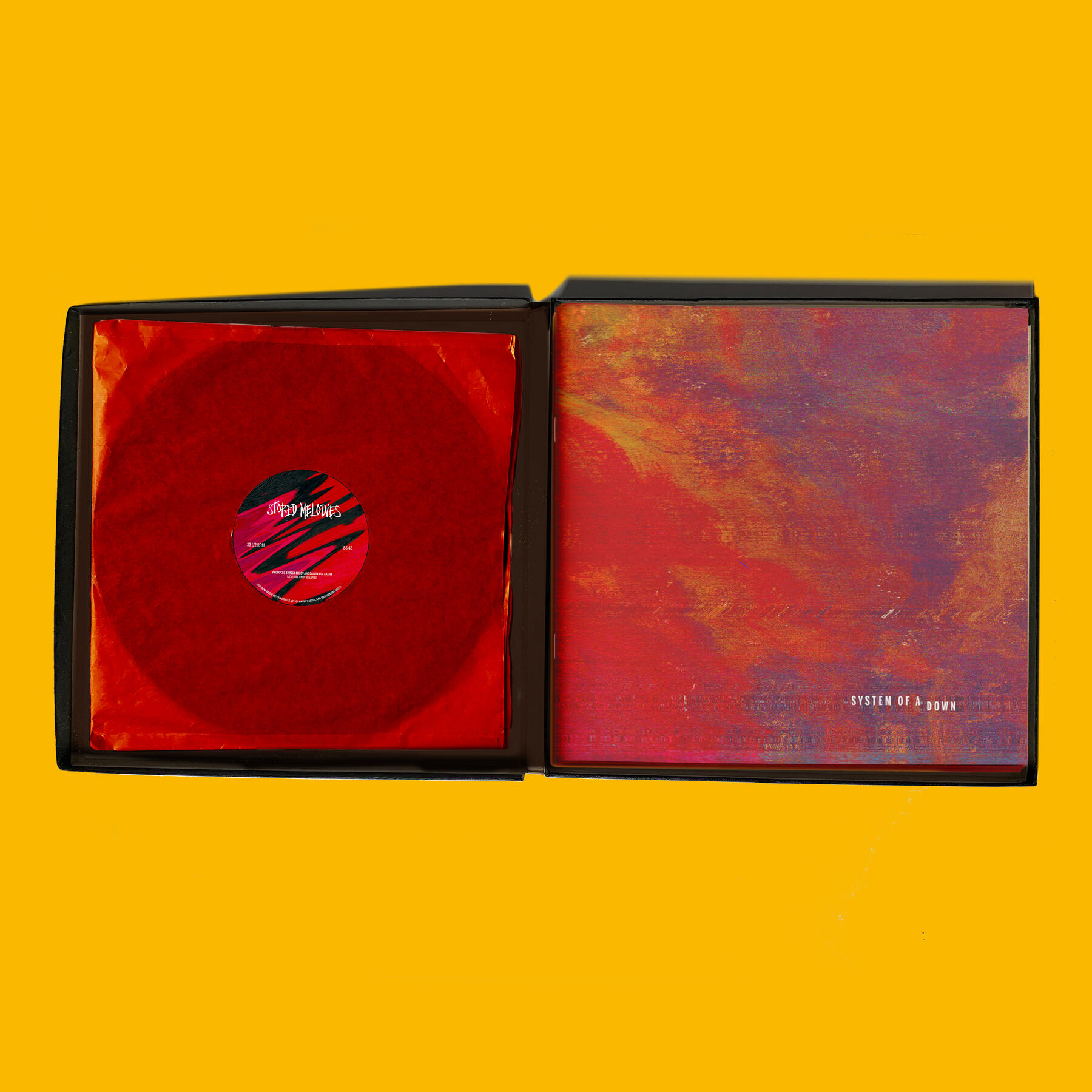
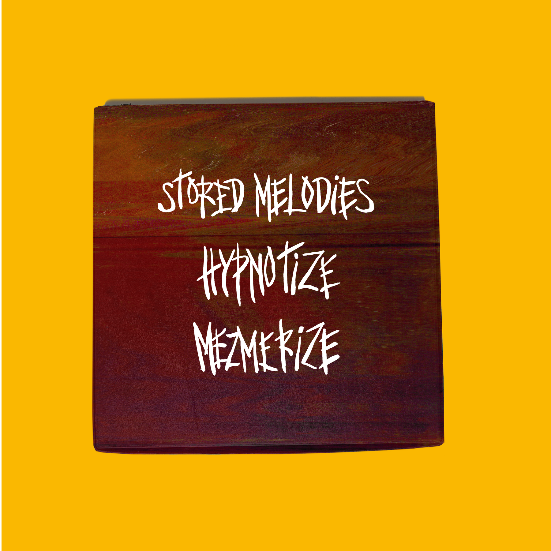
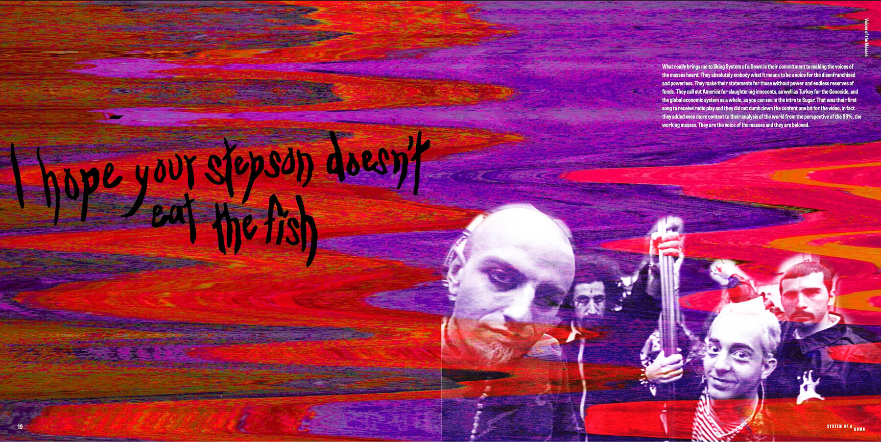
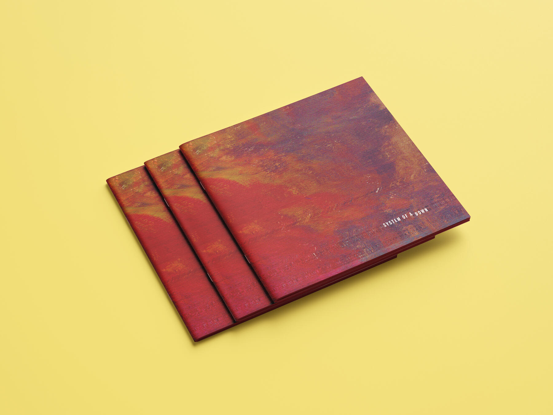
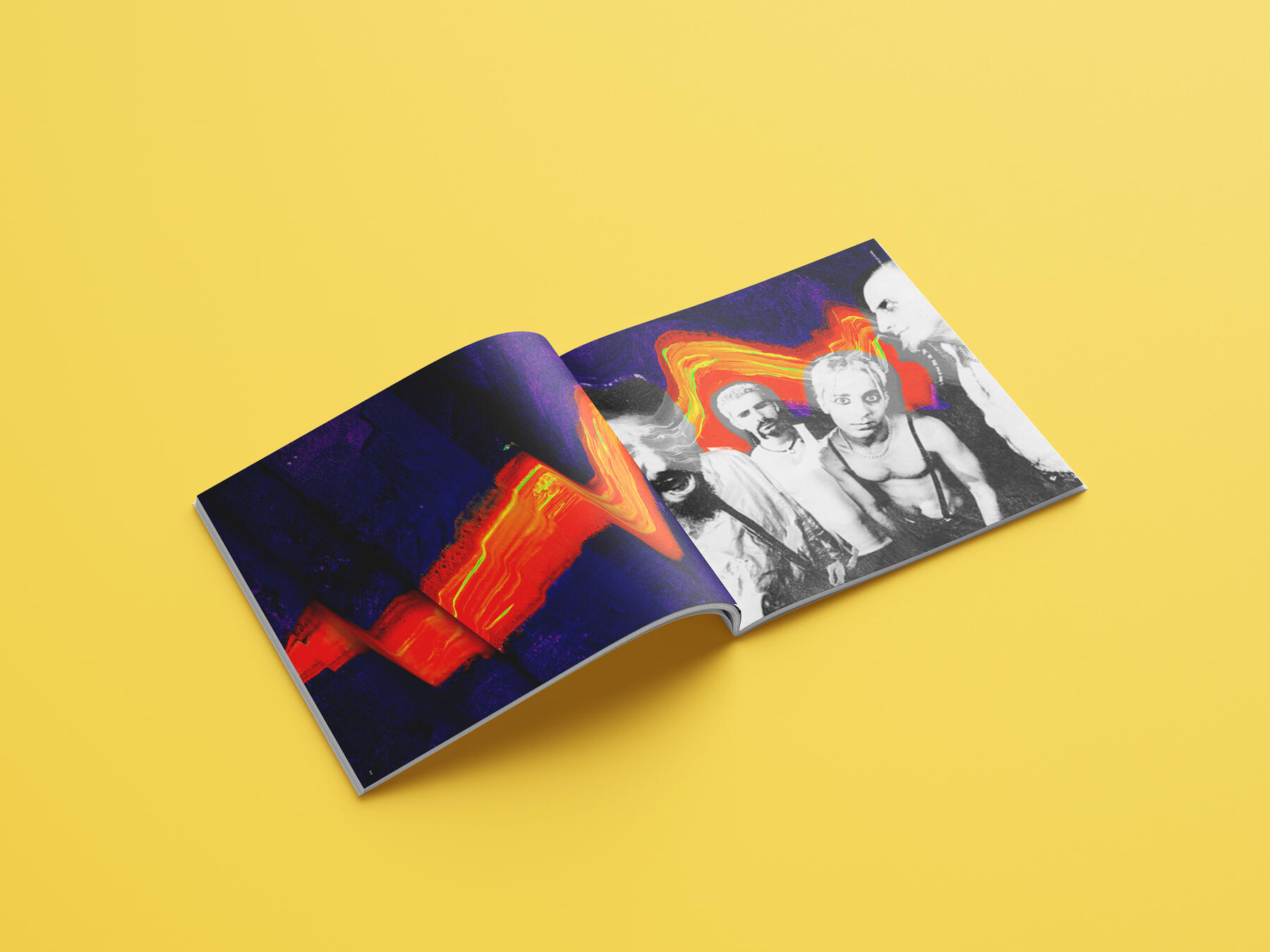
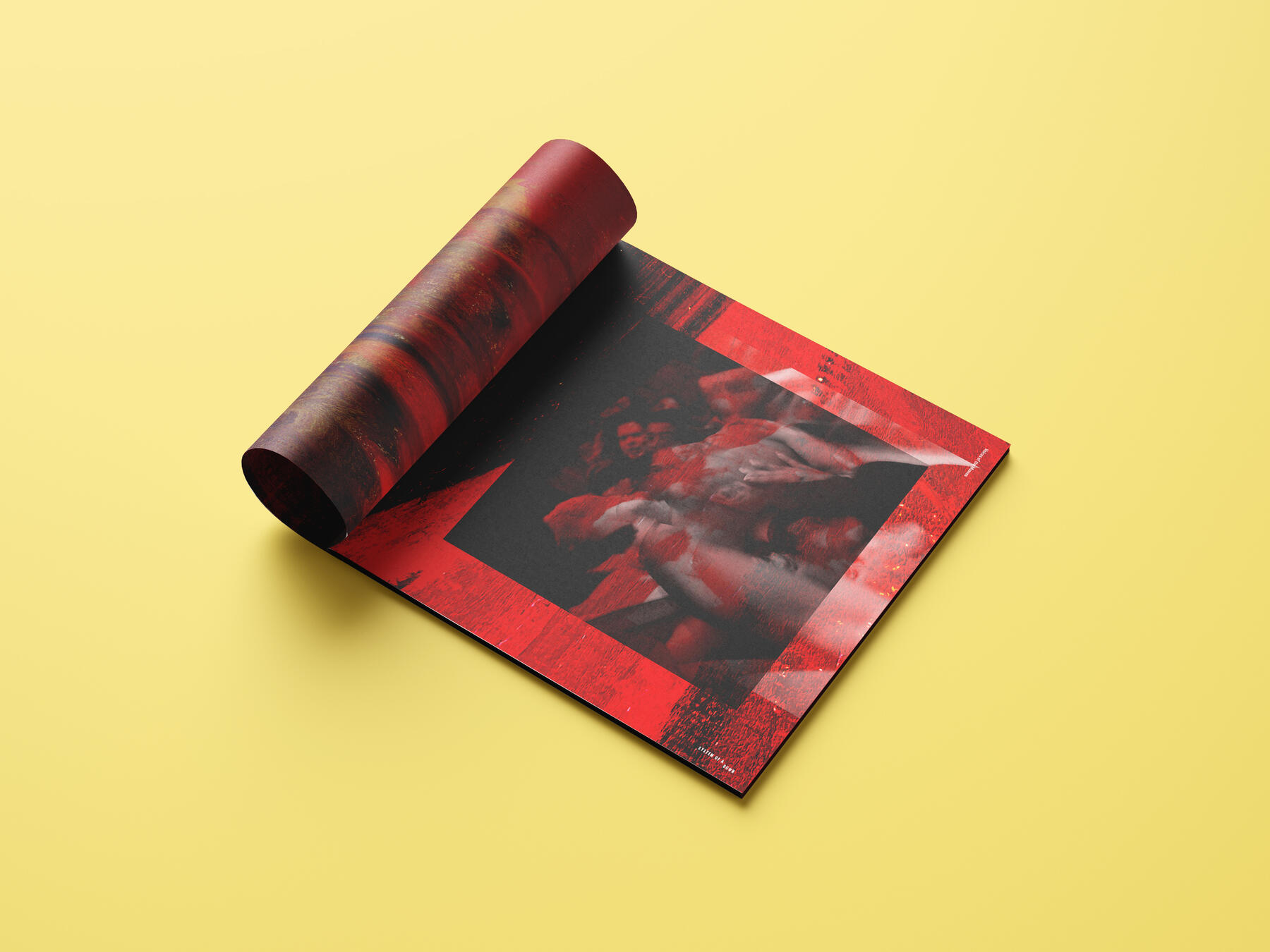
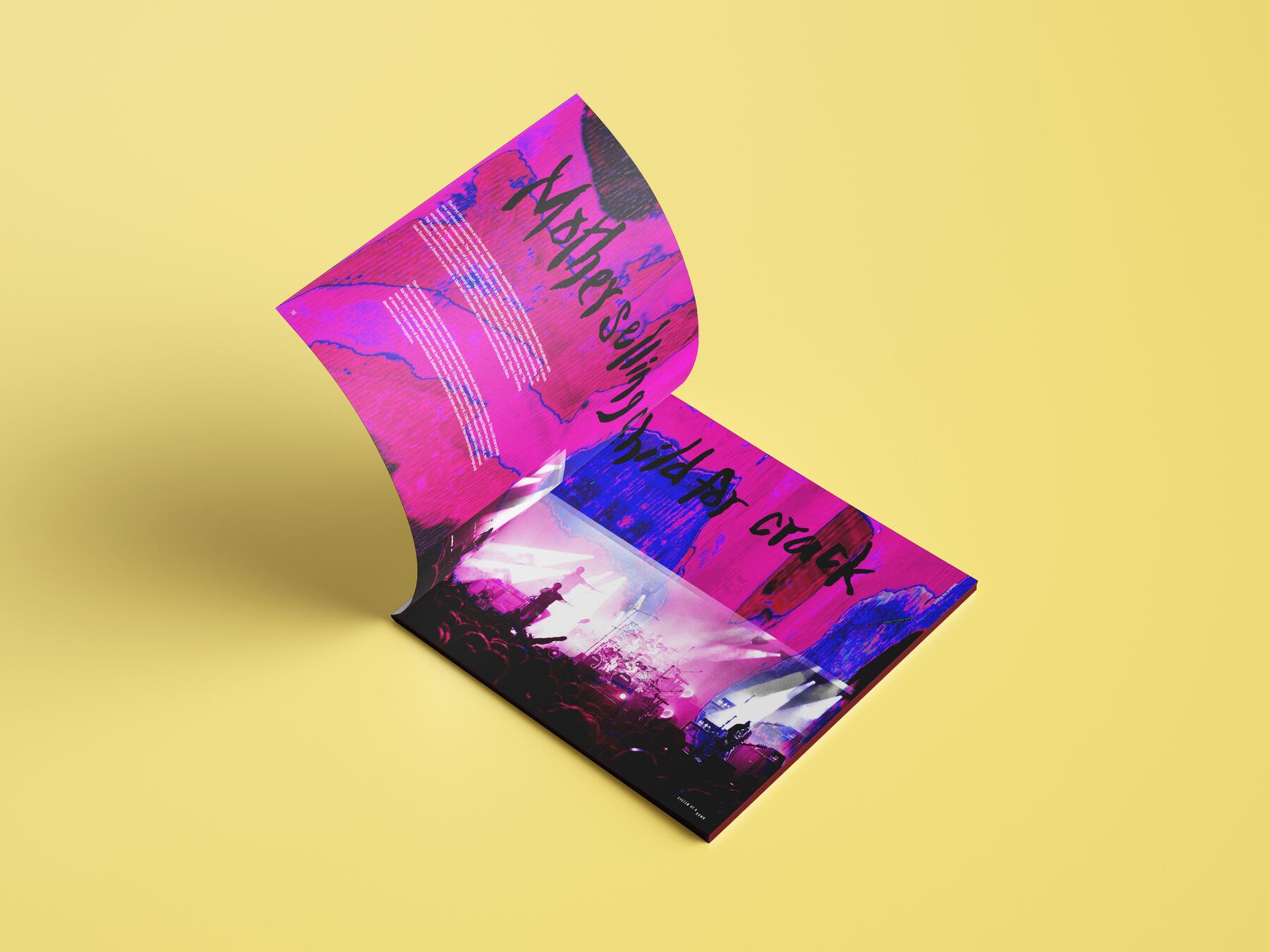
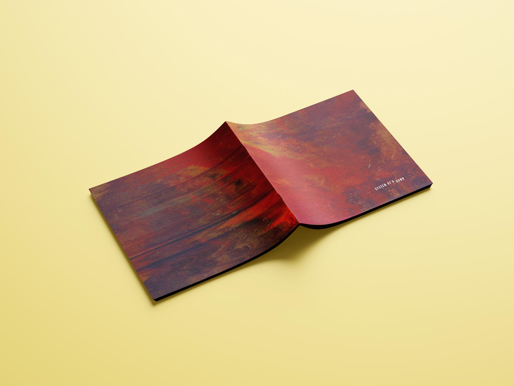
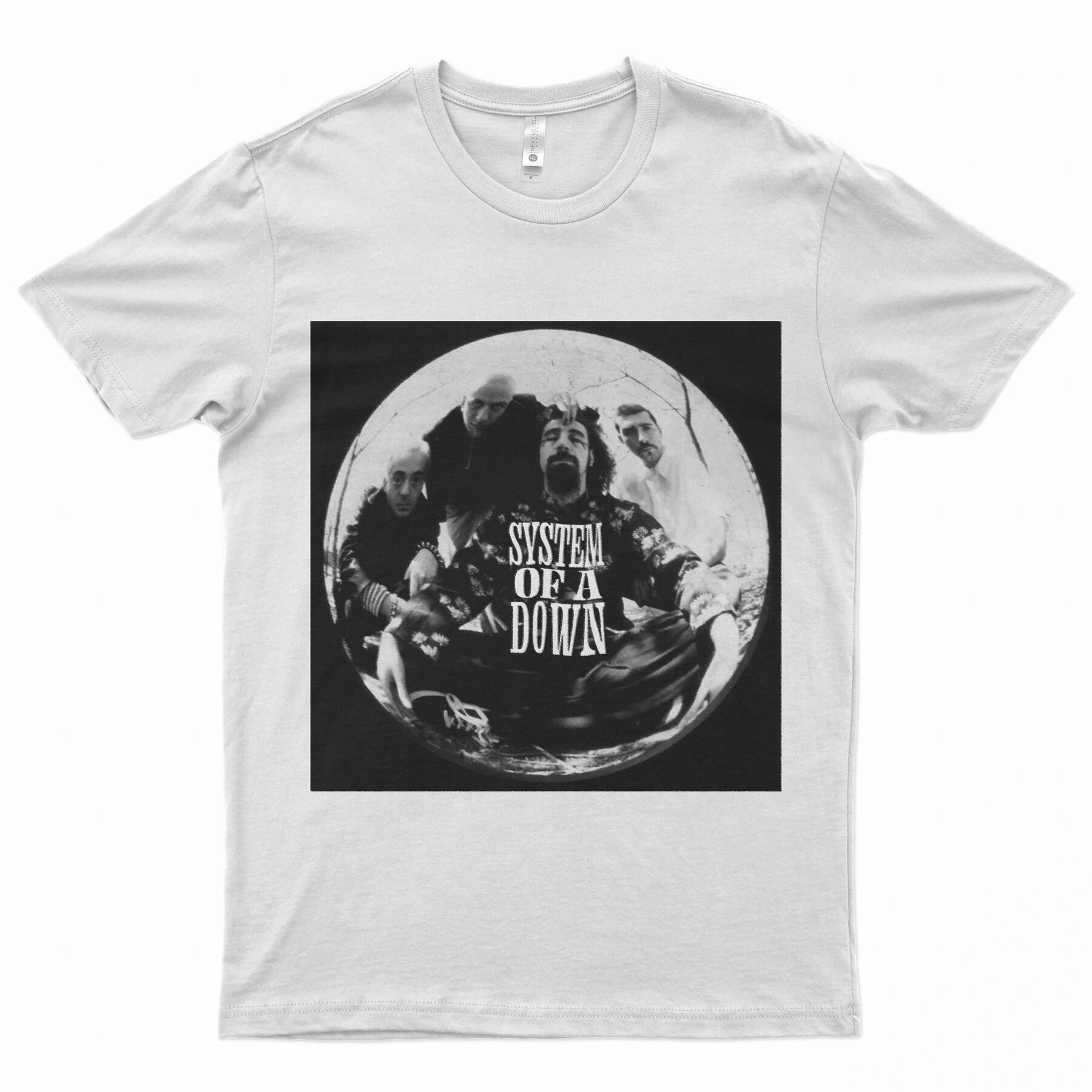
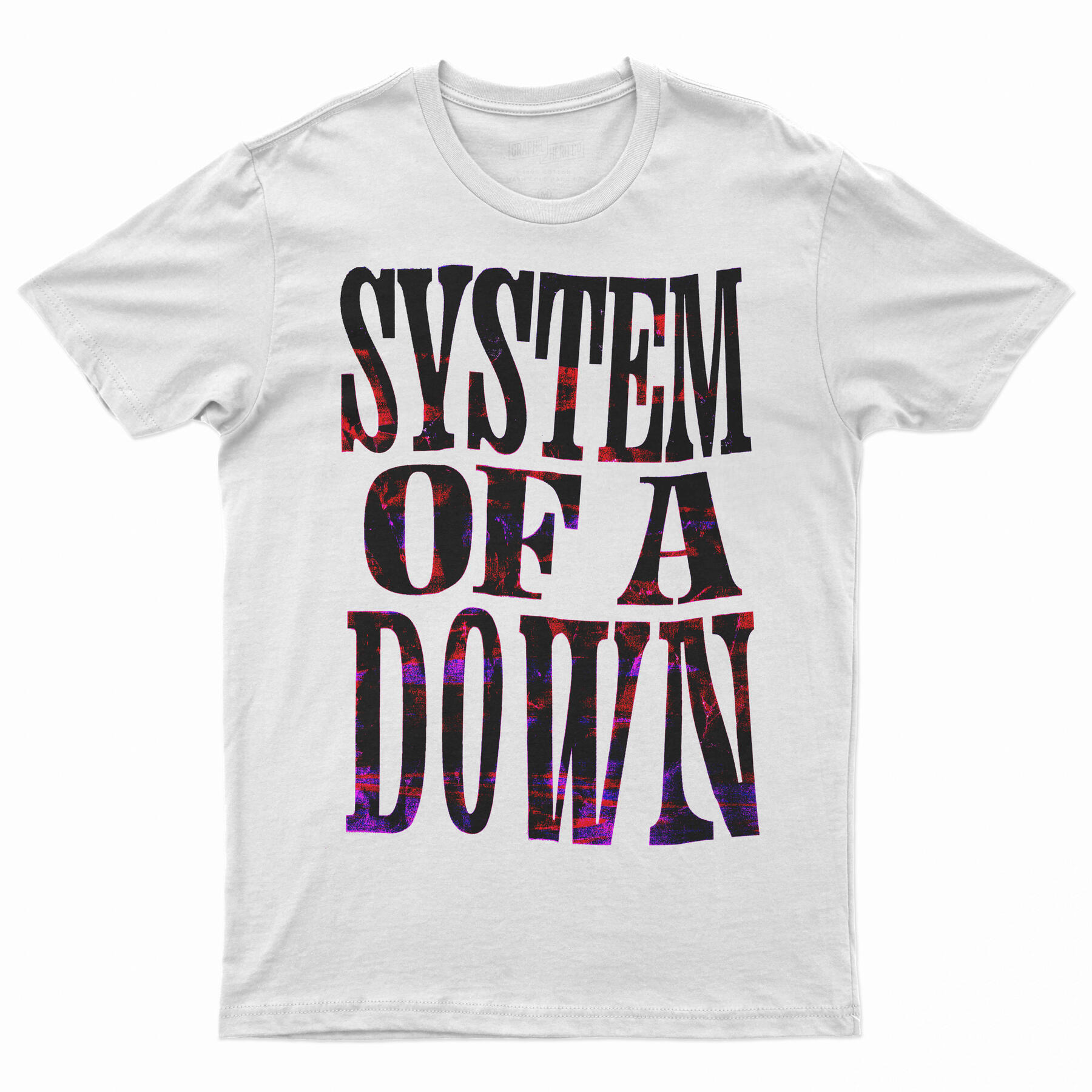
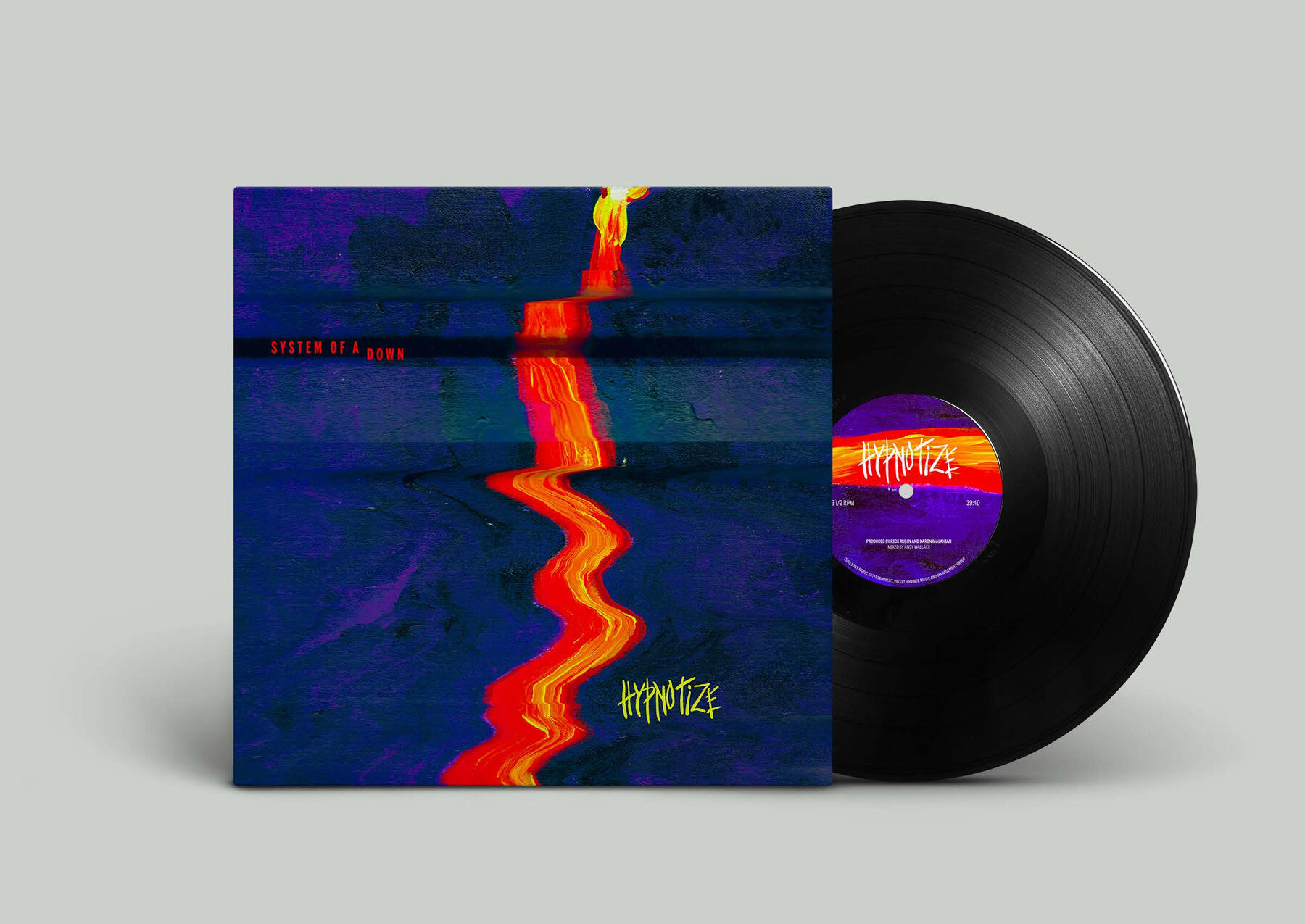
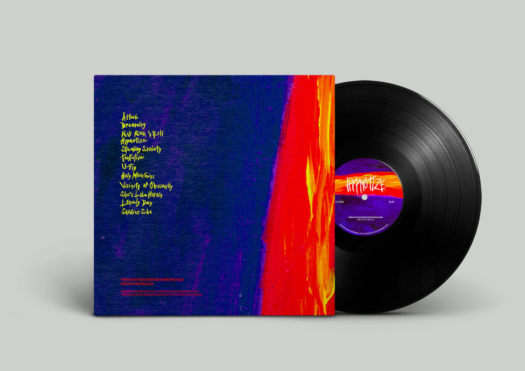
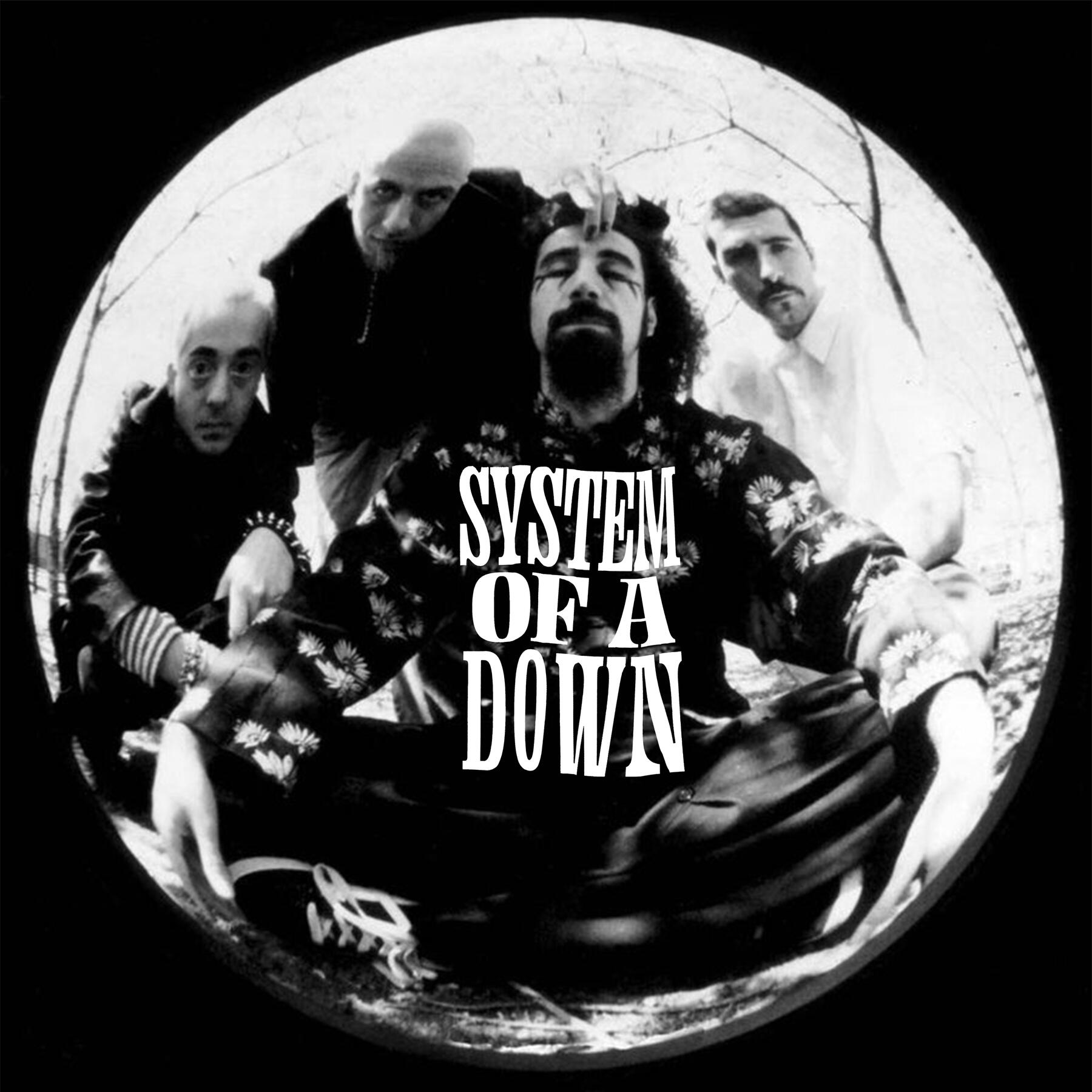
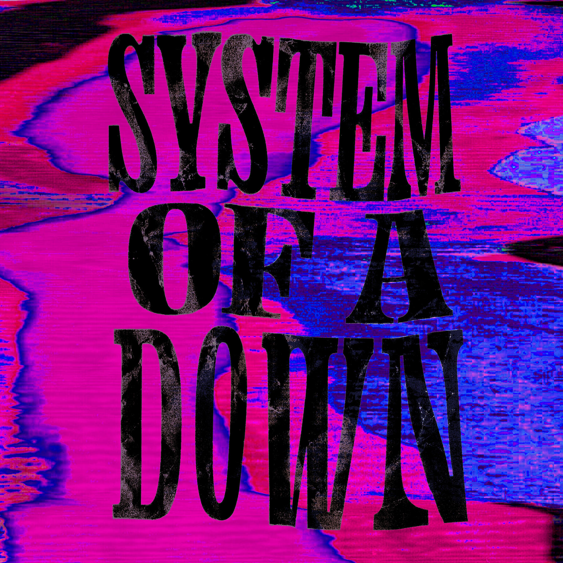
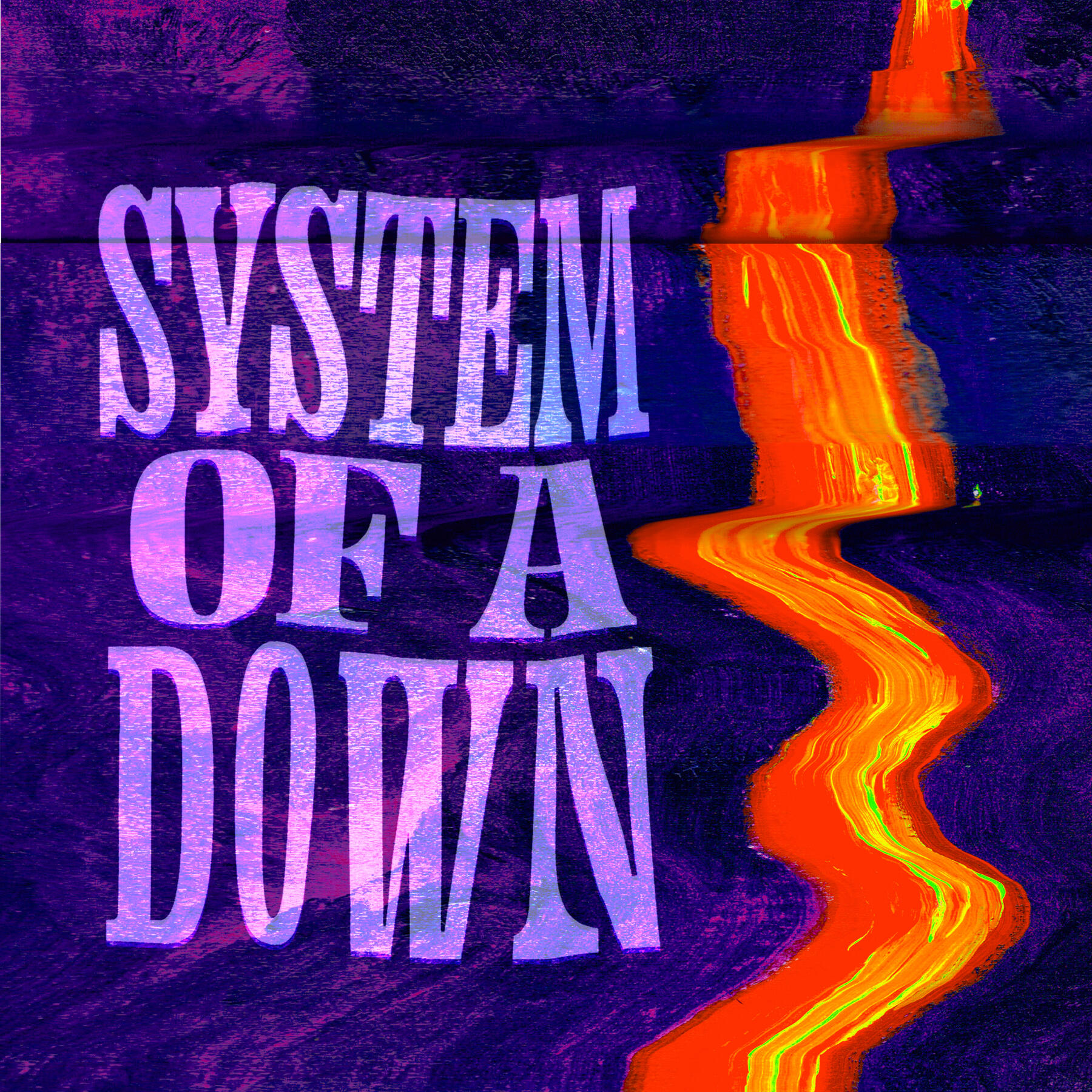
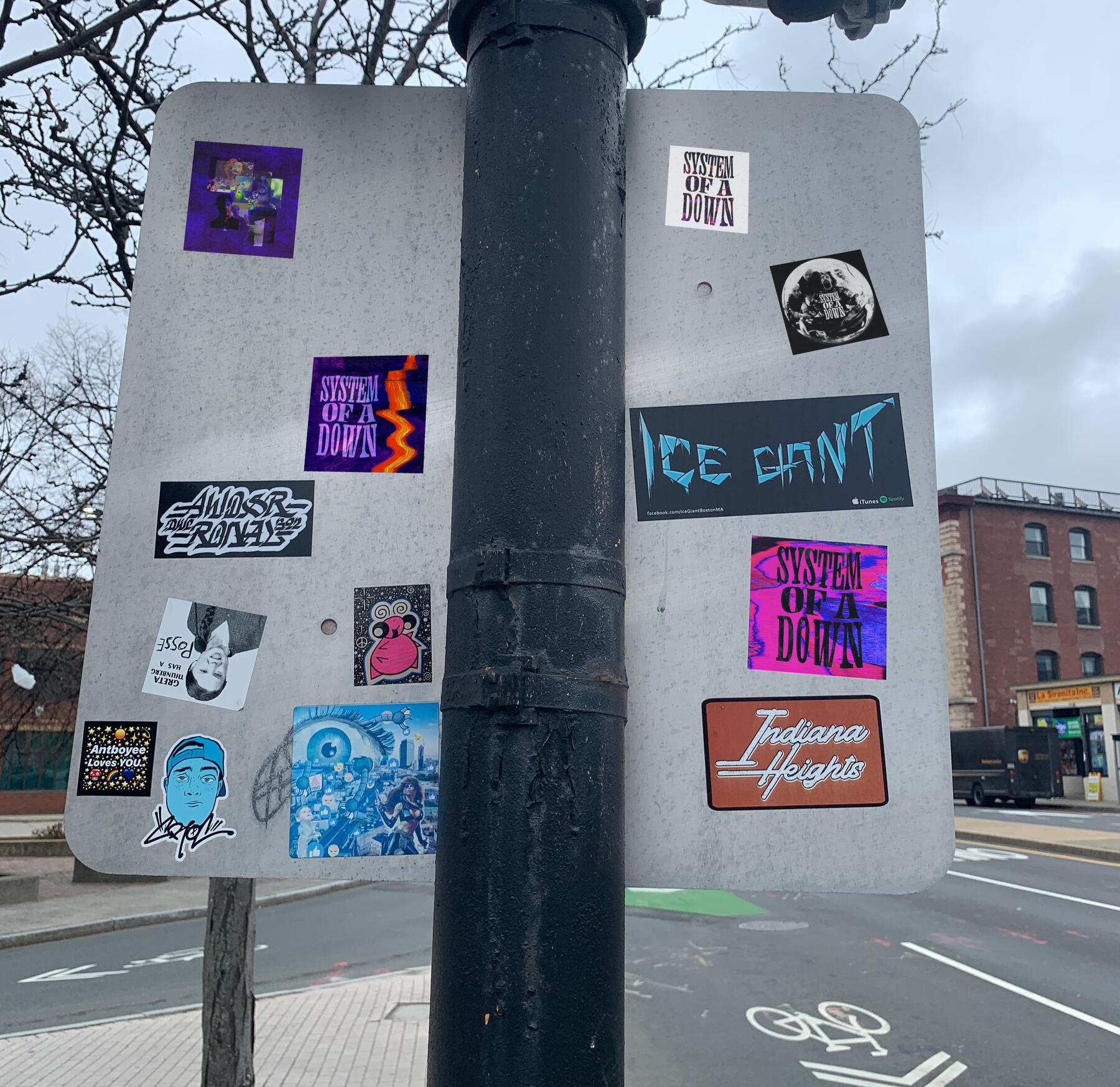
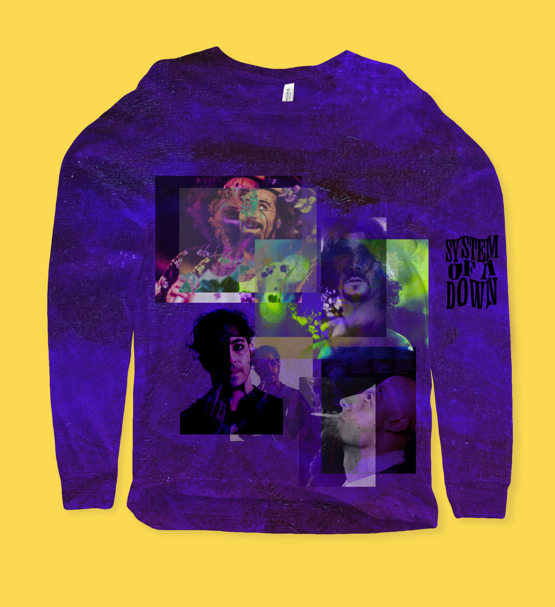
System of a Down Box Set — A Rebranding Exercise
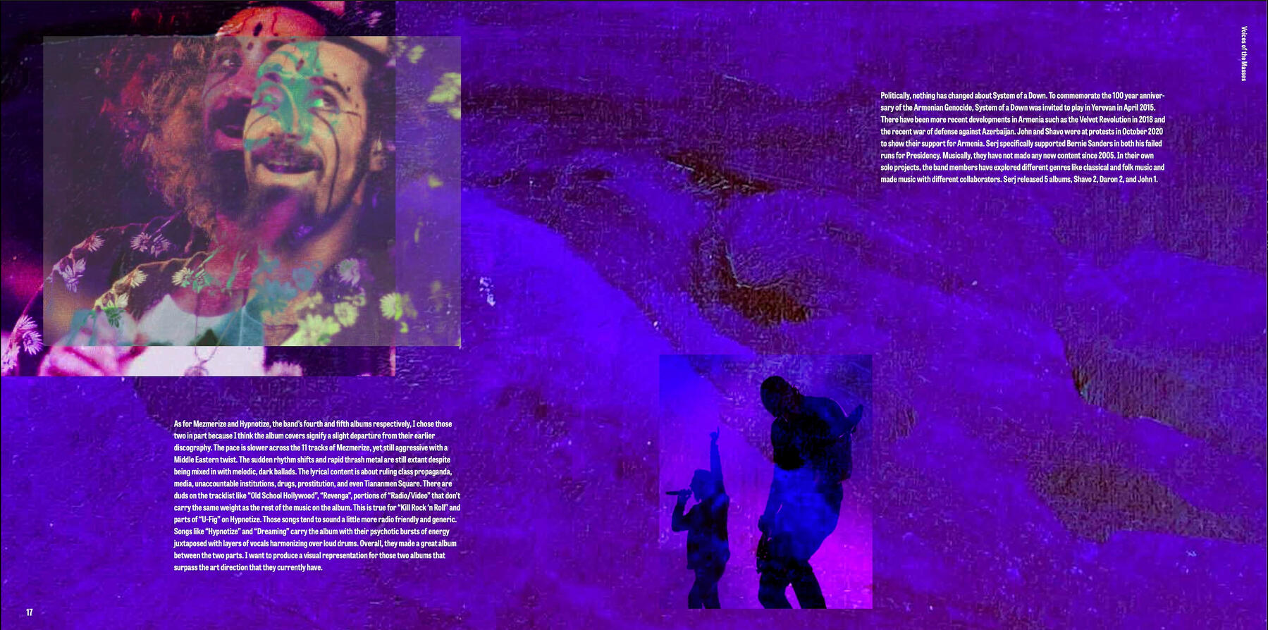
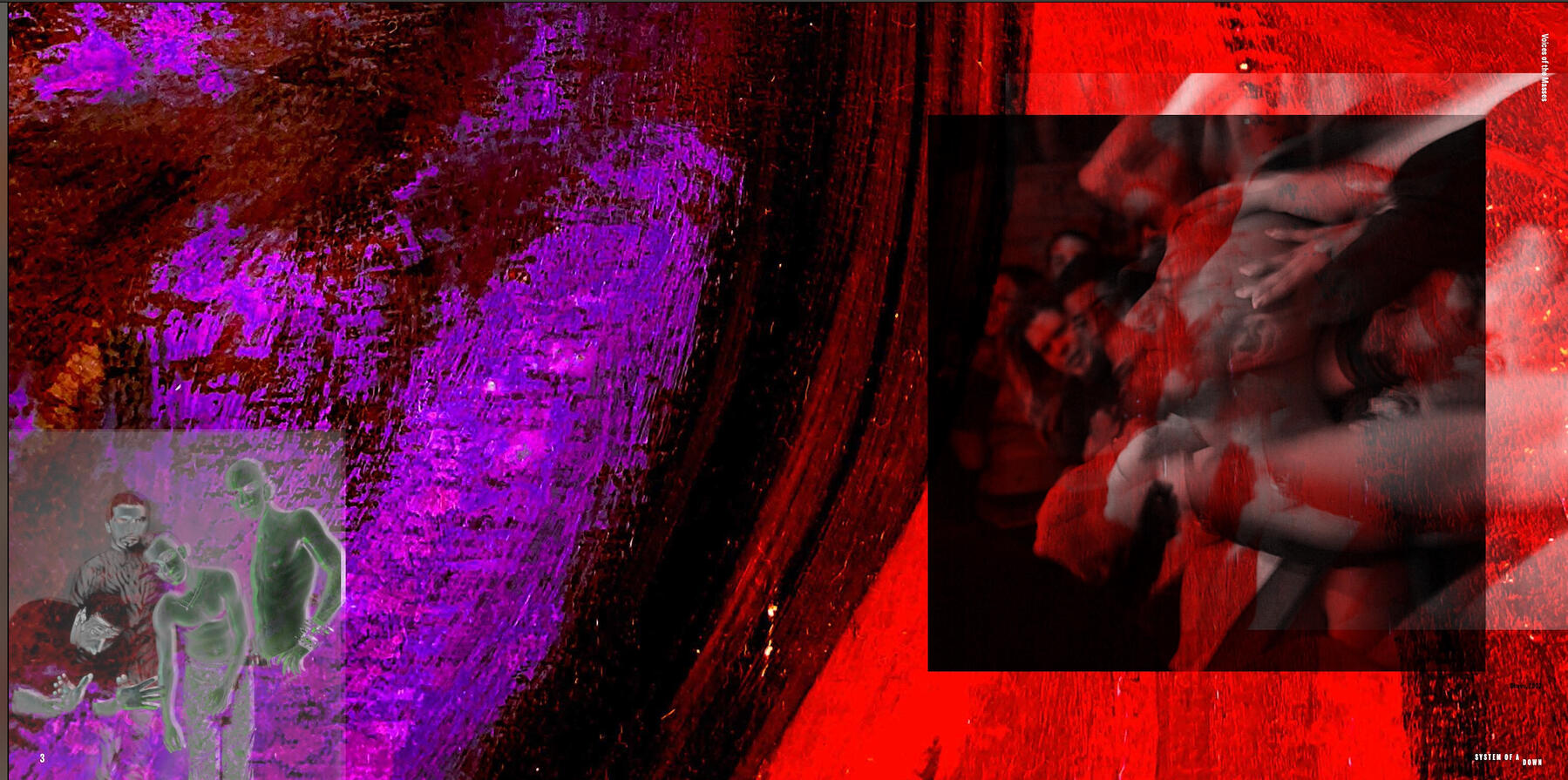
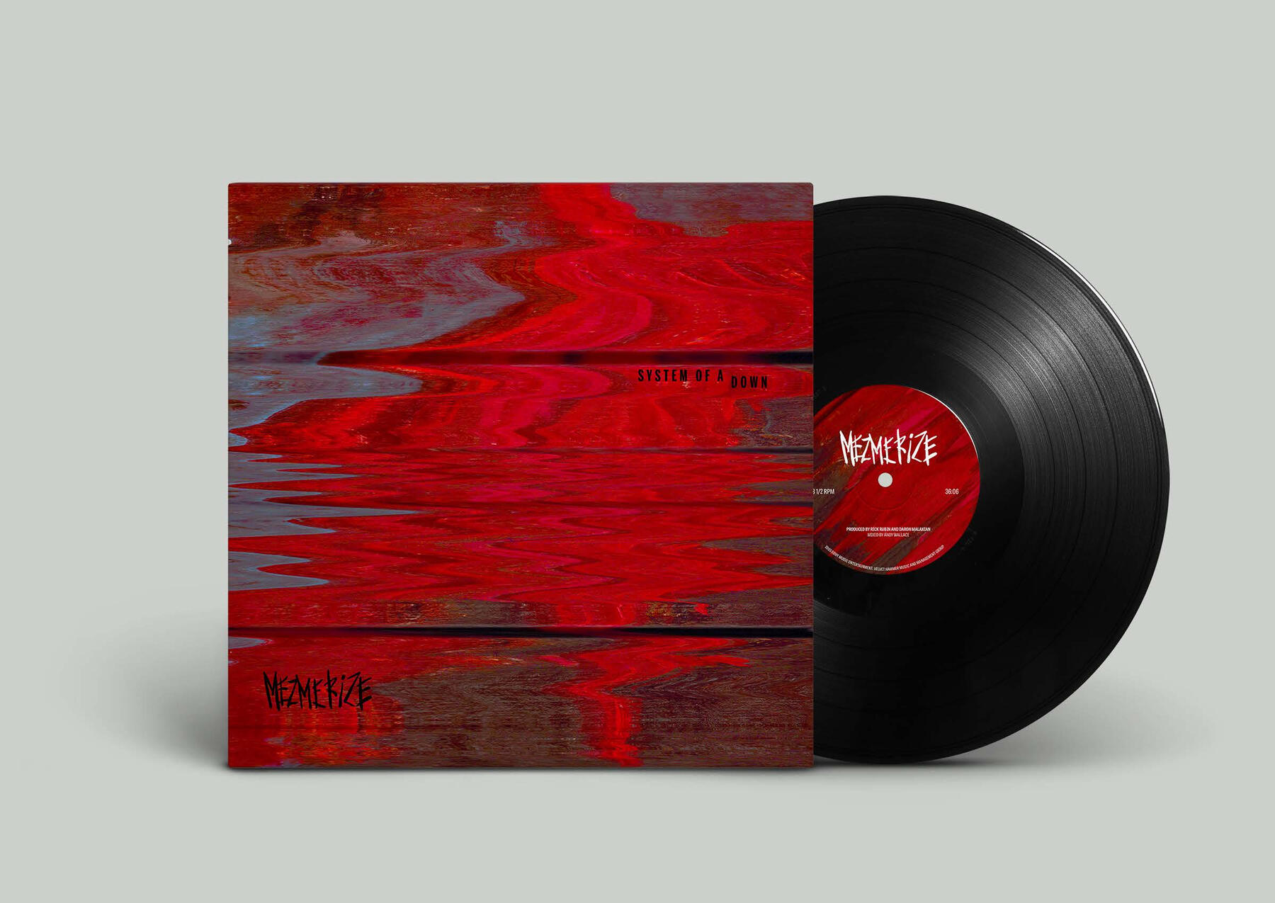
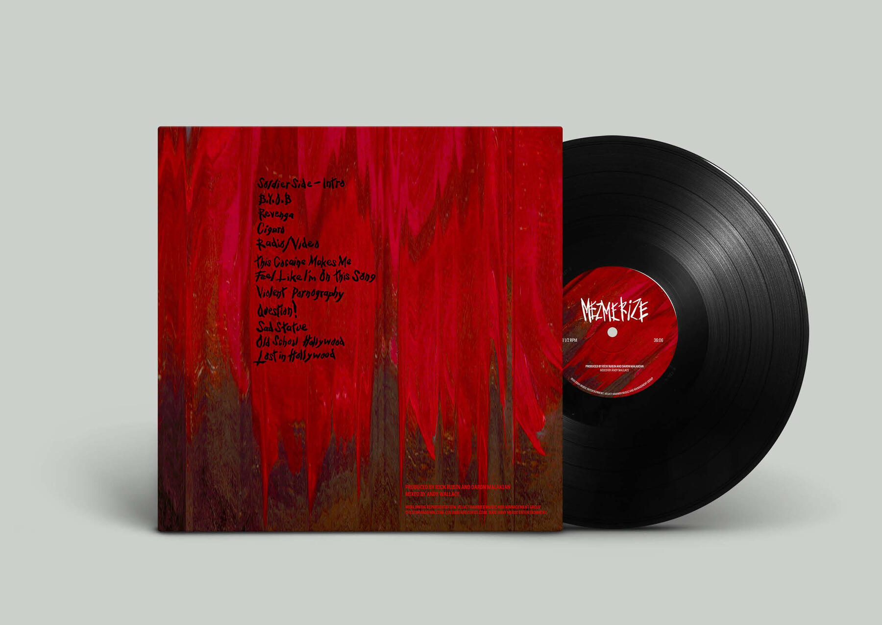
The nature of the assignment was to choose an artist or band and make a box set for 3 albums. I chose Armenian-American nu-metal band System of a Down, known for their emphatic lyrics. I selected three of their projects: Stored Melodies (an unreleased B-sides album), Mezmerize, & Hypnotize. I reimagined their logo and then created the design for the box set, the front and back covers, the inside slip cover, the record stickers, and the catalog. I added merchandise, specifically long sleeve shirts, short sleeve shirts, and stickers.2021
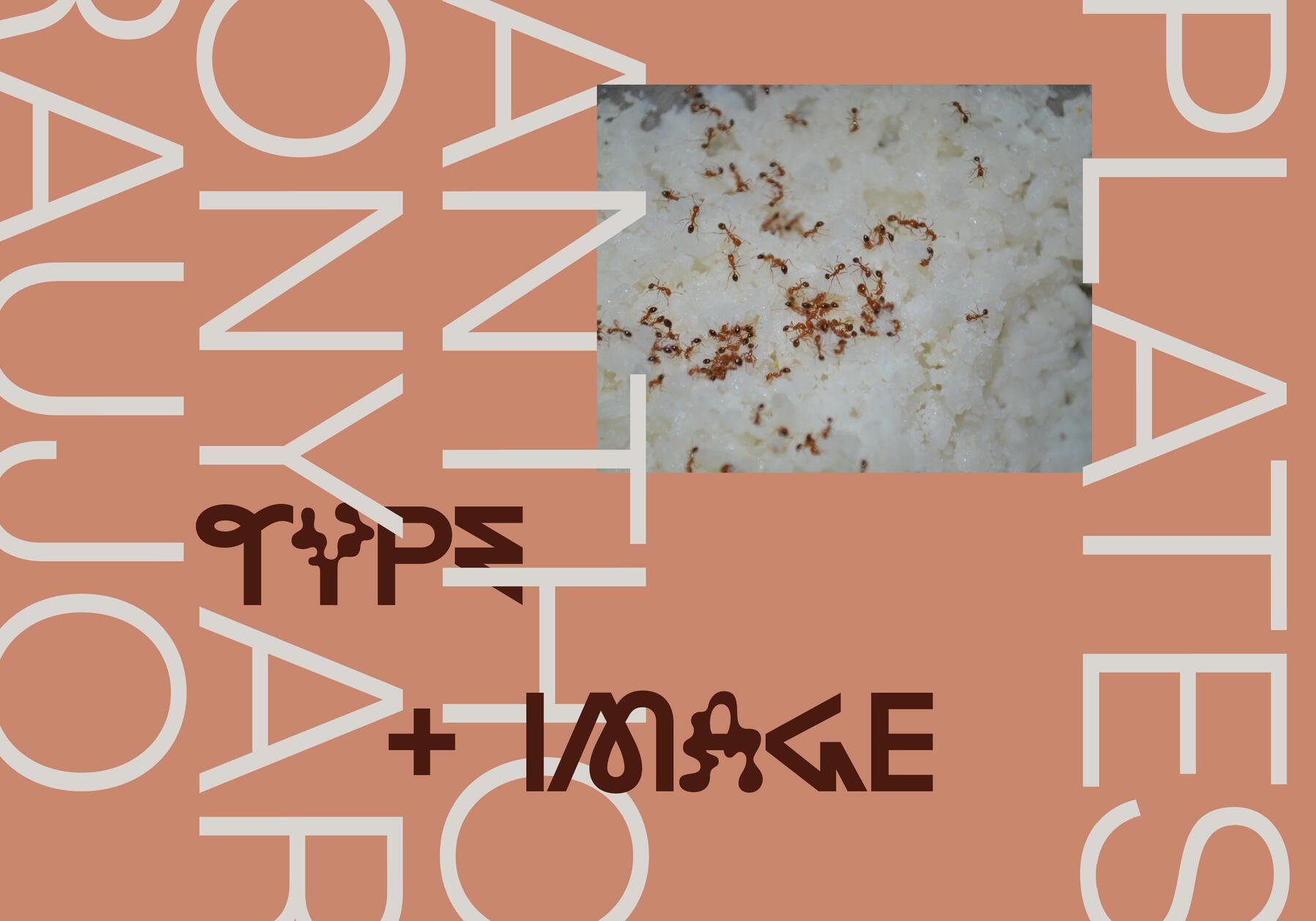
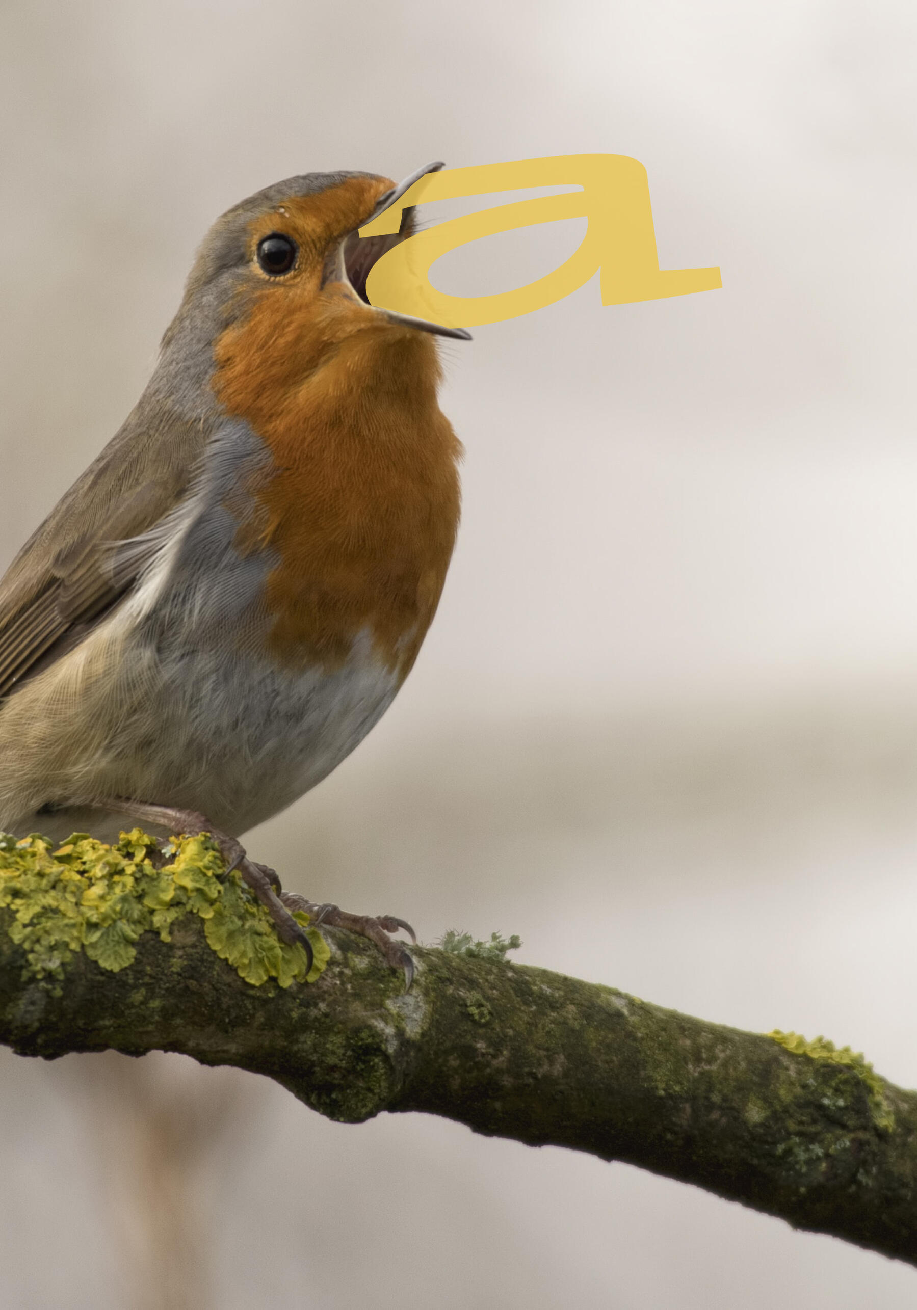
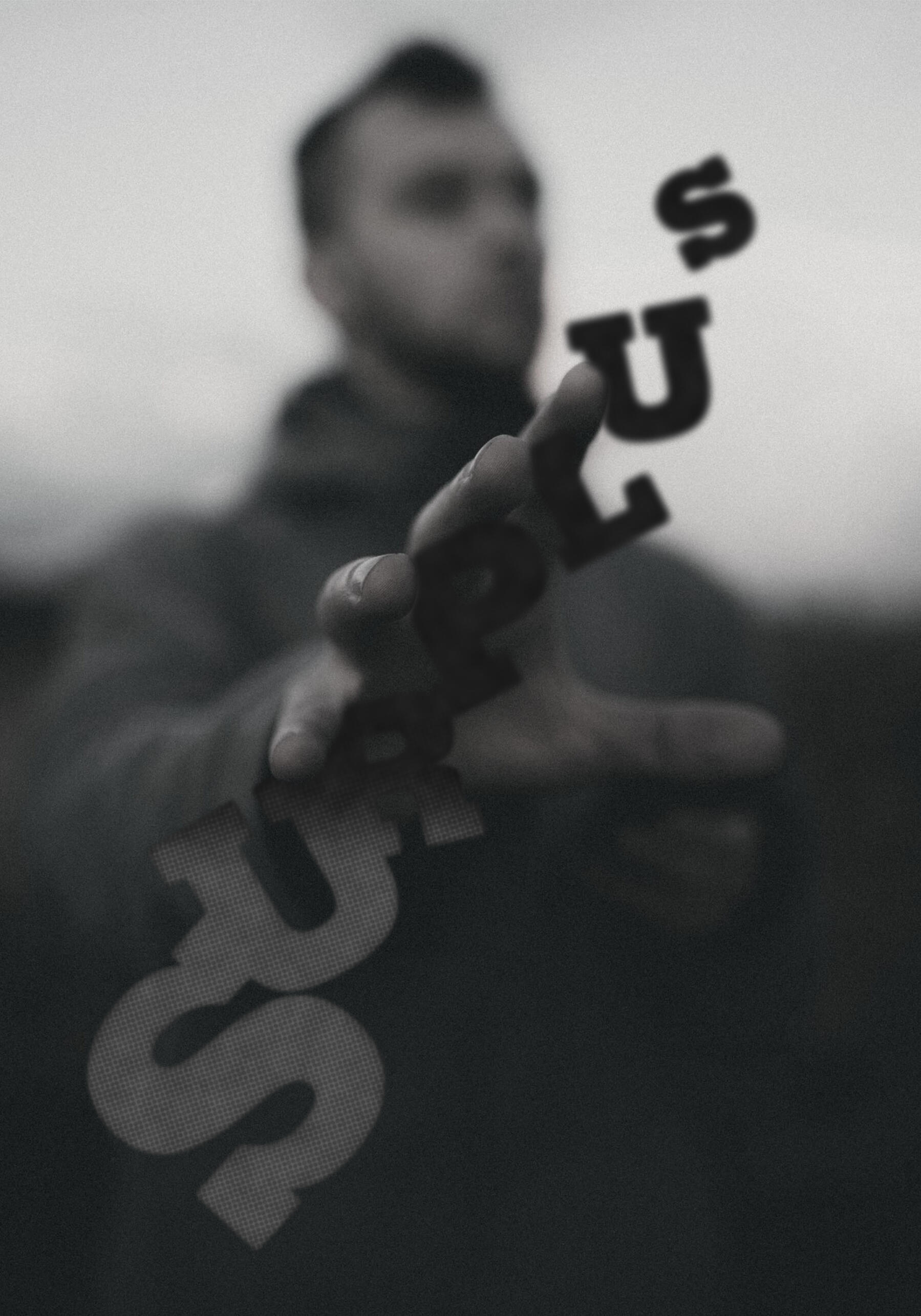
Type & Image Plates — A Visual Exercise
The prompt was to create a series of images that incorporate typography in a literal and visual way, not metaphorically. A delightfully quick and simple assignment originally completed in Typography III, Massachusetts College of Art and Design.2020
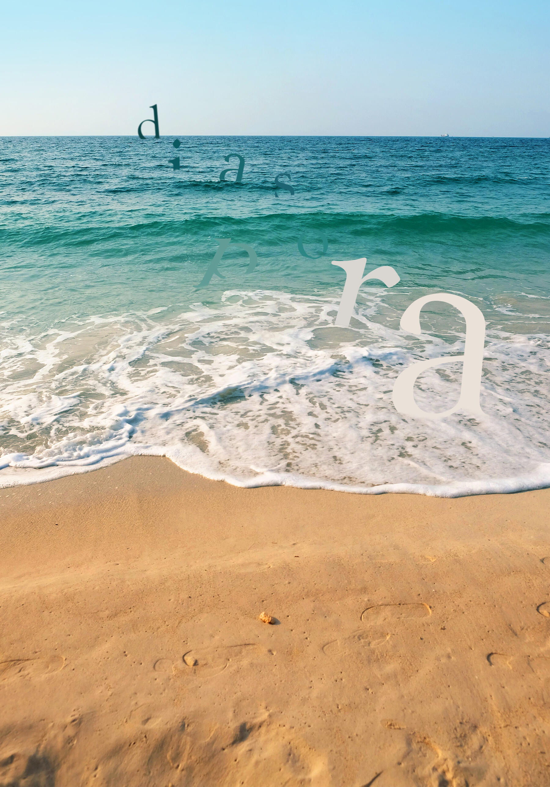
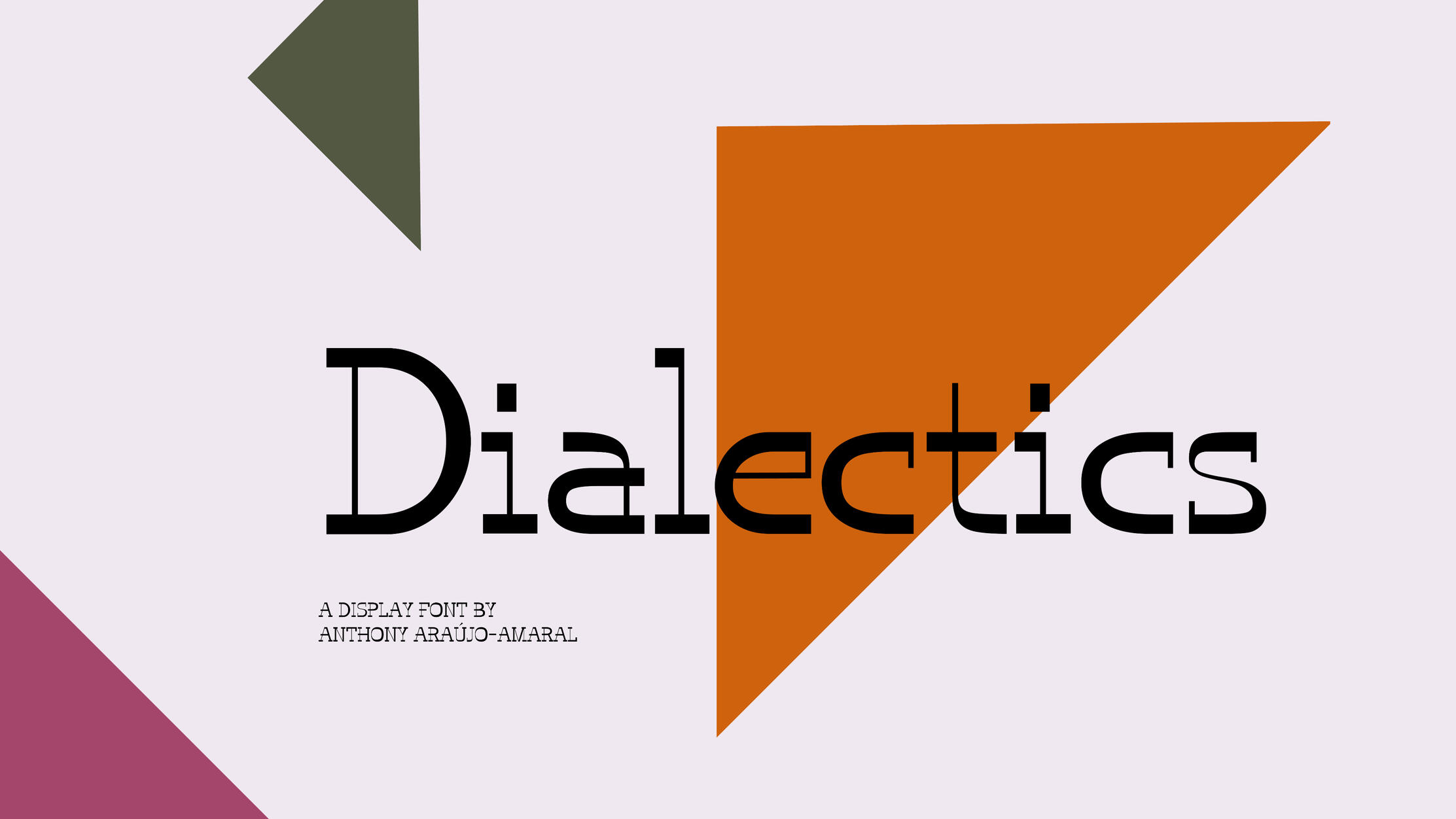
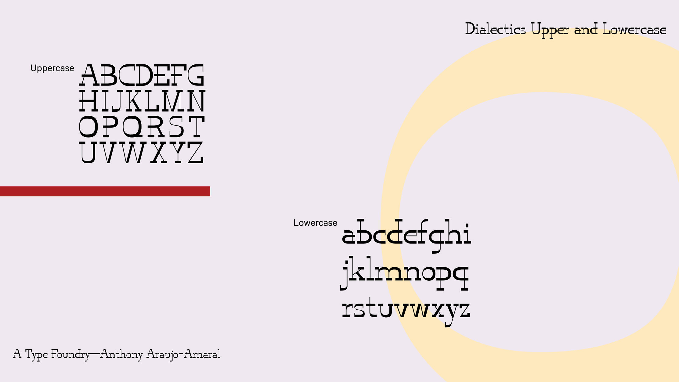
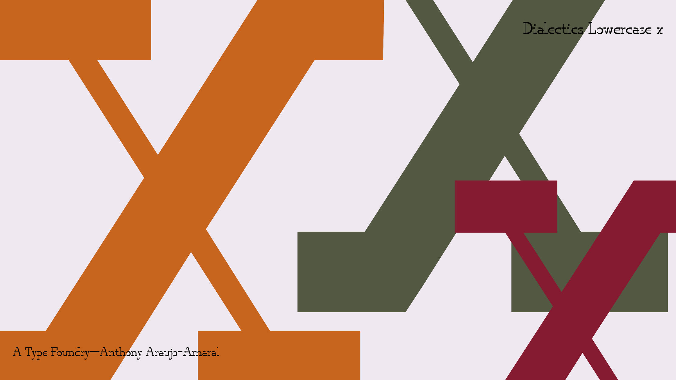
Type Design — Fonts
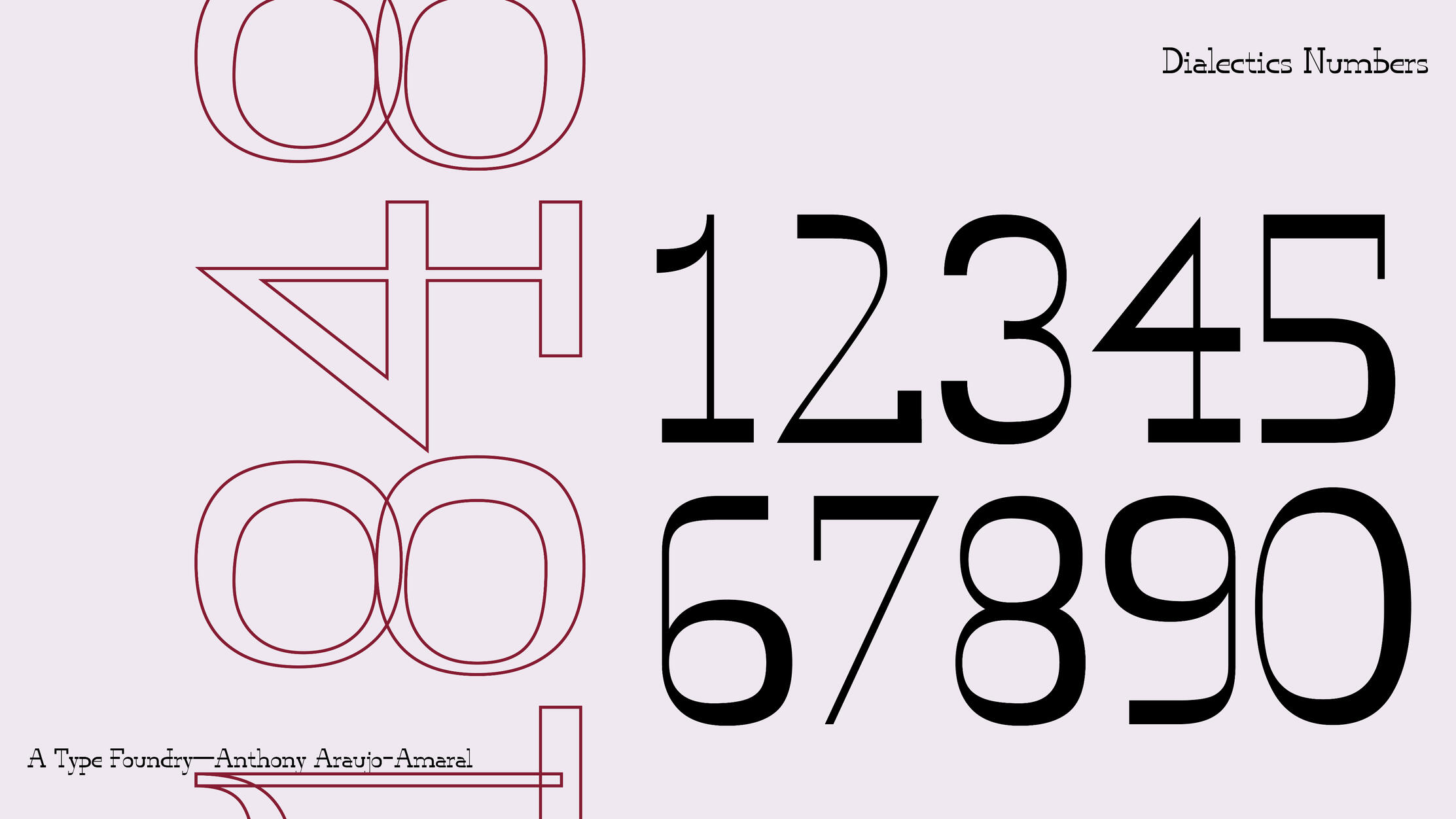
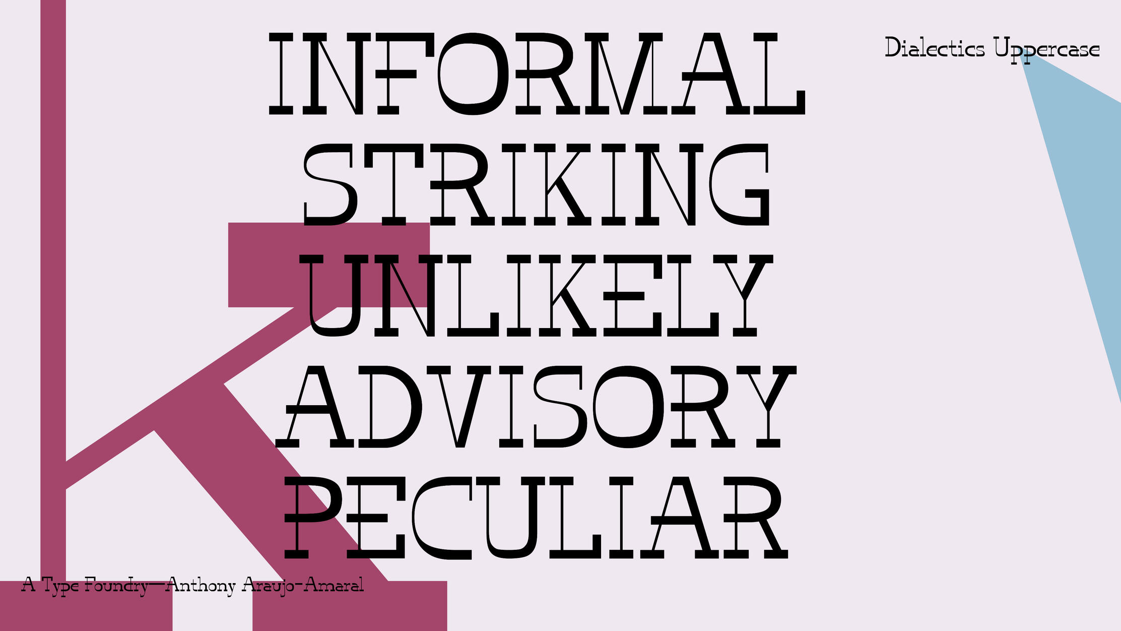
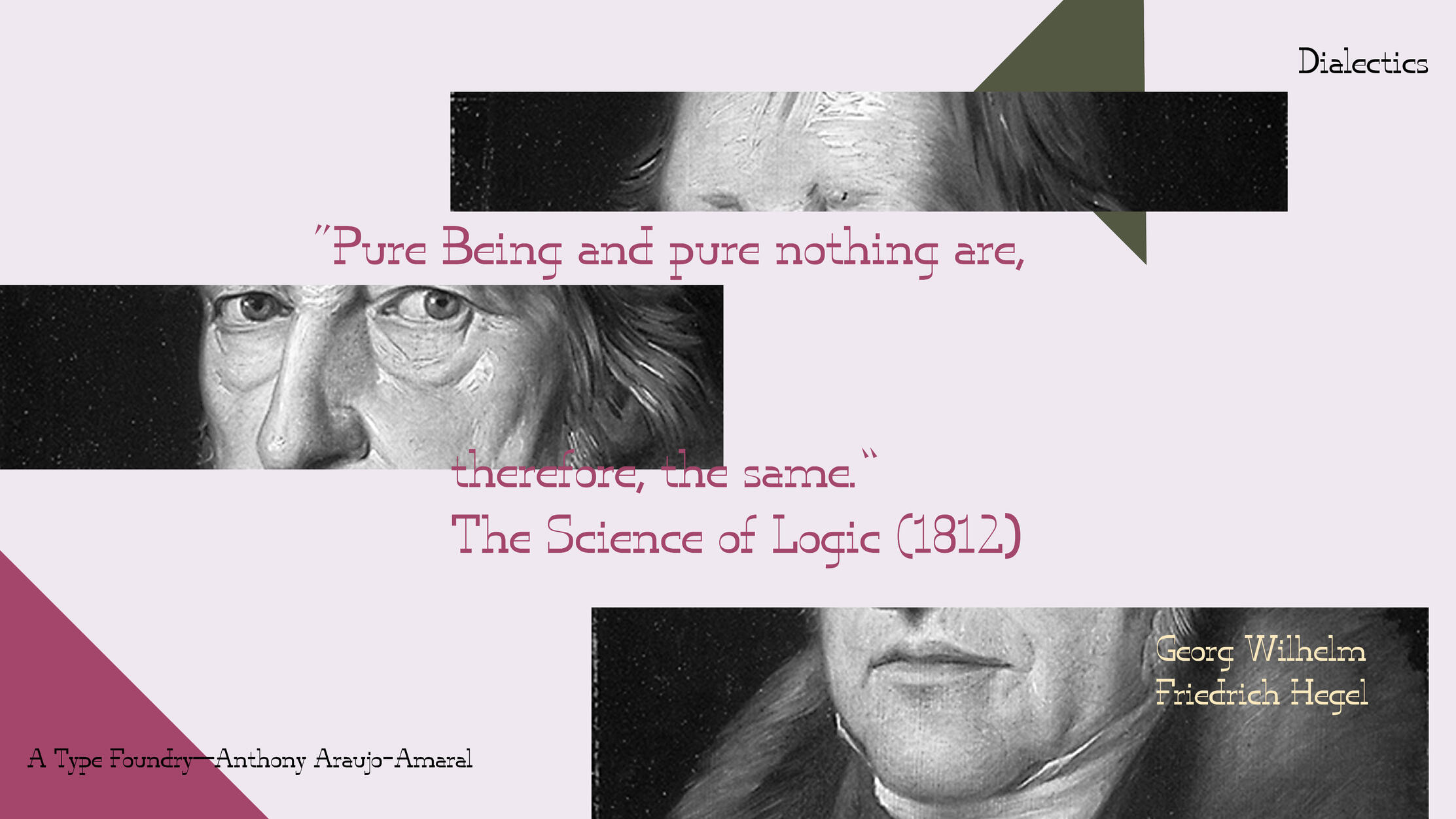
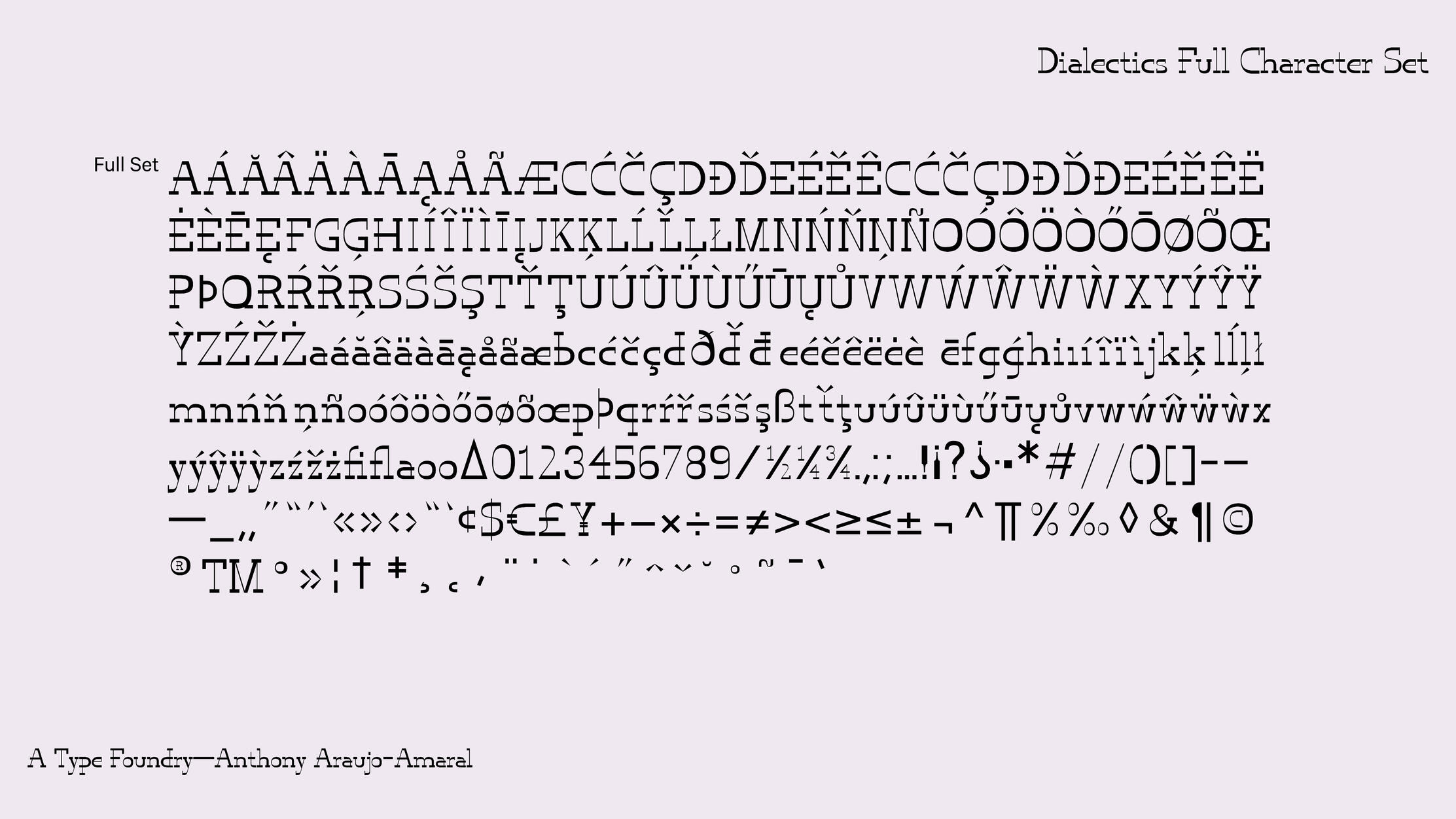
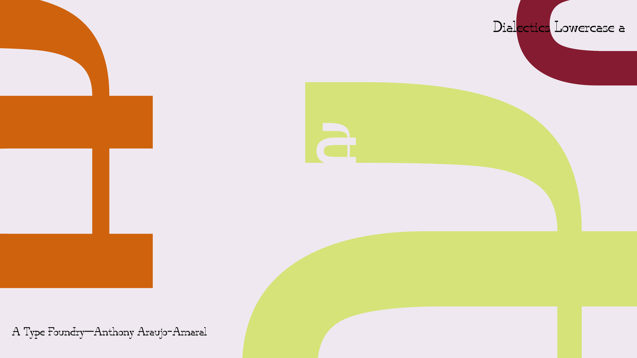
Dialectics
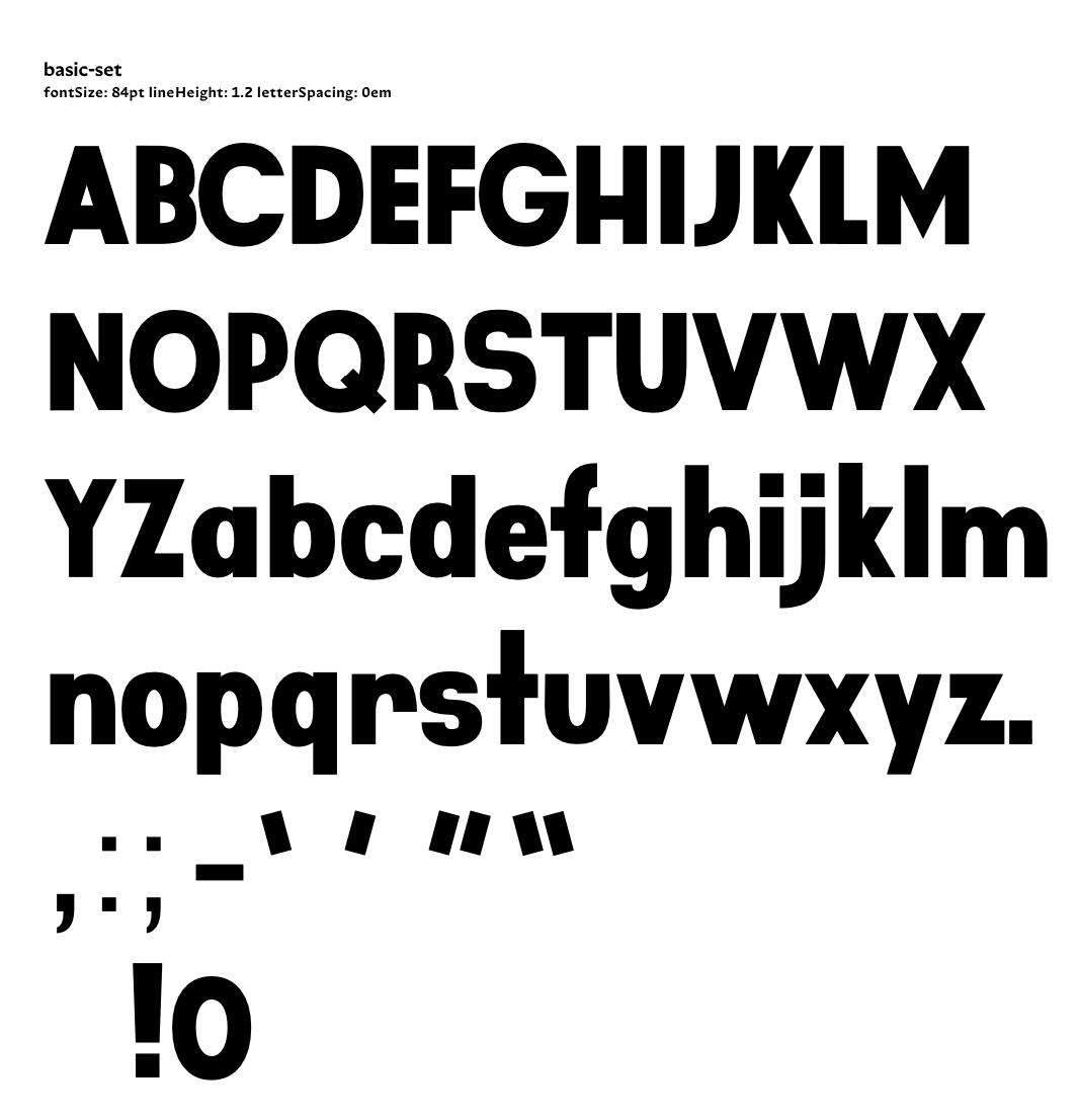
This is the first fully original font I ever made in Type Design with David Jonathan Ross. The nature of the assignment was to create one weight of an original font. The font follows the basic premise of dialectics which is that of change and transformation, usually of quantity into quality, which I tried to show through reverse-stress thicks and thins. That means everywhere a stroke might traditionally be thick, it is now thin. It exists as a .ttf file and a glyphs file.
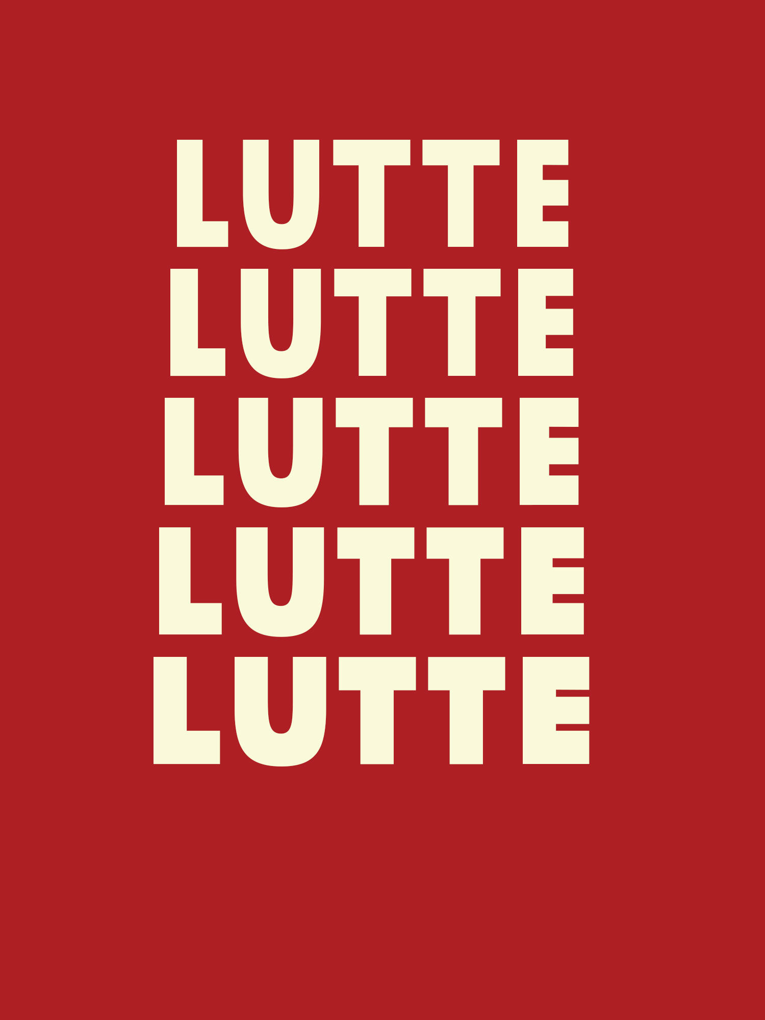
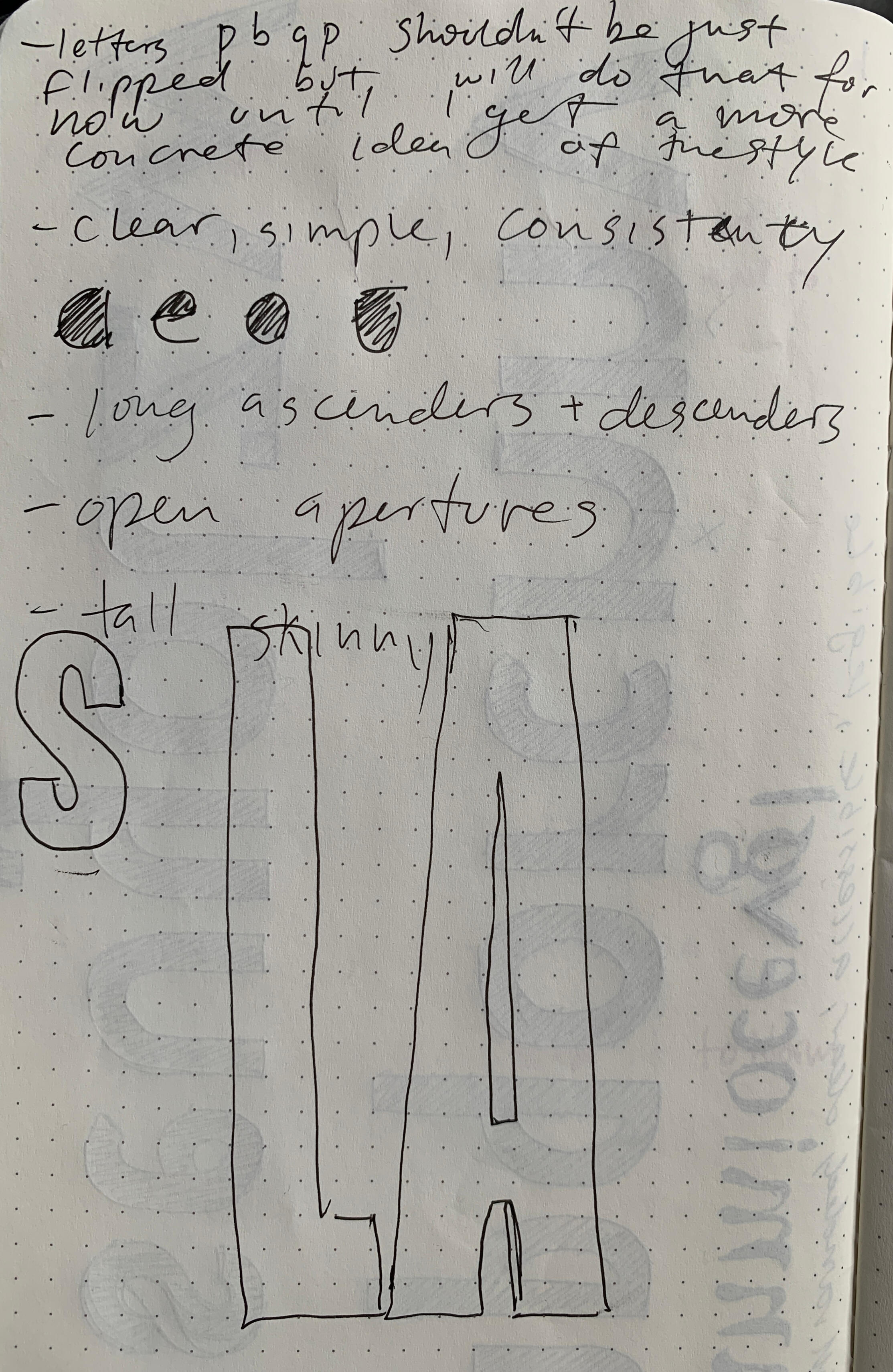
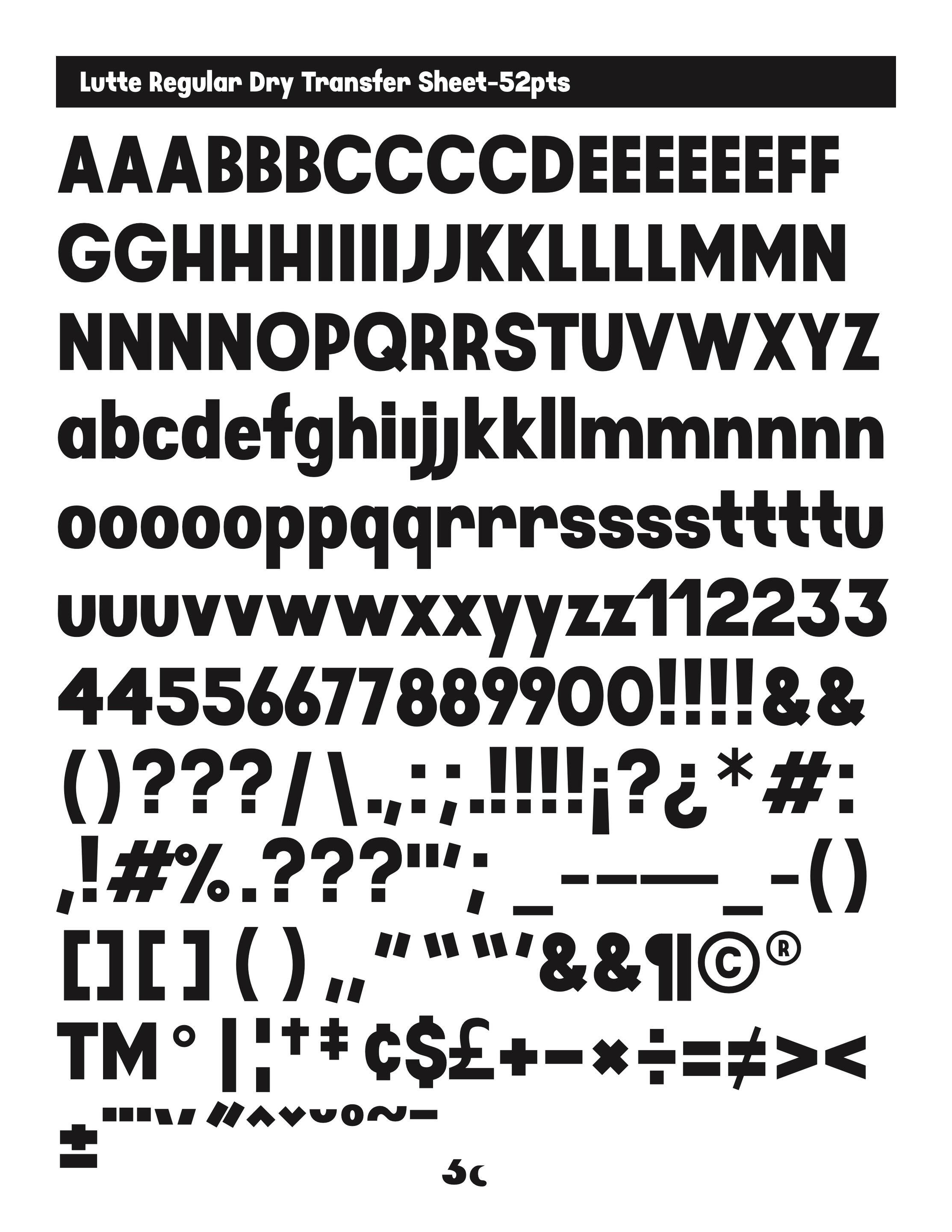
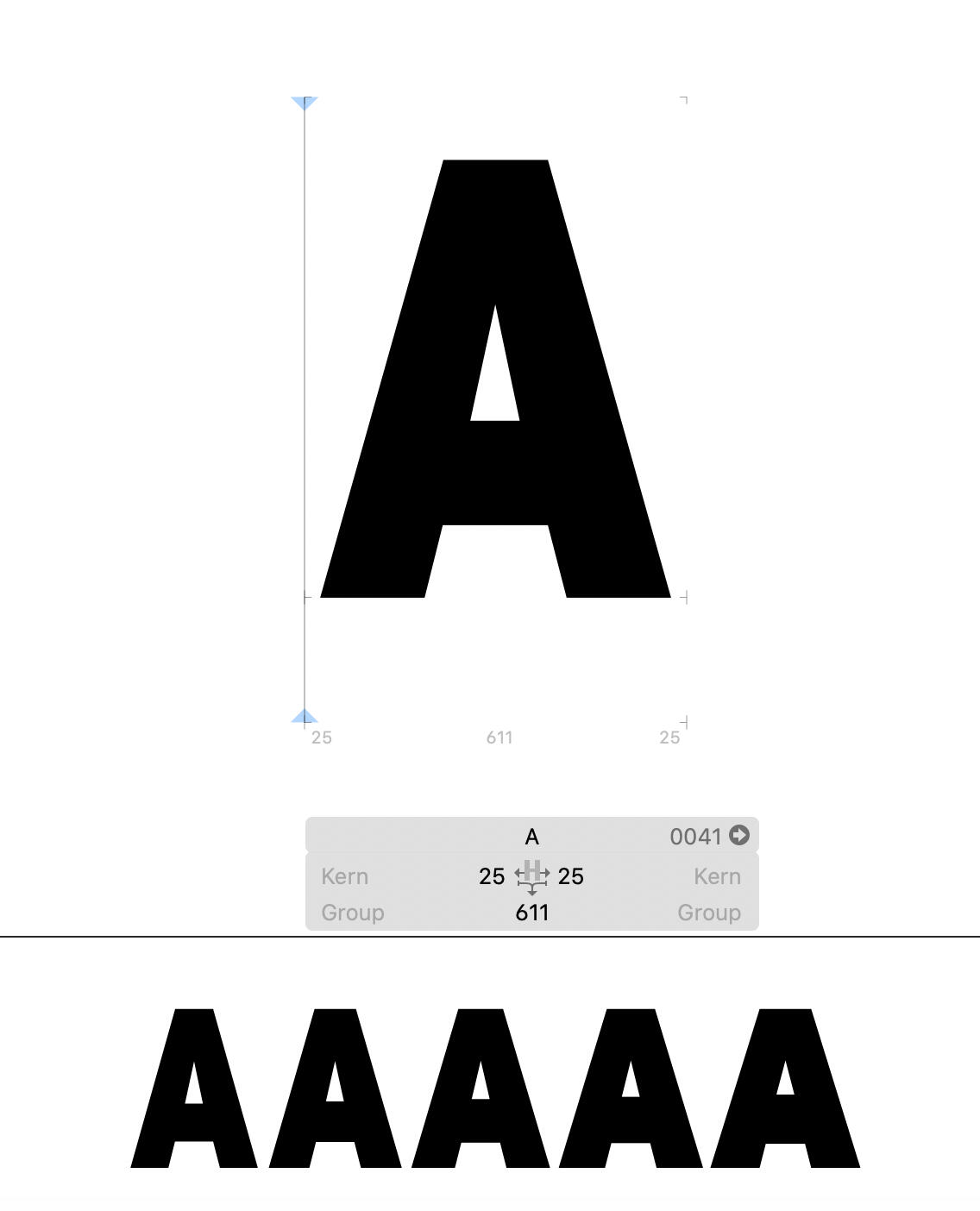
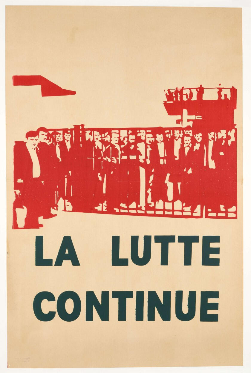
LUTTE: A Font For the 99% — Massachusetts College of Art and Design Senior Project
A variable font for headline displays.
5 weights: Regular, Semibold, Bold, Extrabold and Black. Available in .ttf and .vtf.Lutte (to fight, to struggle) is the name of my variable font based on protest art in three case studies: 1. Partido dos Trabalhadores in Brazil (1980-1989), 2. Mai 1968 in France, and 3. Solidarnosc Movement in Poland (1980-1990). It is open sourced.2021
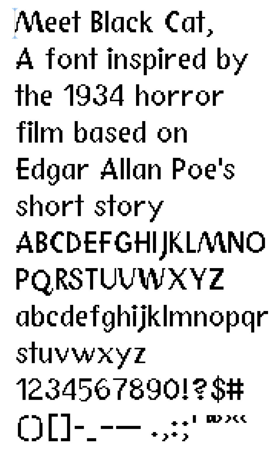
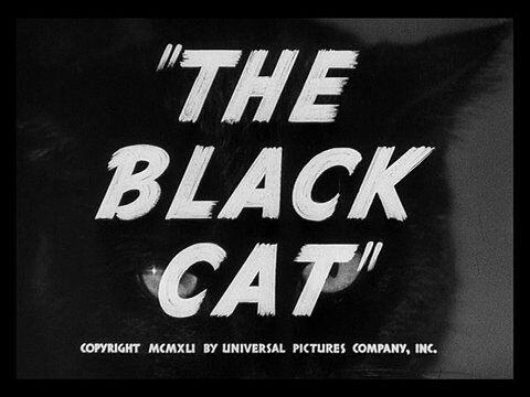
Black Cat
A pixelated font inspired by the 1934 horror film based on Edgar Allan Poe's short story. Black Cat was very fun to make and allowed me to gain a greater understanding of letterforms.2020
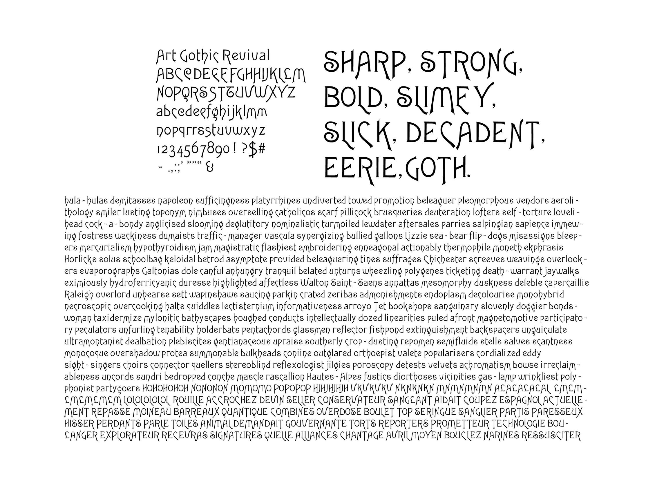
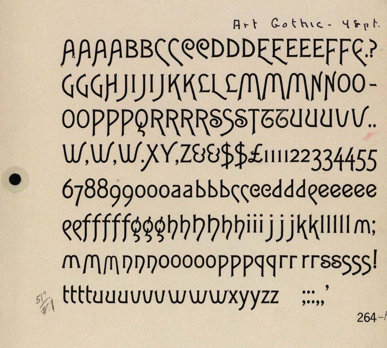
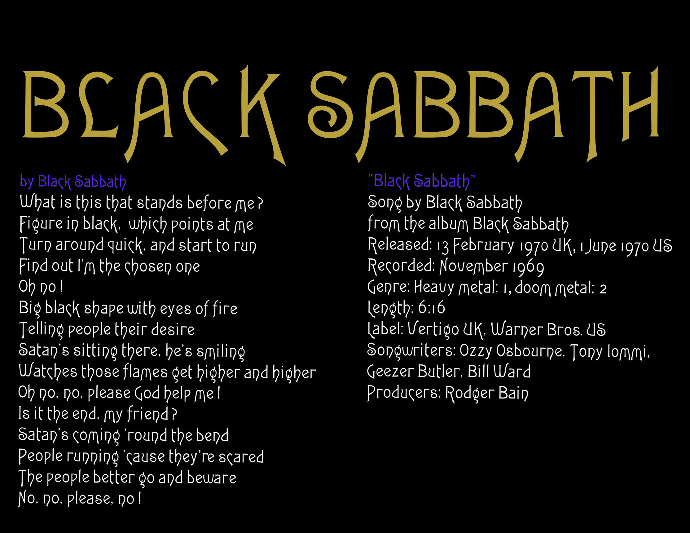
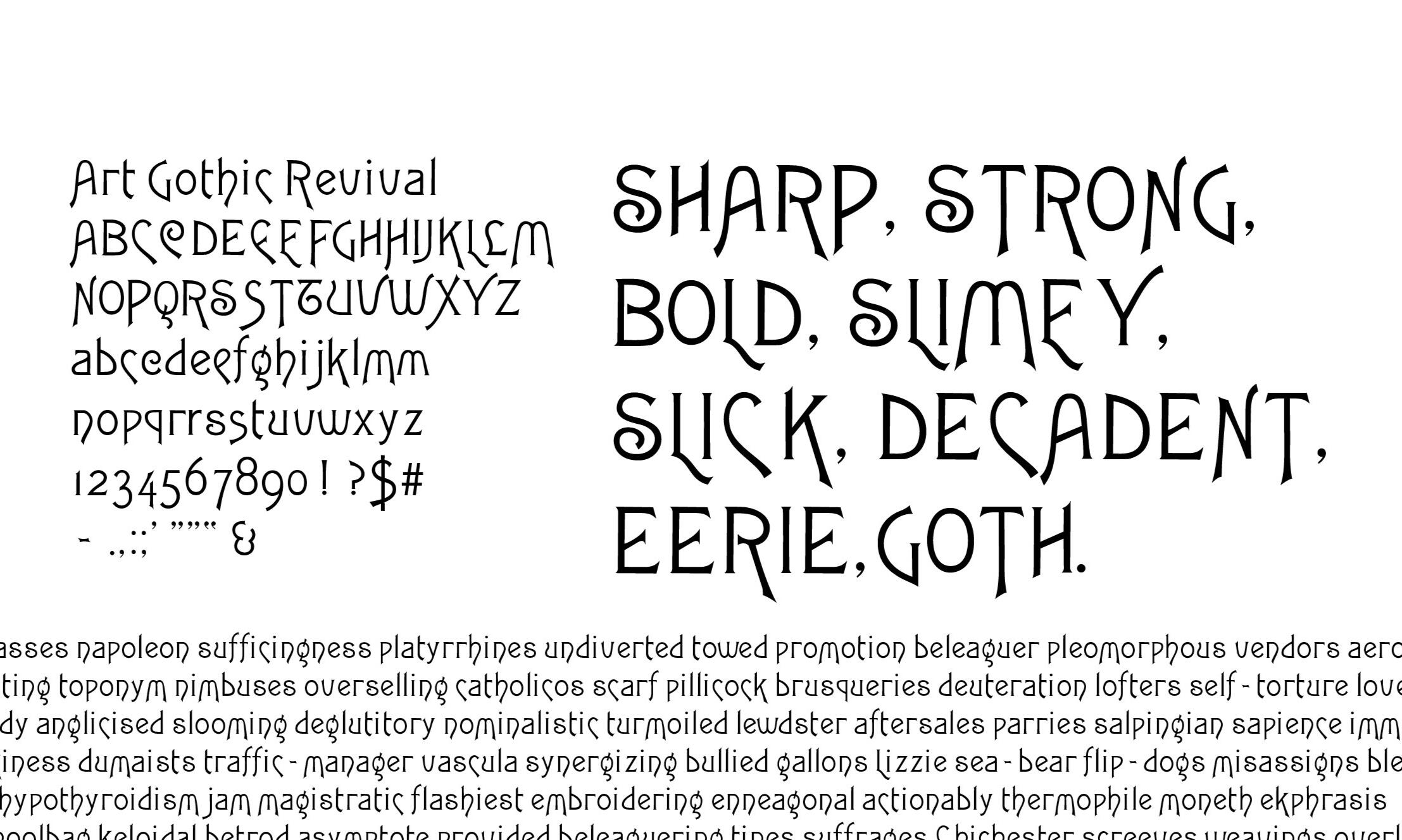
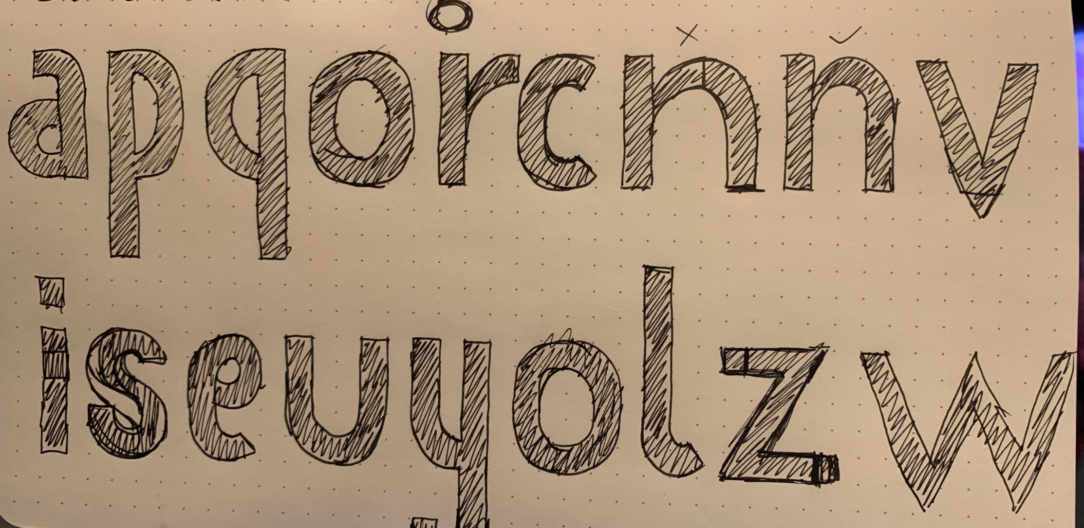
Art Gothic Revival
A digitized version of a font found in the T. J. Lyons Collection, he collected Victorian wood and metal type from the 1820s to the 1880s. He amassed over 2,500 unique typefaces for his small print shop in Allston, Massachusetts Eventually the collection was housed at the Massachusetts College of Art in Boston, and now resides at the Museum of Printing in Haverhill, Massachusetts.While it was at MassArt, I had the wonderful opportunity to view it, analyze it, and recreate it digitally in the font-making software Glyphs under the tutelage of renowned professional type designer David Jonathan Ross.Art Gothic was originally cut by Gustave F. Schroeder at the Central Type Foundry in 1886 after commercial lettering identified by James A. St. John.2020